Sun Mode

updated 12.18.25
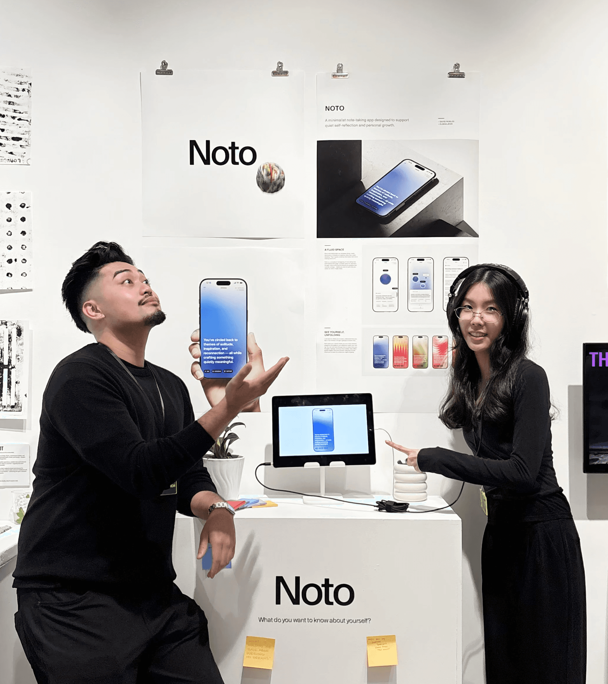
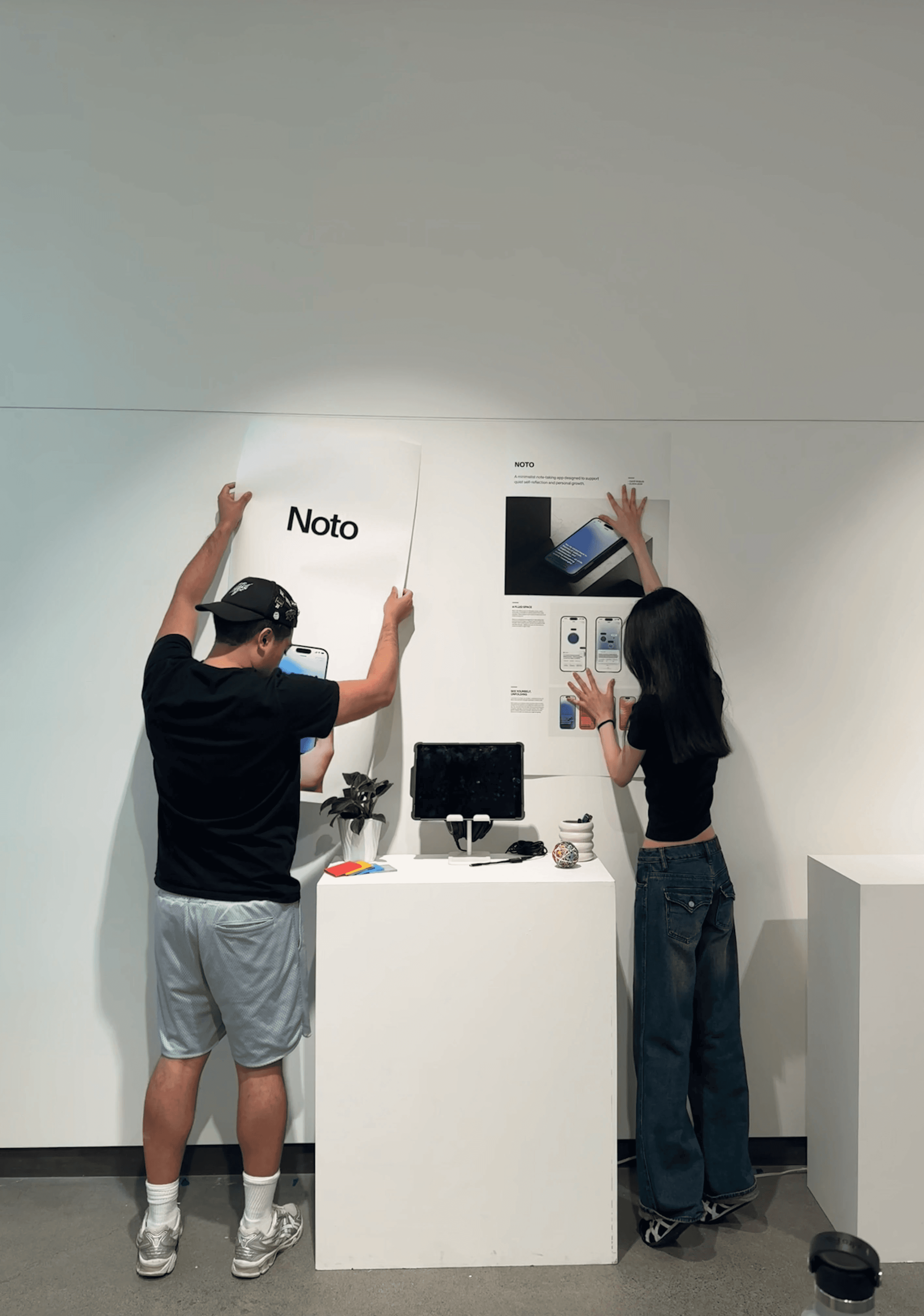
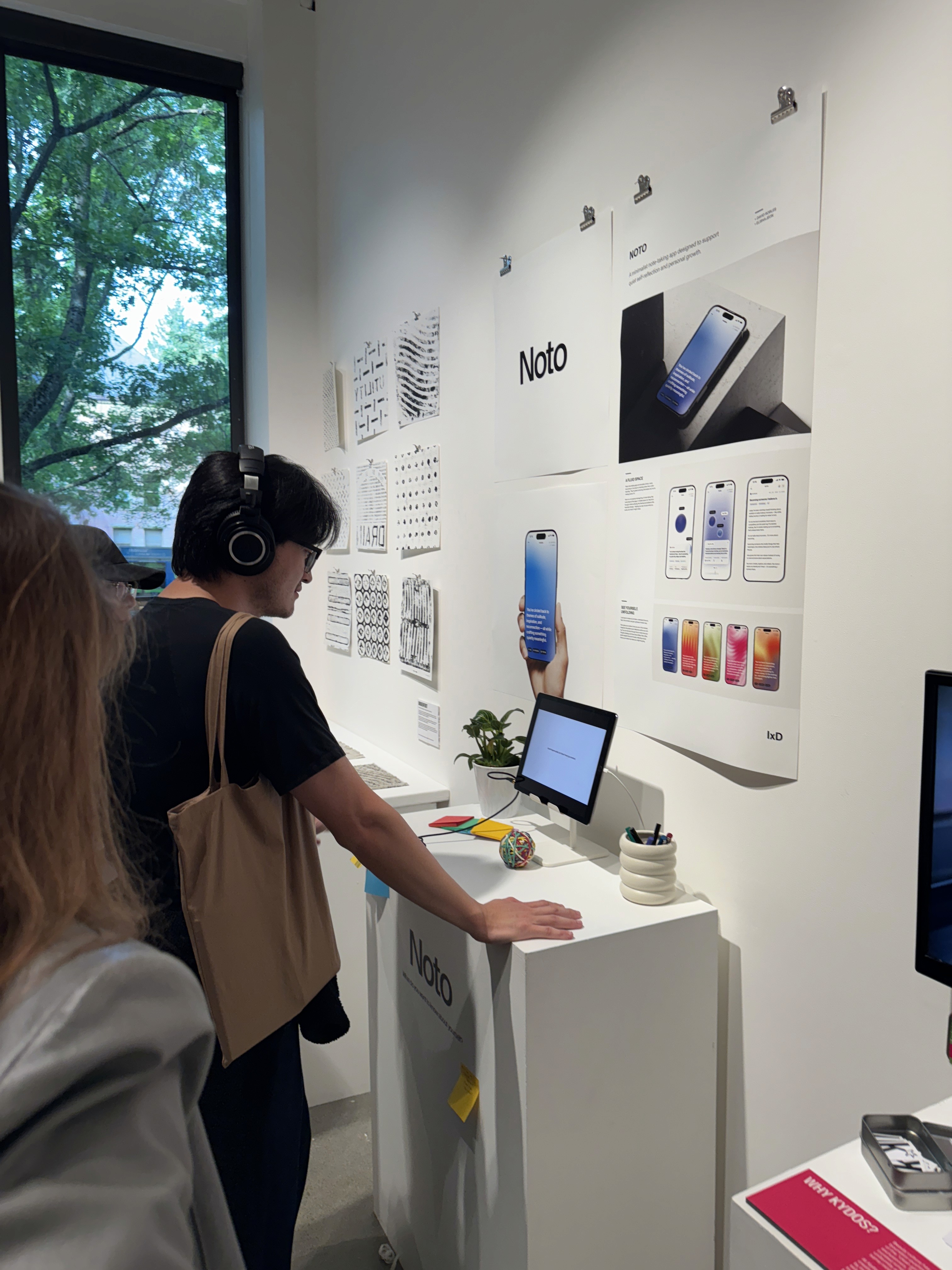
Noto / App
The notes app that captures who you are.
Building a note-taking experience that grows with you, so you can make sense of who you were and who you're becoming.
Role
Product Designer
Timeline
8 weeks
March – June 2025
Team
David Robles
Elisha Jeon
Skills
Overview
What if your notes could help you understand yourself?
A curiosity-driven passion project
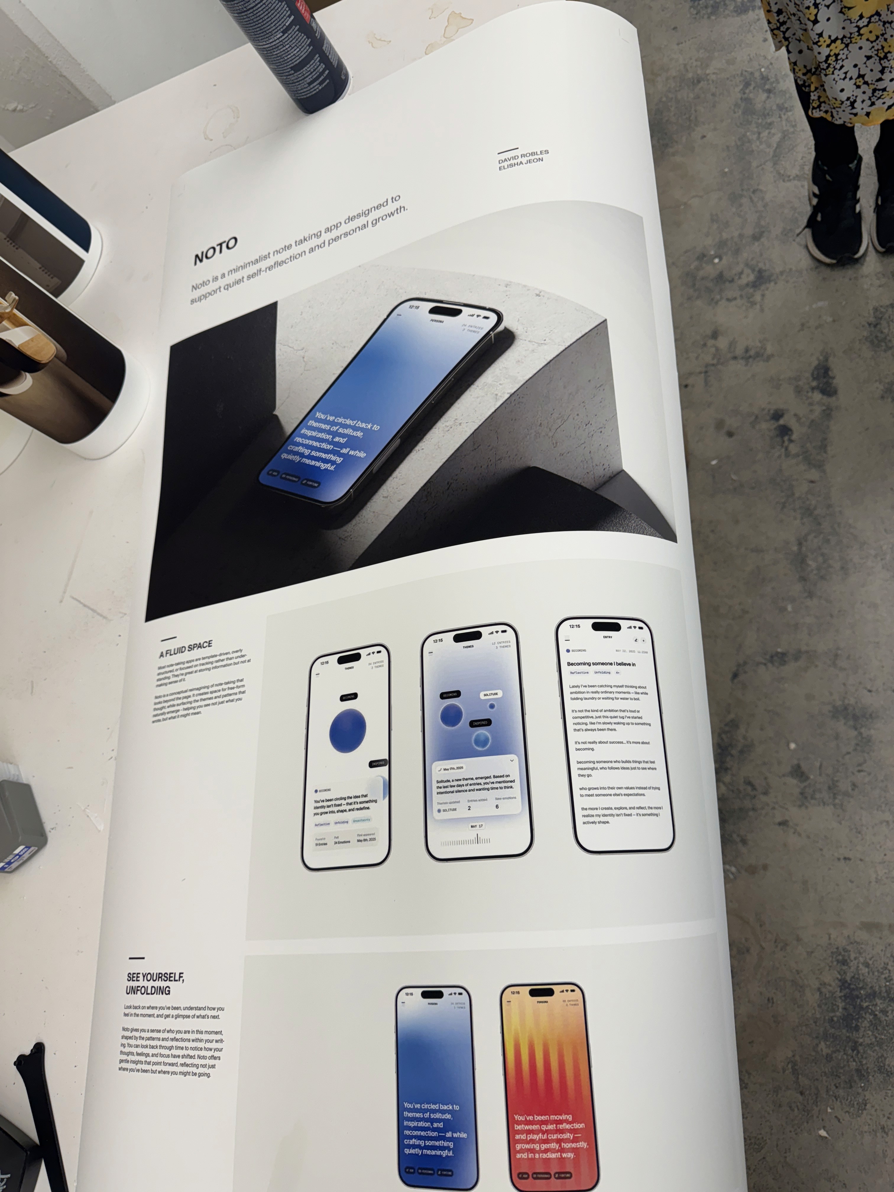
For 8 weeks, I partnered with another designer and led the product concept, interaction design, and visual direction for Noto — a conceptual note-taking app.
As my capstone and farewell to four years of design school, I wanted to create something deeply personal, bringing together my favorite things: Spotify Wrapped-style self-discovery, experimental design, and pretty gradients :')
The Problem
No one is building for self-insight, only self-documentation.
The notes app: a convenient but chaotic space
I've used my notes app for years, and it's become a trusty but unstructured archive of my life, from 2am thoughts, to-dos, and mind dumps. When I tried to make sense of it, I realized most journaling tools share the same flaw: they organize what you write, not what it means.
WHAT'S MISSING
Years of chaotic notes. Easy to write, hard to make sense of.
Solution
Introducing Noto
A reflective notes app that turns everyday writing into personal insight.
Noto creates space for free-form thought, while surfacing the themes and patterns that naturally emerge — helping you see not just what you wrote, but what it might mean.
Core flows
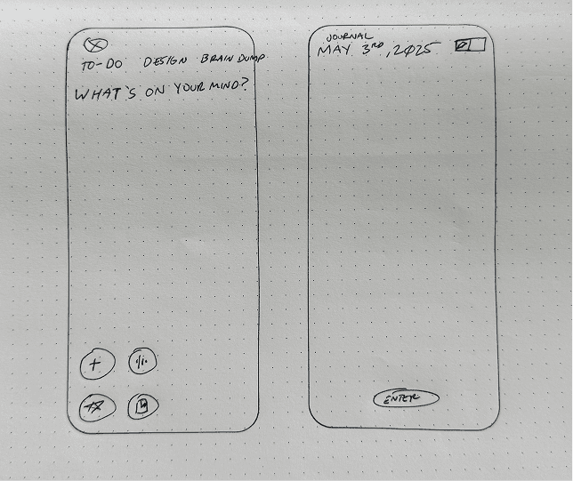
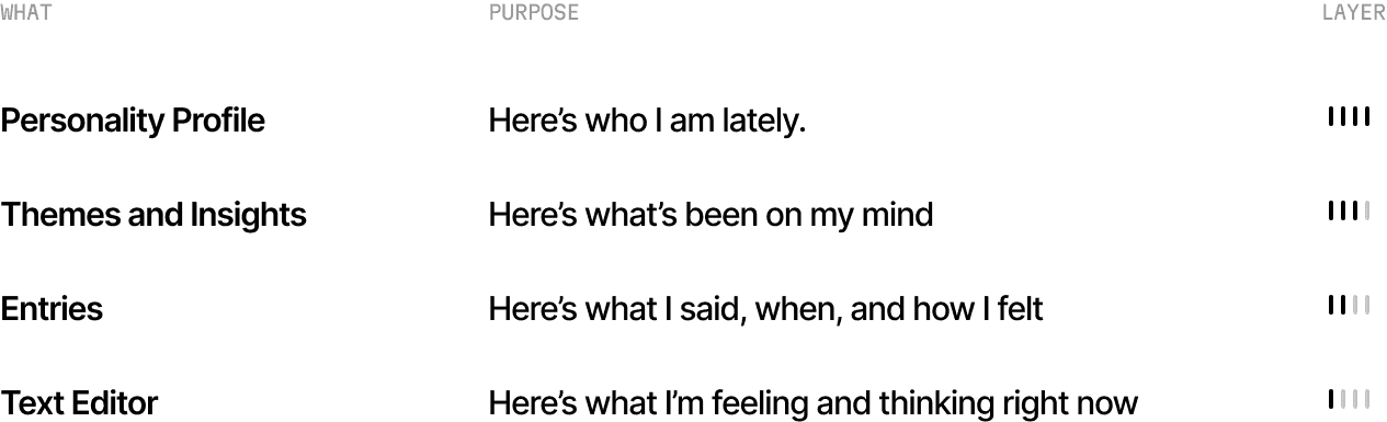
01 TEXT ENTRY
A simple place for your thoughts.
Plans, reflections, or brain dumps — write whatever calls to you in the moment. This space is a living archive of your life but without the clutter. Your entry will be automatically tagged with emotions and topics based on what you write.
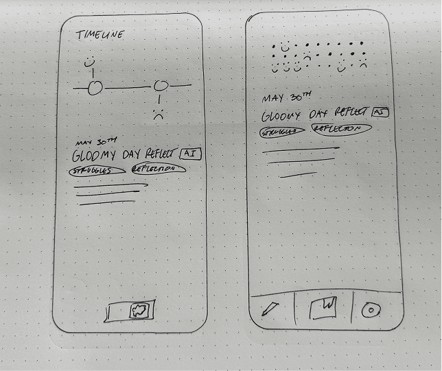
02 ENTRIES
Revisit entries by what emotions emerged in them.
With theme tags, you can sort through your entries by the emotions captured in them, discovering how they connect to larger patterns in your thinking.
03 THEMES & INSIGHTS
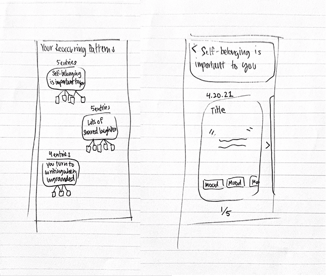
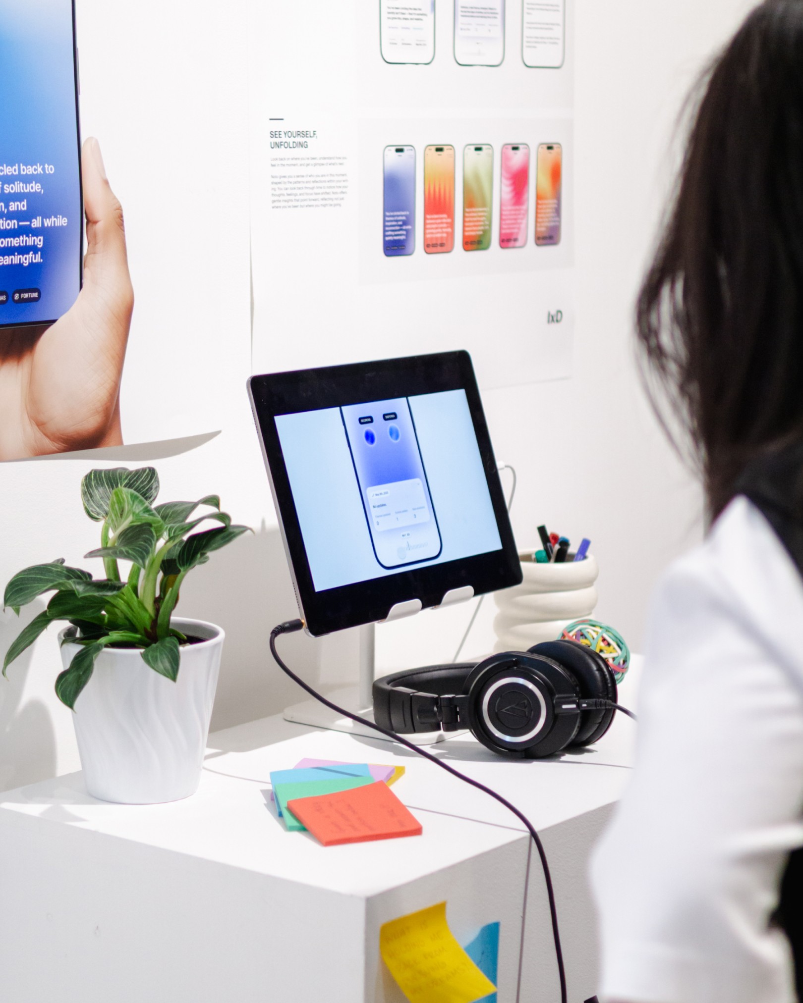
See what patterns and topics have been on your mind.
Recurring or notable ideas appear as theme orbs in the Themes Layer, where size indicates how often you've written about the topic. Use the timeline to see when themes emerged or how they grew.
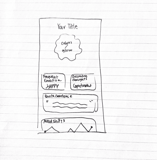
04 PERSONA
A bird's eye view of who you are.
Your persona is an evolving monthly reflection of you. Expressed through color, motion, and a summary, it captures who you are through your writing, giving you both a quick understanding of yourself and a fun, personal keepsake. Return to past personas to see how you’ve changed.
05 ASK AI + FORTUNE
Find answers about yourself and who you're becoming.
Ask questions without digging, like "What have I been stressed about?". You can also find a gentle forecast of what you may be moving toward based on your entries and their emerging patterns.
06 NAVIGATION
Move through layers to see different depths of yourself.
Zoom seamlessly from a high-level summary of who you are to the writing behind it. Every insight and pattern traces back to the original notes that created it.
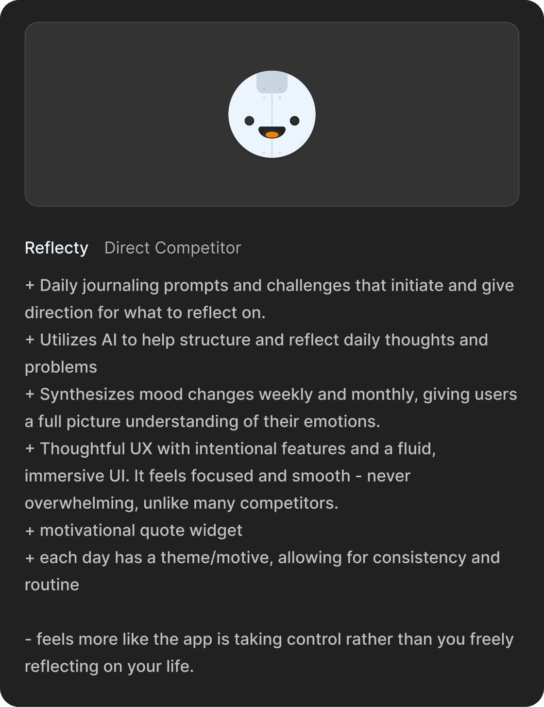
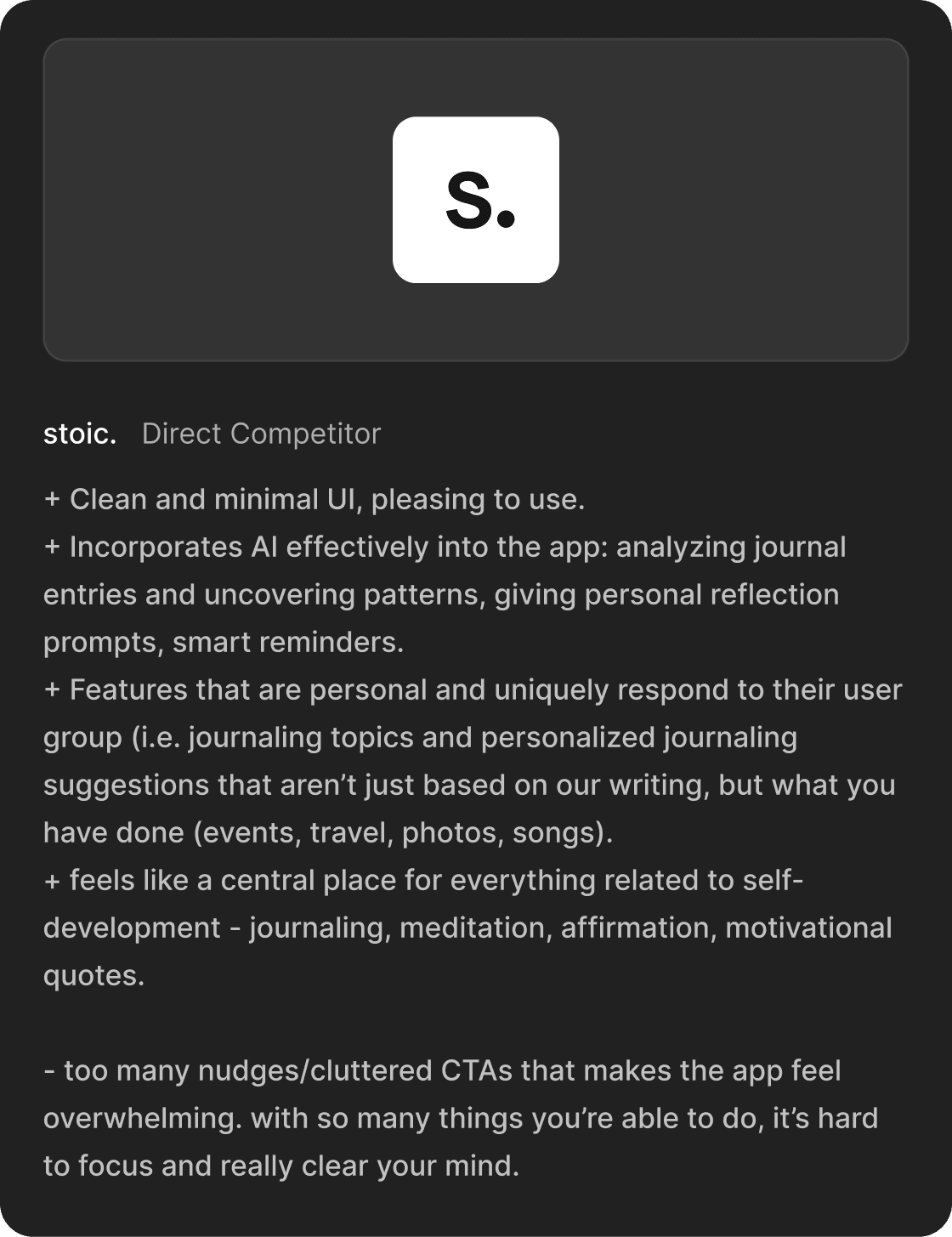
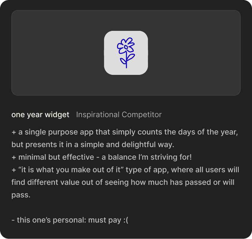
Competitive Analysis
Understand why journaling apps fail.
Too much direction, too little you
These apps take control, limiting space for self-led reflection. Predefined selections feels mindless, overwhelming features dilute user intention, and excessive nudging feels disingenuous.
On the other hand…
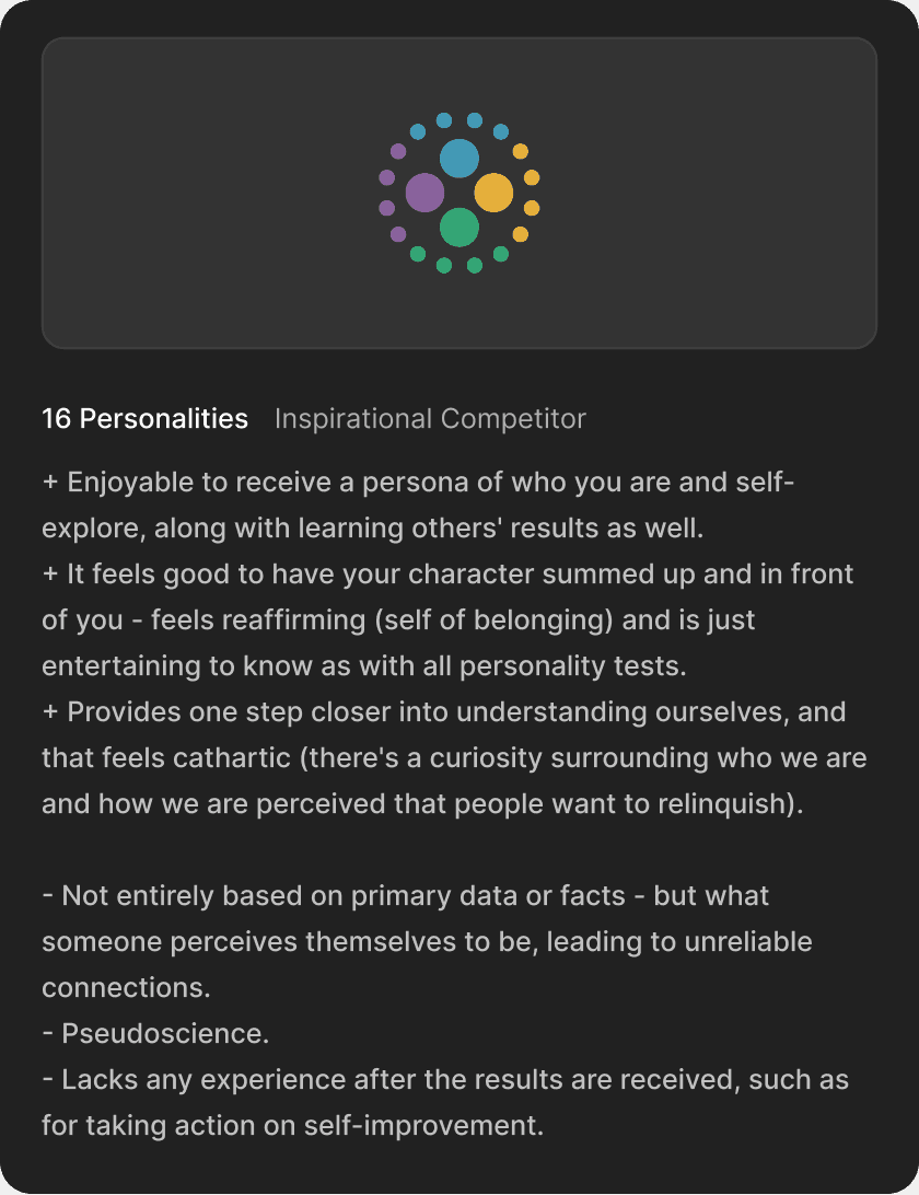
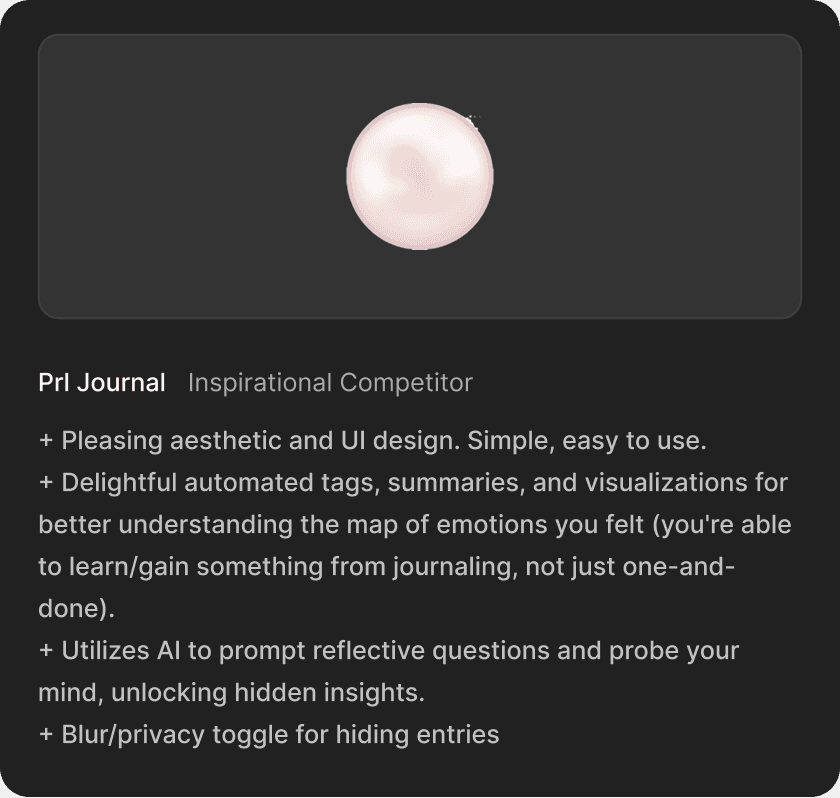
Tools that feel like yours
The apps people love taught us what to build: Spotify Wrapped, personality tests, curated spaces. They take passive data and turn it into something affirming, making users feel present, seen, and surprised. That's what was missing from journaling apps.

User Research
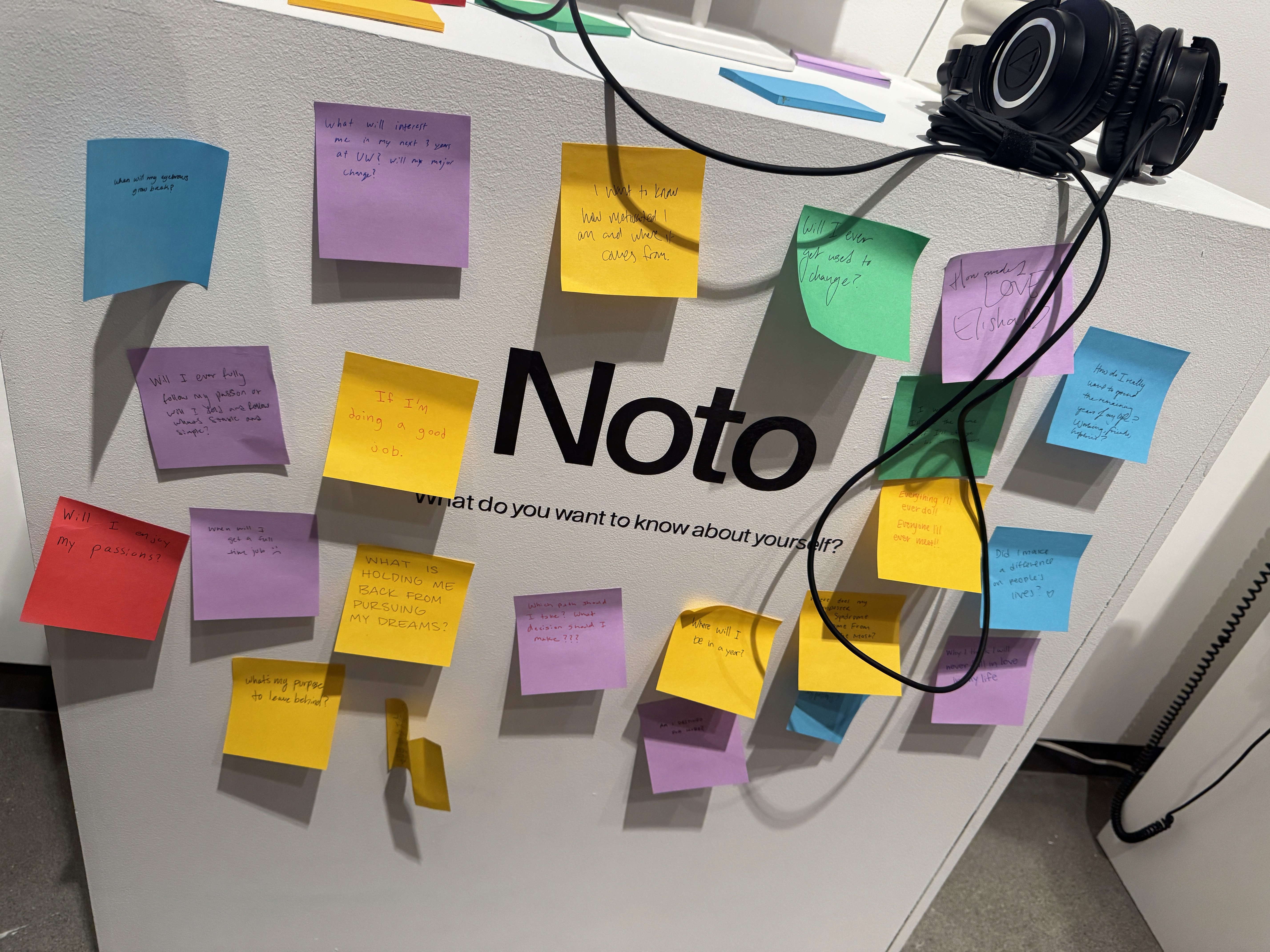
I surveyed 19 people to understand what was missing in their journaling.
KEY INSIGHTS
Journaling feels like a chore.
Too structured, too time-consuming. Digital entries get buried and forgotten.
Forced engagement backfires
Streaks, mood check-ins, daily prompts lead to half-hearted entries people never revisit.
Q: WHAT FRUSTRATES YOU ABOUT CURRENT JOURNALING OR NOTES APPS YOU'VE USED?
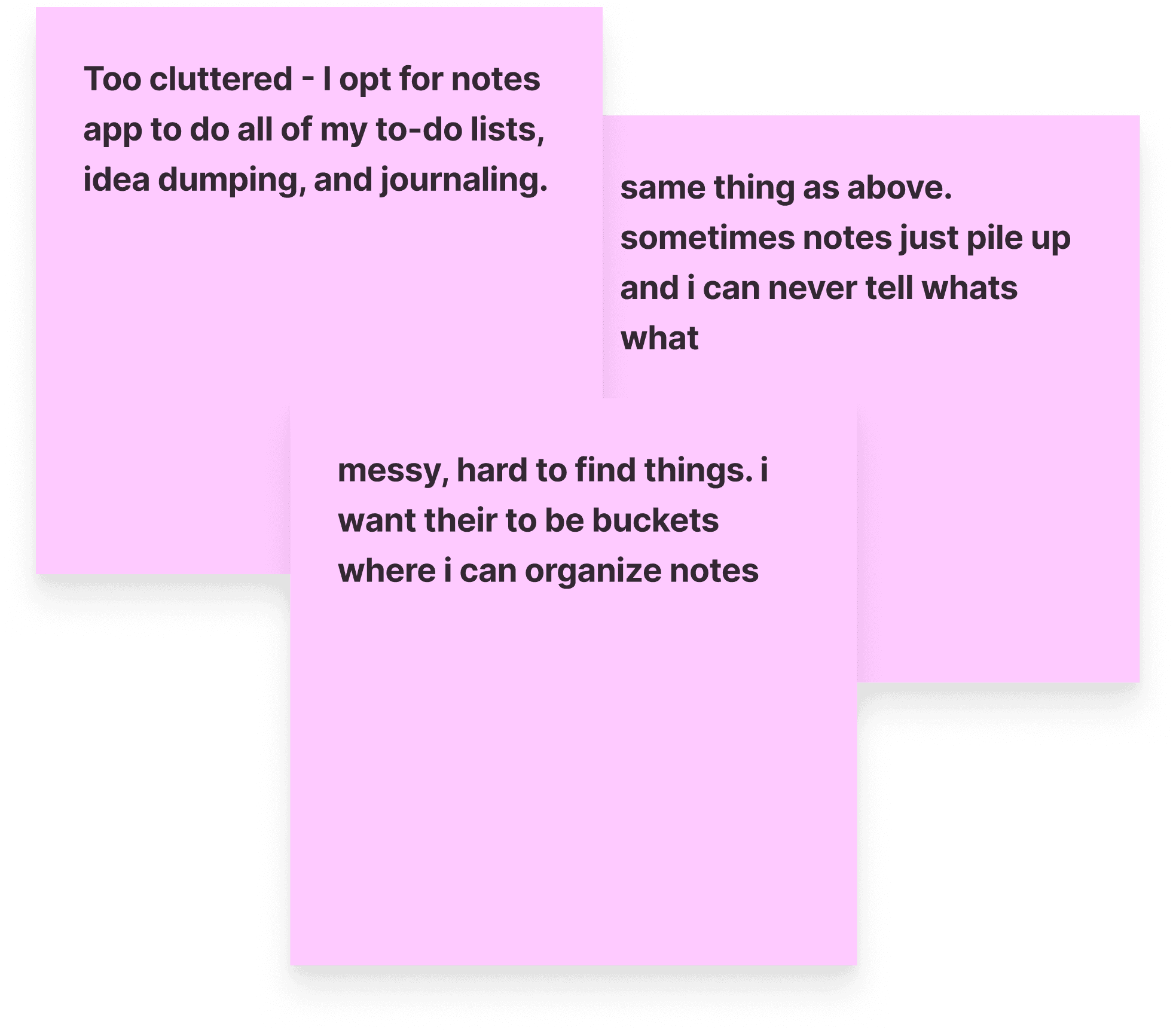
Messy/cluttered
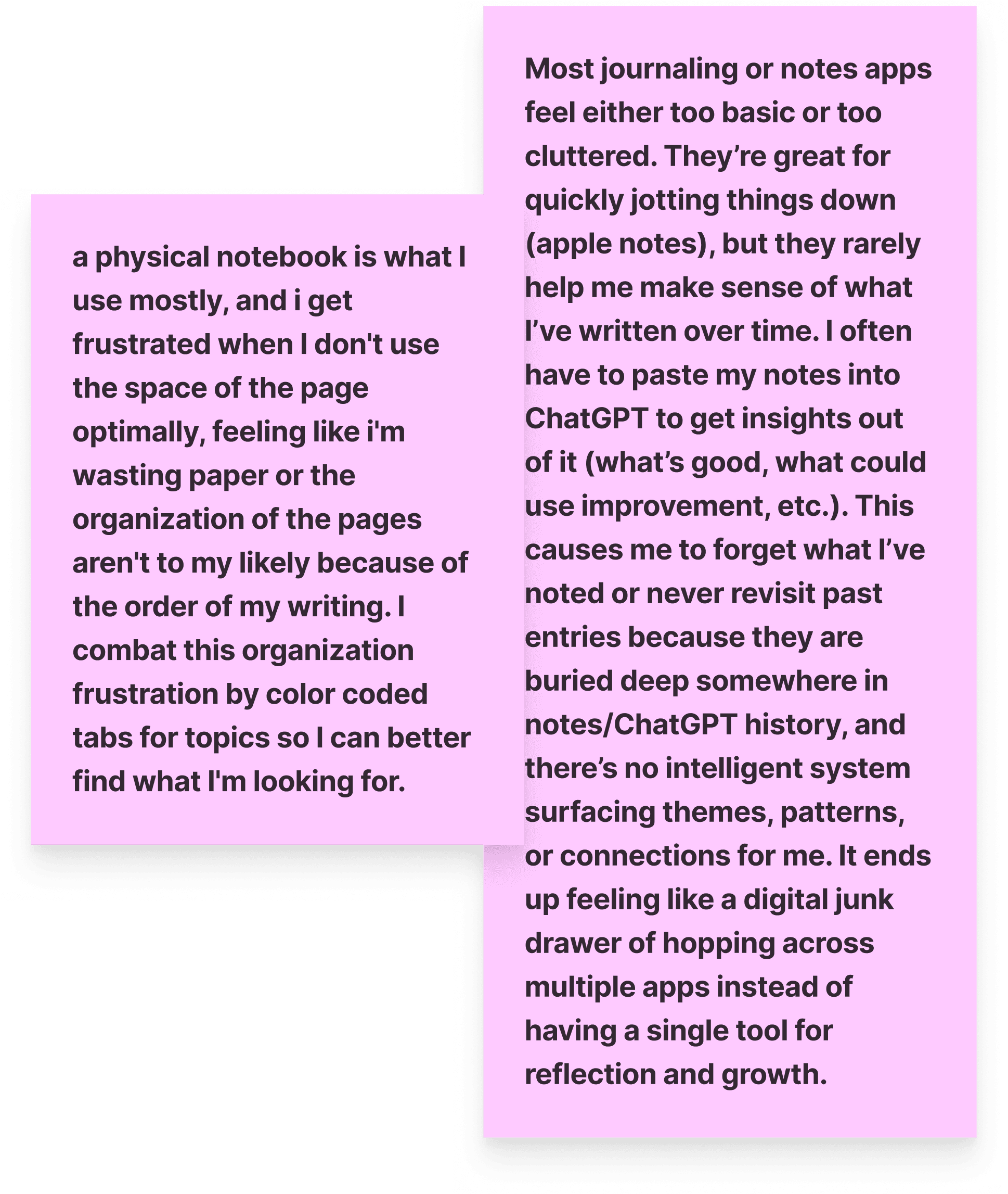
Not insightful or optimized
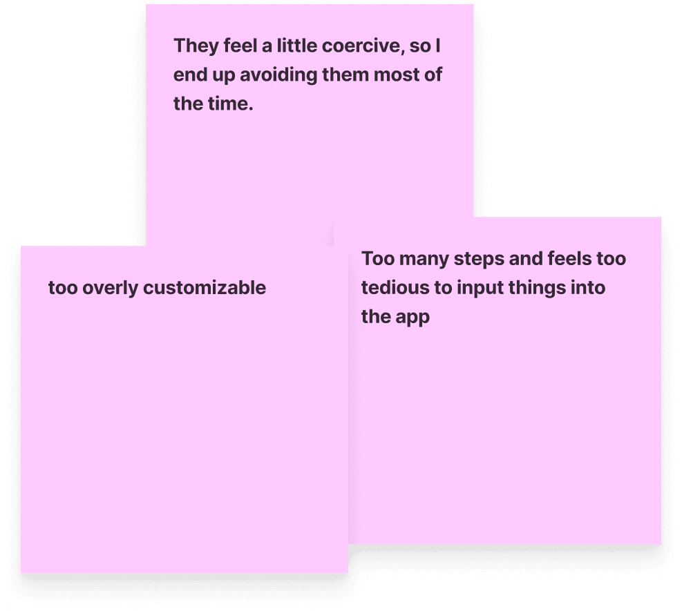
Too much
Stats ≠ understanding
Apps are great for tracking numbers. But they miss the why behind how you felt — not just the data point that you did.
Q: IF YOUR NOTES COULD REVEAL STUFF ABOUT YOU, WHAT WOULD YOU WANT IT TO REVEAL?
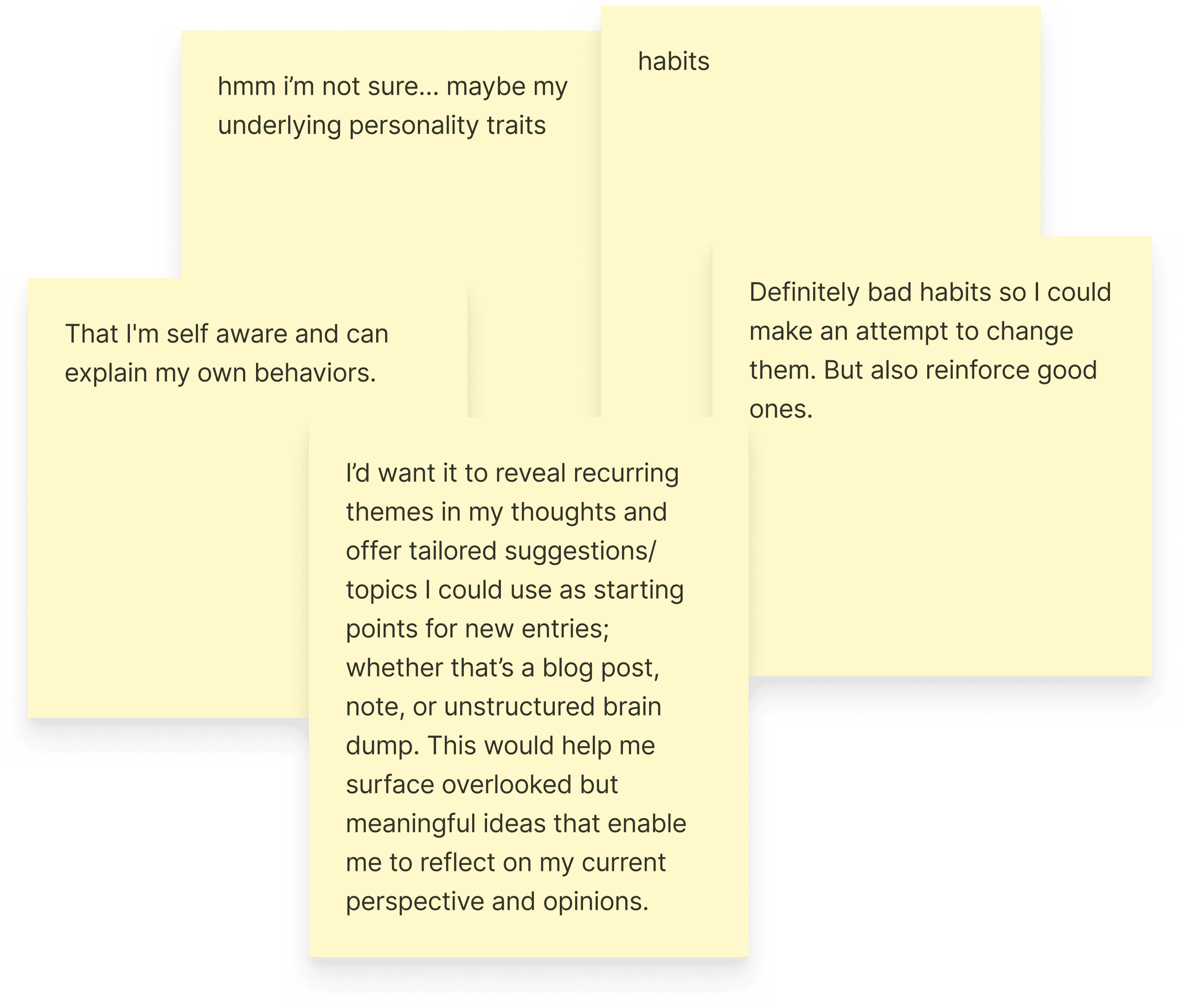
Habits and behaviors
Growth
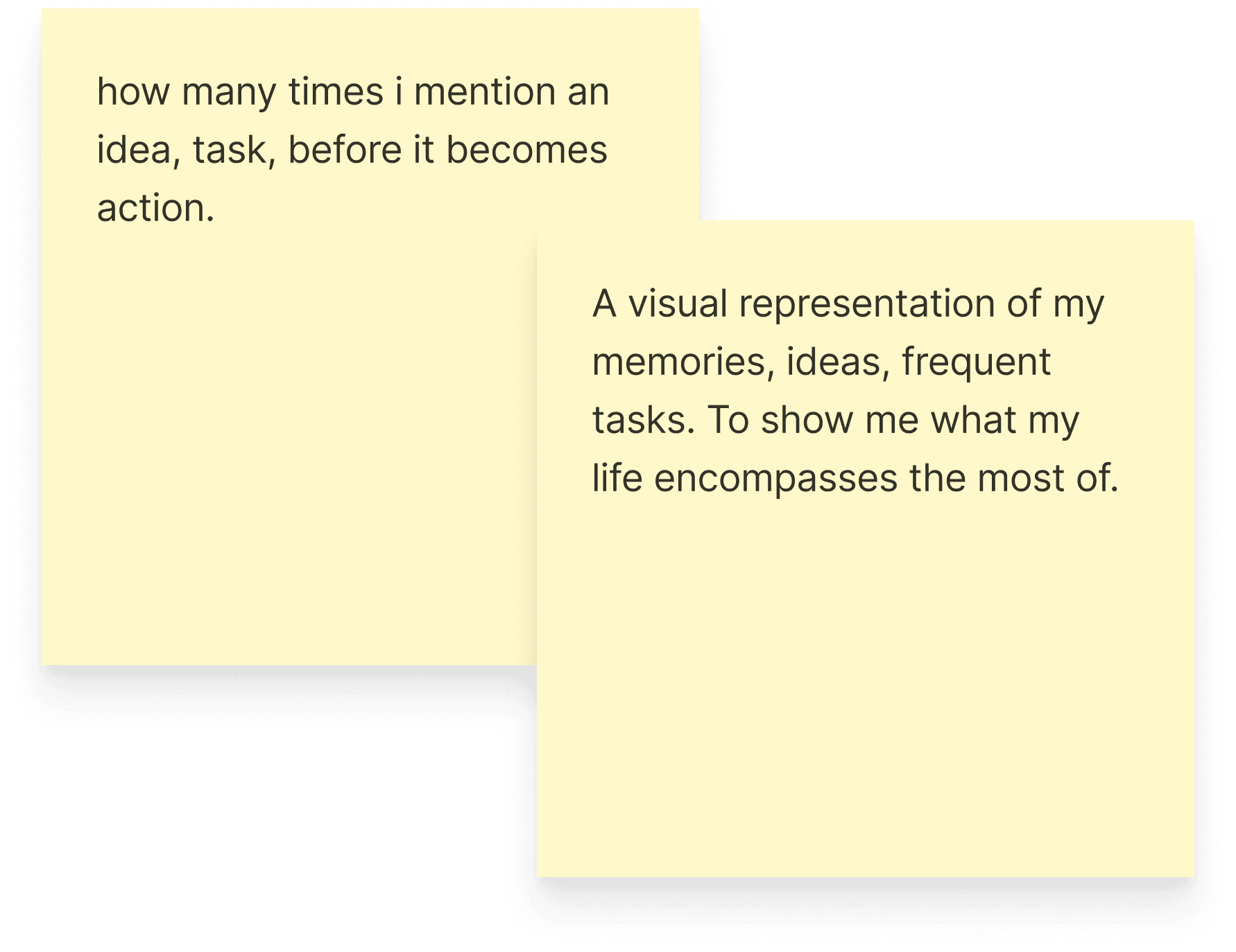
Reoccurring ideas + tasks
People want insights about themselves.
Nuanced things like recurring thoughts or how they've shifted over time. Something that gives back, not just takes input.
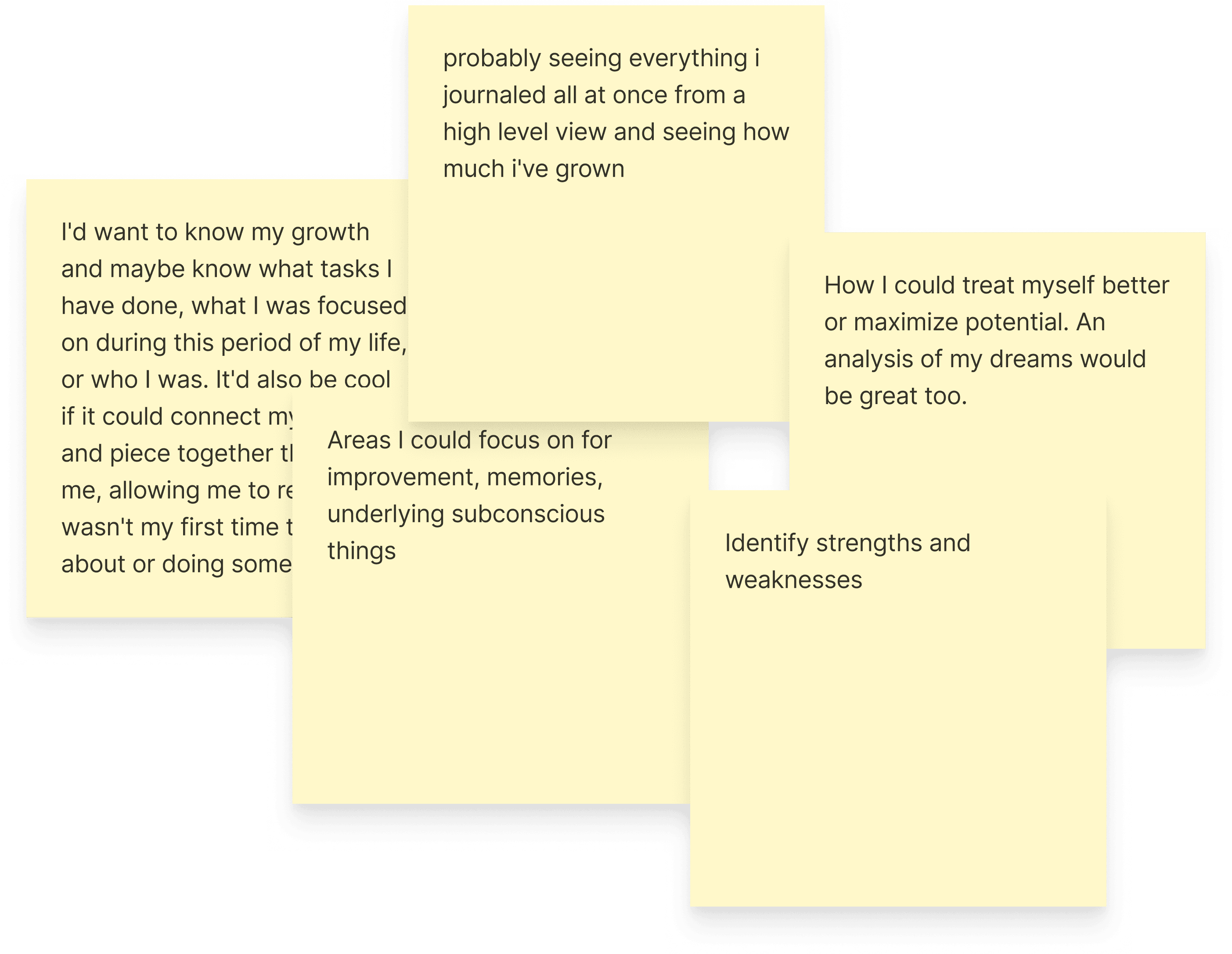
Q: WHEN JOURNALING, WHAT KIND OF INSIGHTS ARE YOU HOPING TO UNCOVER ABOUT YOURSELF?
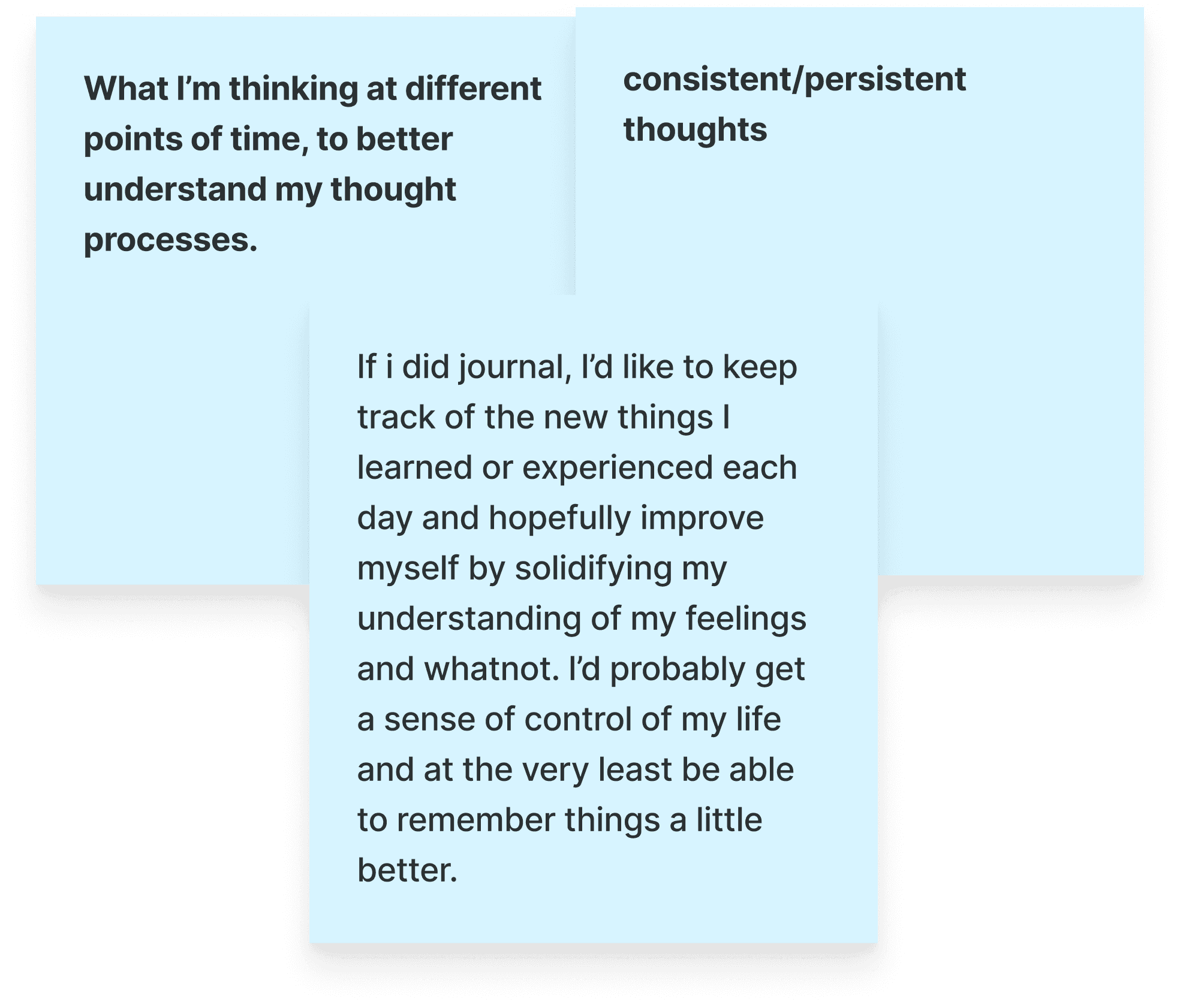
Tracking
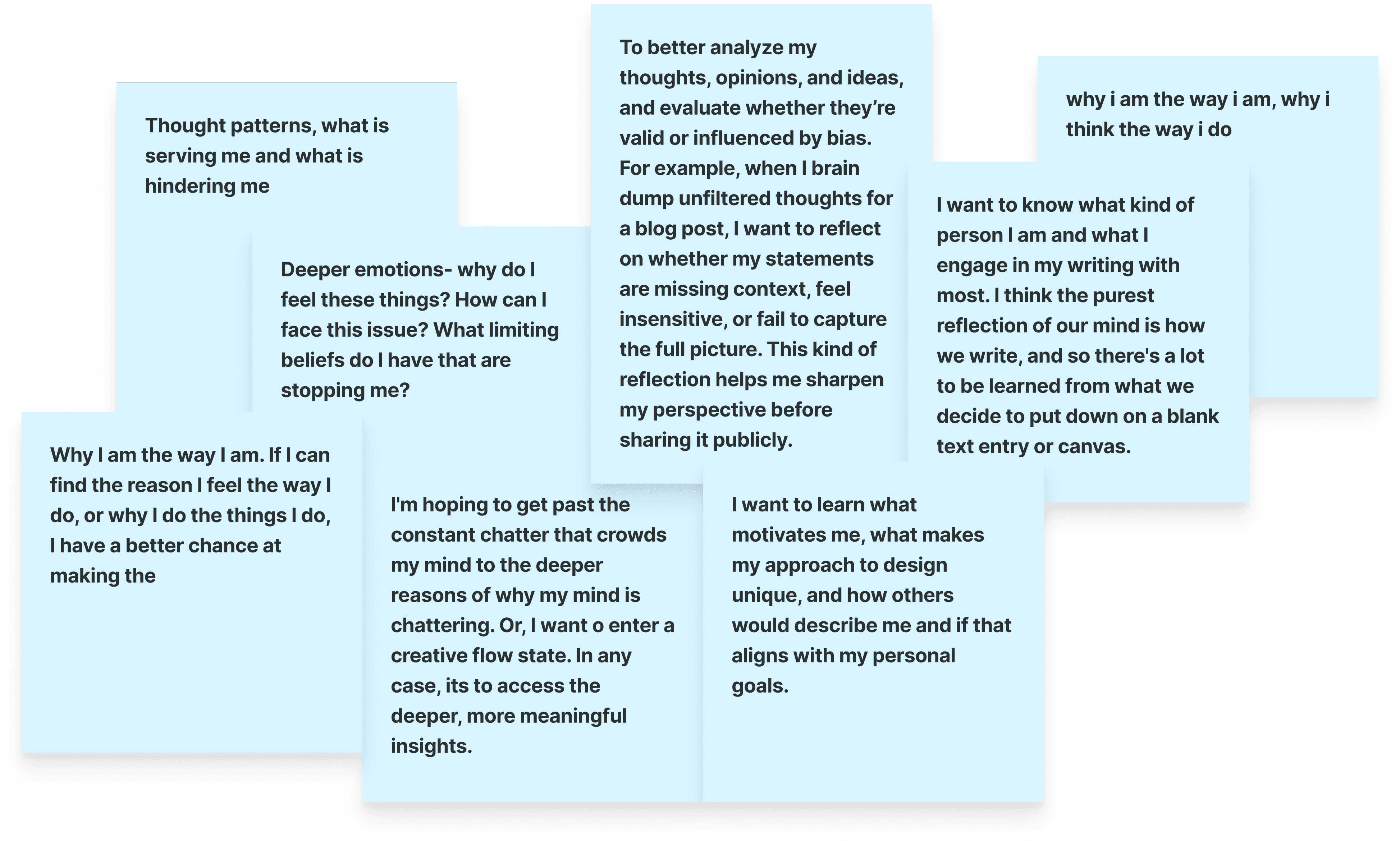
Self-awareness
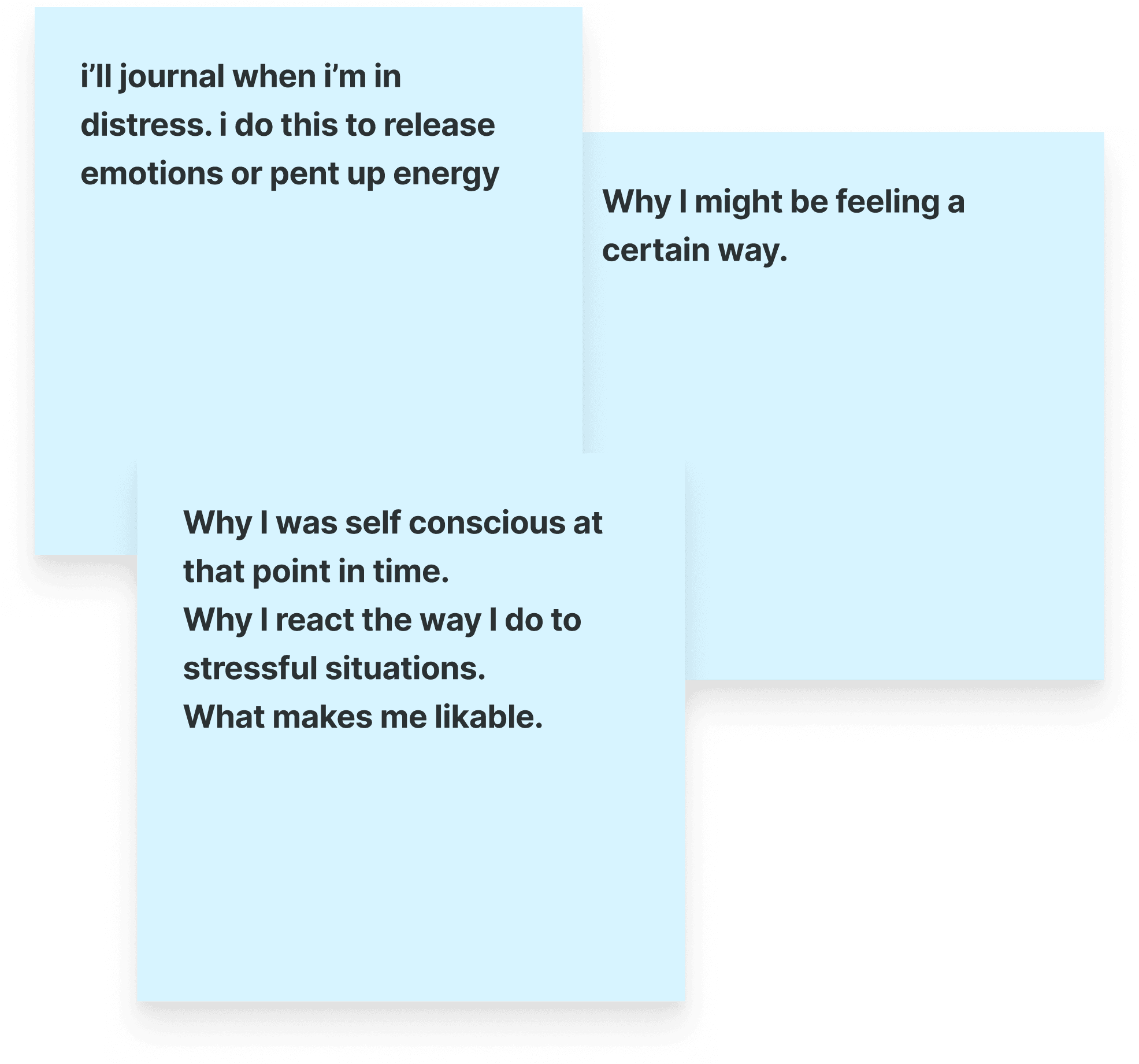
Mental Health
Opportunity
People don't need more prompts, they need meaning.
Shifting from documentation to understanding
Most journaling apps approximate insight with mood sliders and surface-level stats. I wanted something more nuanced — using AI to read between the lines and pull meaning straight from the writing itself. The aim was to reveal patterns and reflections that feel genuinely tied to who the user is.
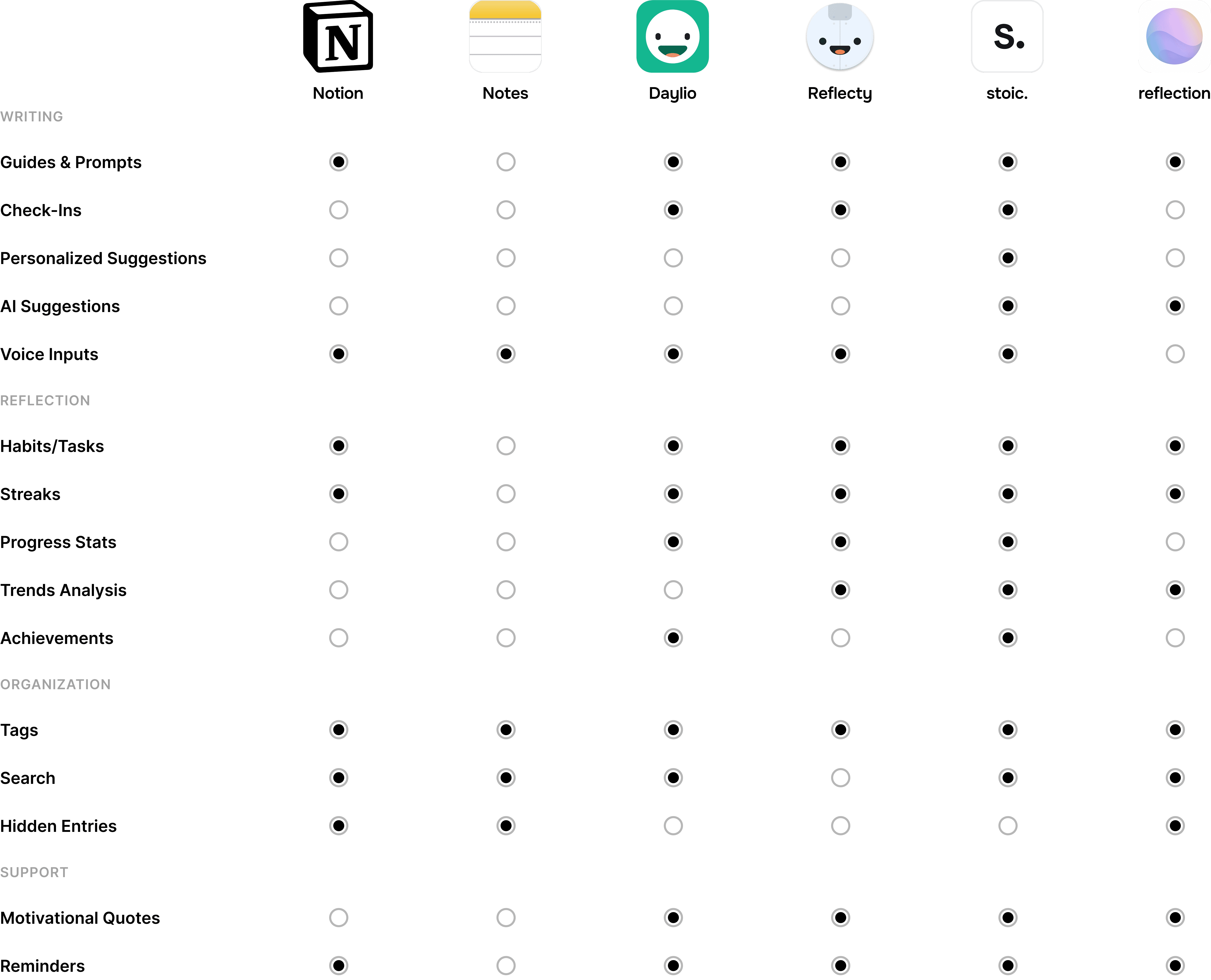
Feature matrix with direct competitors
Write to feel, not to finish.
In addition to lacking meaningful self-insight, most competitor apps push engagement over genuine reflection. I wanted to create a space where insights emerge naturally, not because users are trying to hit a quota.
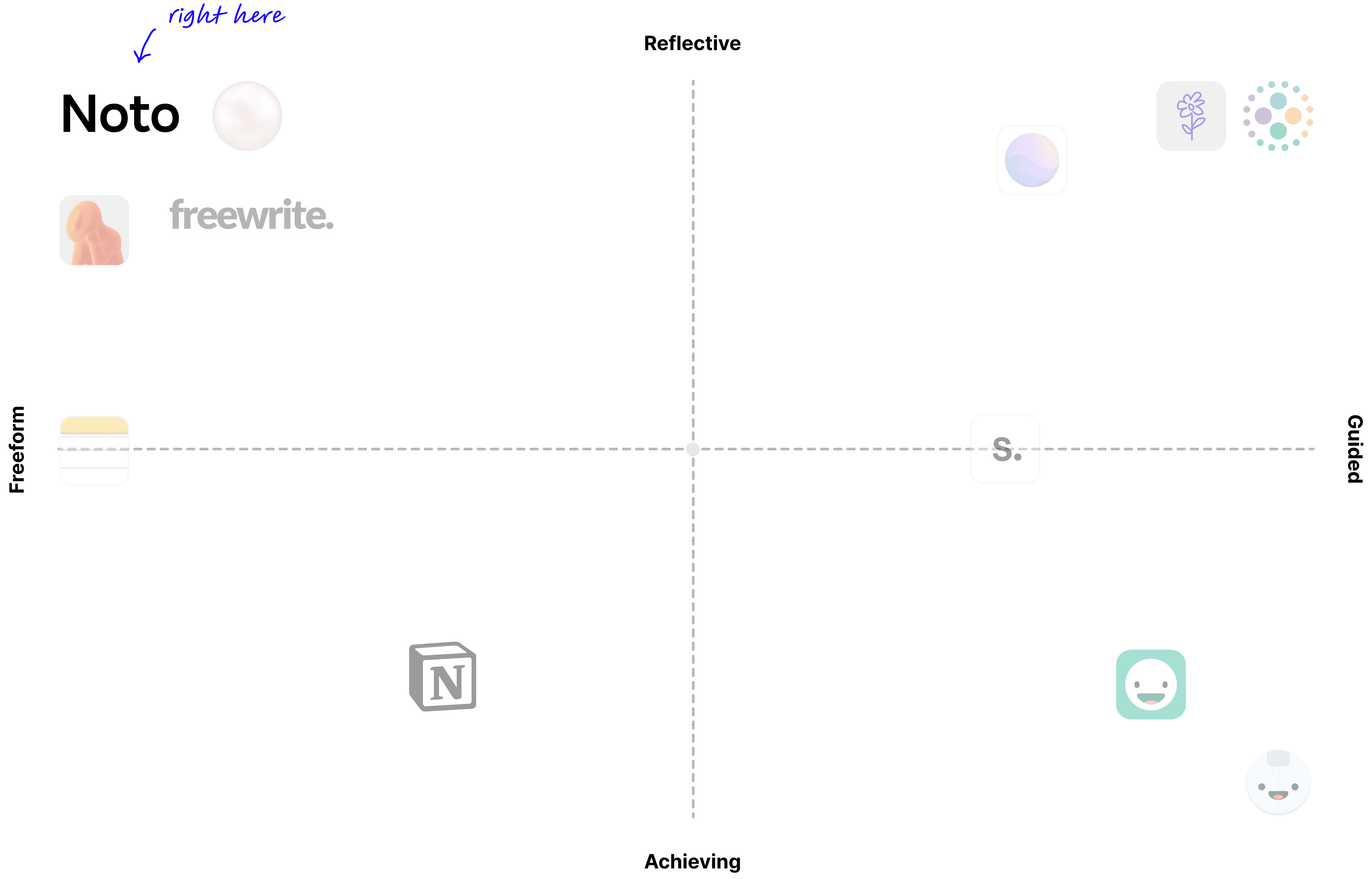
Positioning matrix
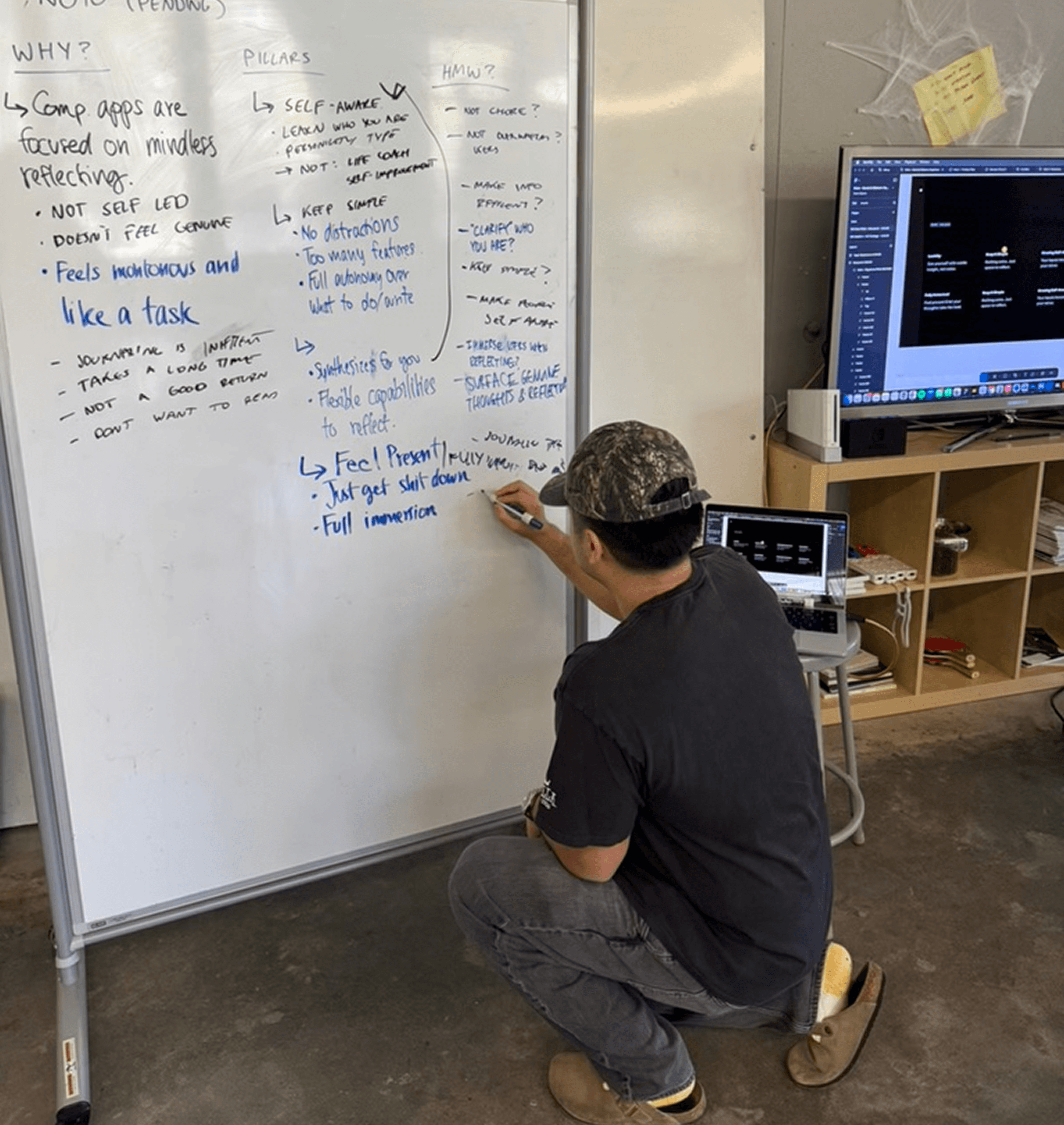
Ideation
How might we turn every unfiltered writing into meaningful self-understanding?
HIGH-LEVEL GOALS
I want this app to feel natural, intuitive, and second nature.
I want people to feel fully present, without distractions or obstacles.
I want people to write freely and honestly, without needing to make it perfect.
I want people to discover what matters most to them — fluidly and flexibly.
Exploring what our app should have
My teammate and I whiteboarded different ways to surface insights — from abstract, build-up visuals (dots tracking progress or patterns) to prescriptive snippets and direct feedback. This helped us realize that each idea held a different tone and that we wanted to evoke one that felt insightful but not like it boxed you in.
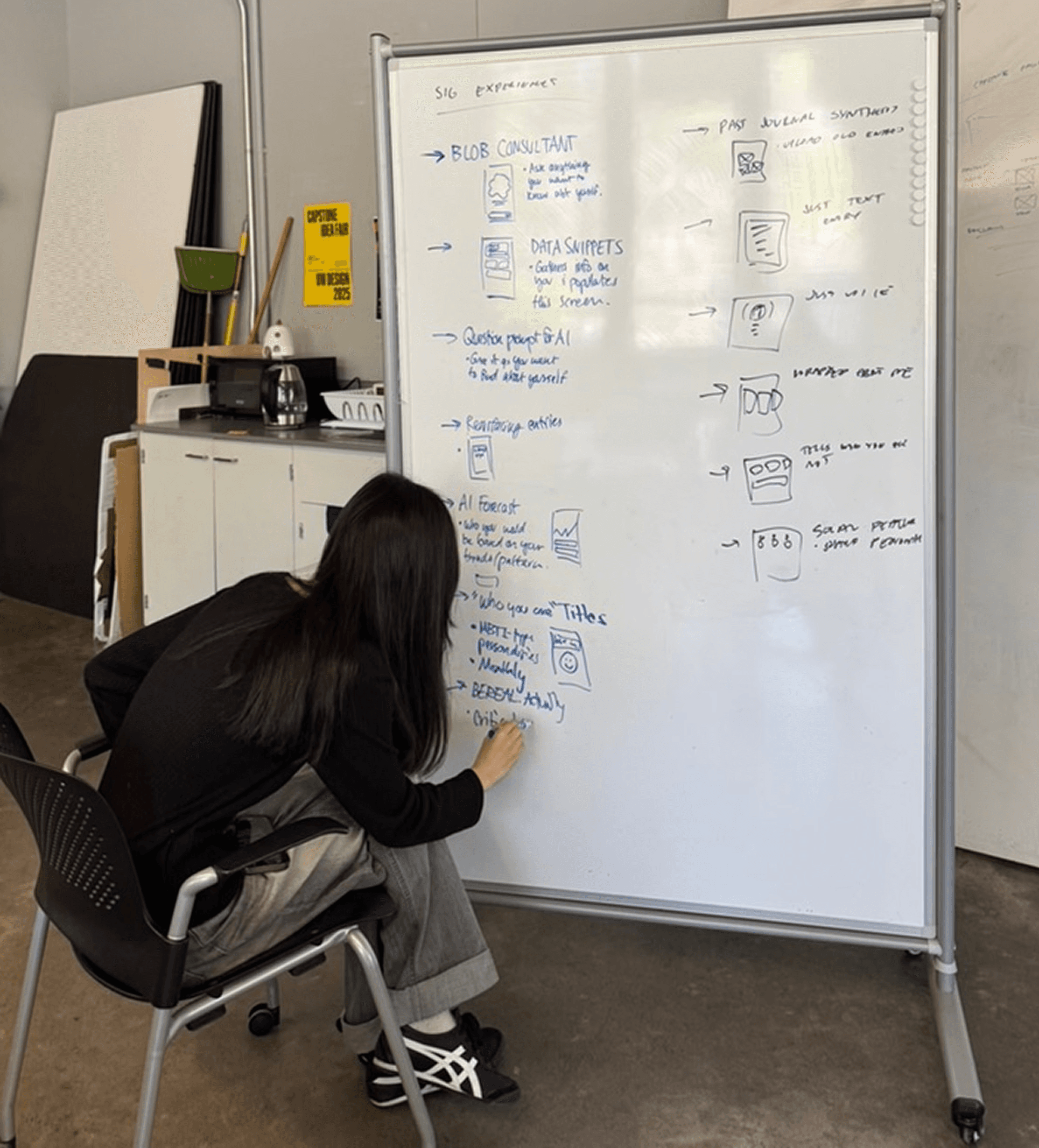
We landed on ideas that were essential to our goals.
From our research, we knew users wanted to understand not just what they were thinking, but when and why. This guided our selection of signature experiences to develop further:
Simple Entry Page
Themes Timeline
Themes & Patterns
High-level Insights
UX Strategy
Defining the Noto experience.
An unbiased but supportive space
Too many AI tools act like yes-men, validating rather than offering honest reflection. We made a deliberate decision not to make a personal therapist, but instead a quiet observer that surfaces patterns as they are, leaving the mental-health realm untouched. Instead, we wanted Noto to simply reflect their true selves, whatever may show up.
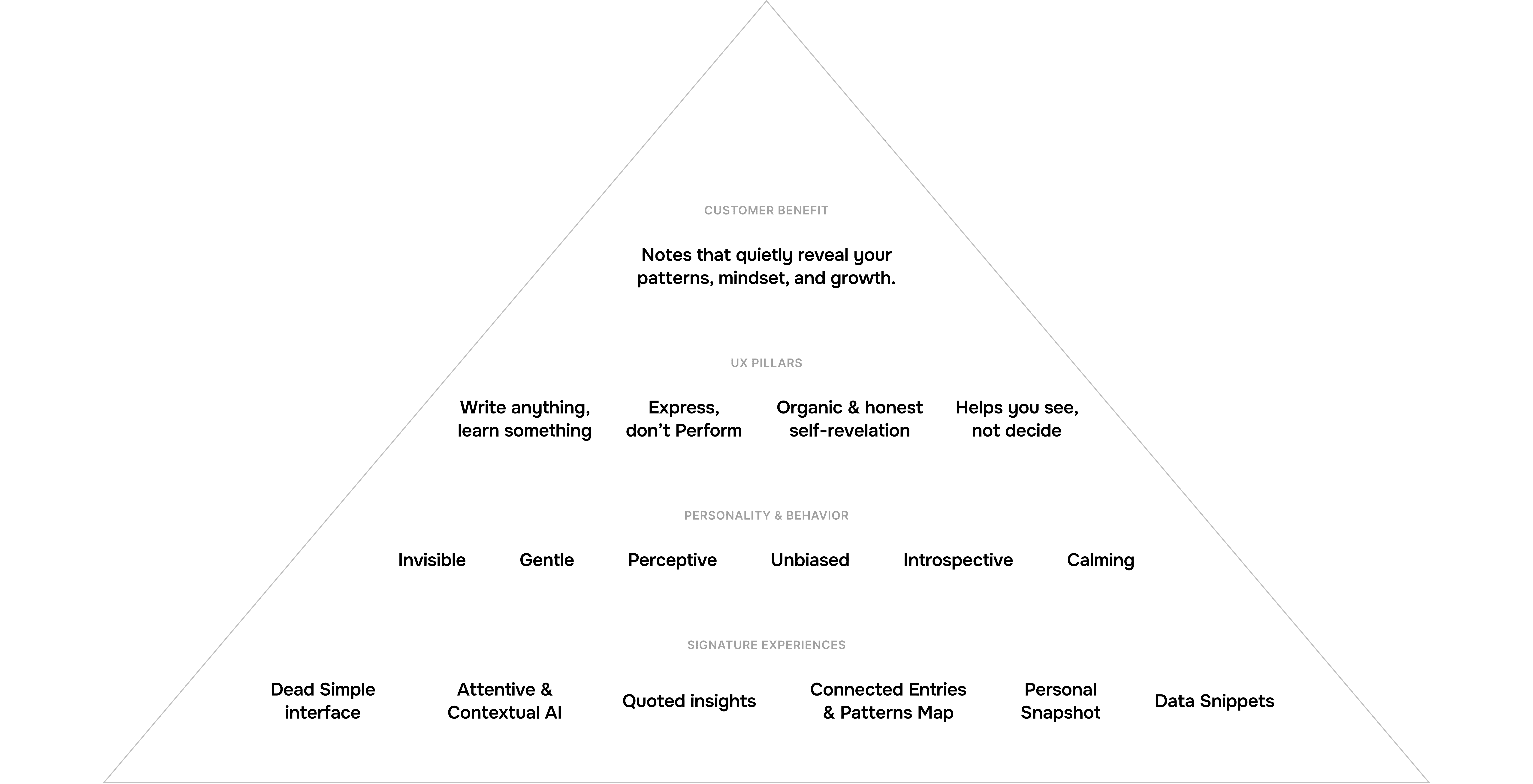
UX pyramid
A purposefully stripped-down, minimal interface
Personally, I found many existing journaling apps overwhelming, which is why I kept returning to my Notes app. To recreate that same quiet space you want to return to, we designed a dead simple entry interface.
For the insights and themes, we knew we wanted to capture the feeling — so soft shapes, subtle blurs, and generous white space to keep the mind clear and calm.
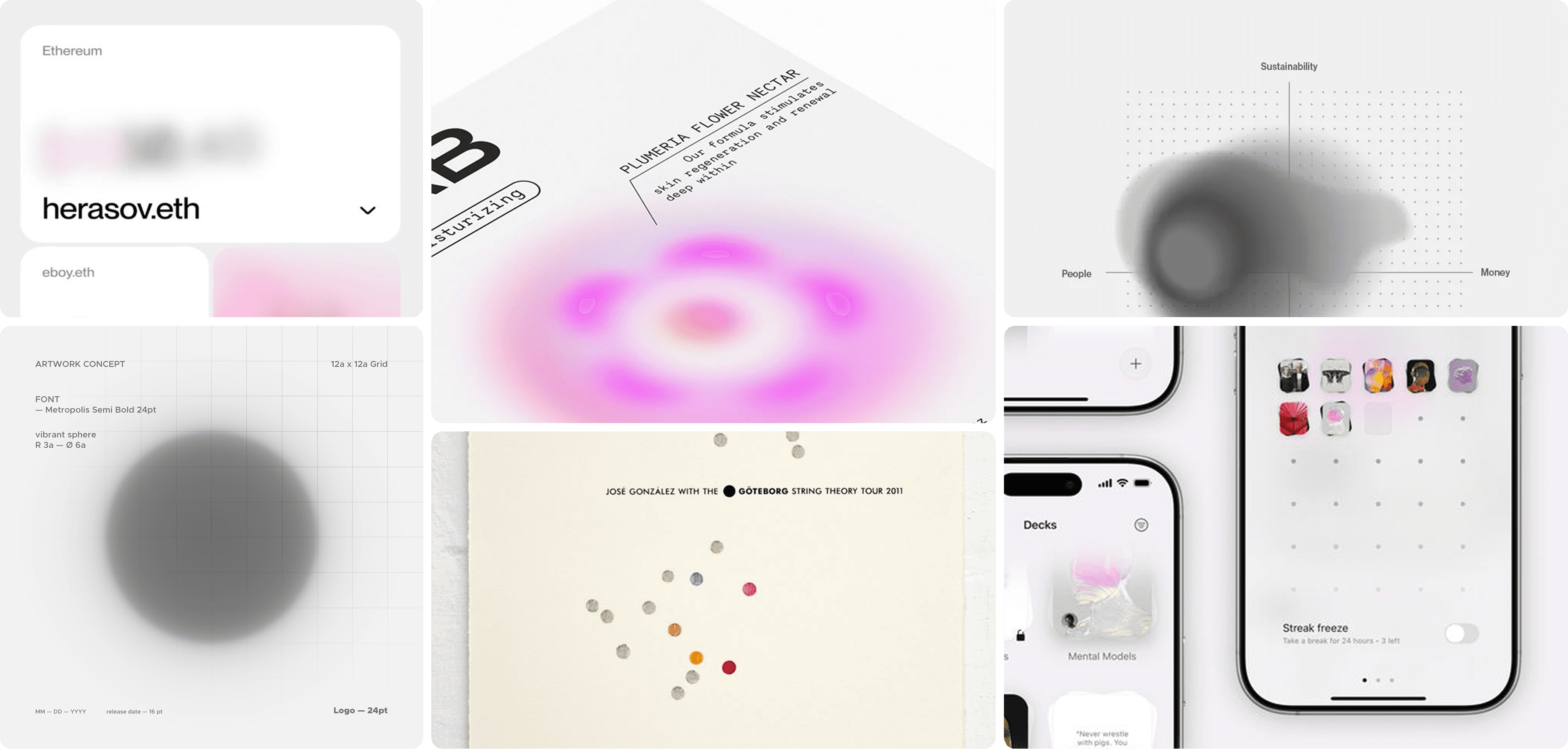
Moodboard
Mirroring inner reflection with spatial navigation
To hide clutter and keep users fully immersed on each layer, we decided to have a spatial zoom interaction to change tabs. This way, each layer feels like a “depth of self”: from the surface-level personality to the raw inner monologue:
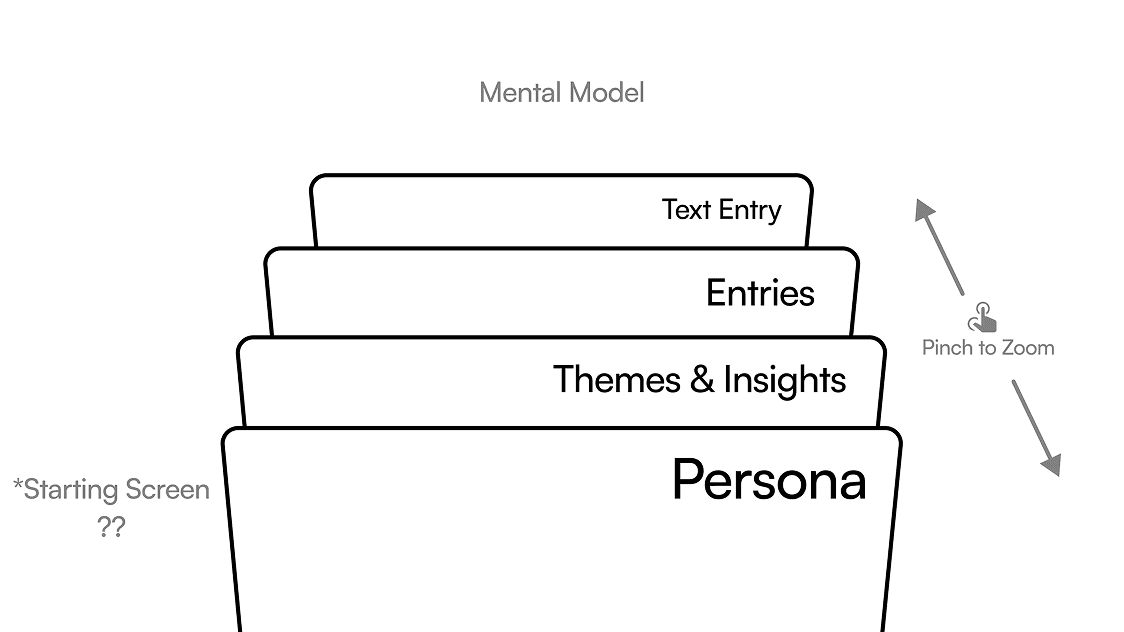
Mental Model
Navigation Layers
Next Steps
What I'd do next
Improve interactions and feature design
Juggling three other projects limited the time I wish I had to refine the interactions and the UI. Areas like the searchability of entries + timeline events interaction still need more care. If I revisit this project I’d definitely polish the experience by thinking on a larger scale (e.g. more notes, more themes, etc.) to improve usability — or even make transformative changes to cater to a more general audience.
Add an Import Notes Feature
Many people already have years of notes in other apps, giving them a wealth of material to generate insights from. To allow users to leverage their existing notes and adopt Noto more easily, I’d build import tools that seamlessly integrate previous entries into the new system.
Develop it (in the works)
This is a tool I’d love to use myself. With vibe-coding lowering the barrier from design to build, David and I hope to make it a reality one day.
Looking back
What I learned from Noto.
I'm grateful to have ended with a deeply personal project, & it couldn't have been done without my amazing co-designer and the 2025 IxD cohort :-)
WHAT I LEARNED
Bringing a product mindset
While this was just a school project, I approached it like a product I’d pitch. Understanding the market and defining the mission gave me a taste of designing with stakes, and how that framing sharpens clarity and impact.
Designing for people, not just function
I believe at the core, people crave tools that feel made for them, not just function, but experiences that are intuitive and personal. This project reminded me that designing for humans starts with honoring that simple, human need.
Using the free will to just create stuff
Much of this project felt like I was designing for myself, and in that freedom, I discovered how liberating it is to simply make. In many ways, this project became a reminder that the best work often comes when you give yourself permission to create without constraints — a fitting way to close out my time in school.