
Back
Overview

LOOSELY
Your Concert. Your Friends.
Your Timeline.
Making concert planning with friends easy and all in one place.

WATCH TEASER VIDEO

OVERVIEW
Creating a multi-touchpoint service for concertgoers.
Loosely was a quarter-long project aimed at creating a digital service that has multiple touch points and use case scenarios. My team solved for a more collaborative, fun, and intuitive way for planning and experiencing concerts, while applying design thinking fundamentals — such as storyboarding, scenario writing, and client presentations.
Role
Product Designer
UI Designer
User Research
Team
Alice Dibbo
Prestin Artis
Luna Osaki
Xenia Capcan
Elisha Jeon
Timeline
Apr–June 2024
11 weeks
Instructor
Thomas Ham
Tools
Figma
FINAL DESIGN
A Concert App That Makes It Easier to Plan and Enjoy Plans w/ Friends.
Concert planning no longer has to feel like a chore. Loosely turns the hassle into excitement, giving you the tools to plan and enjoy your day seamlessly!
With collaborative itinerary planning, real-time navigation, and a special highlight reel to remember your experience, it transforms every step of your concert journey into a stress-free & memorable experience.
DESKTOP TOUCHPOINT
Collaborate, Share, Plan.
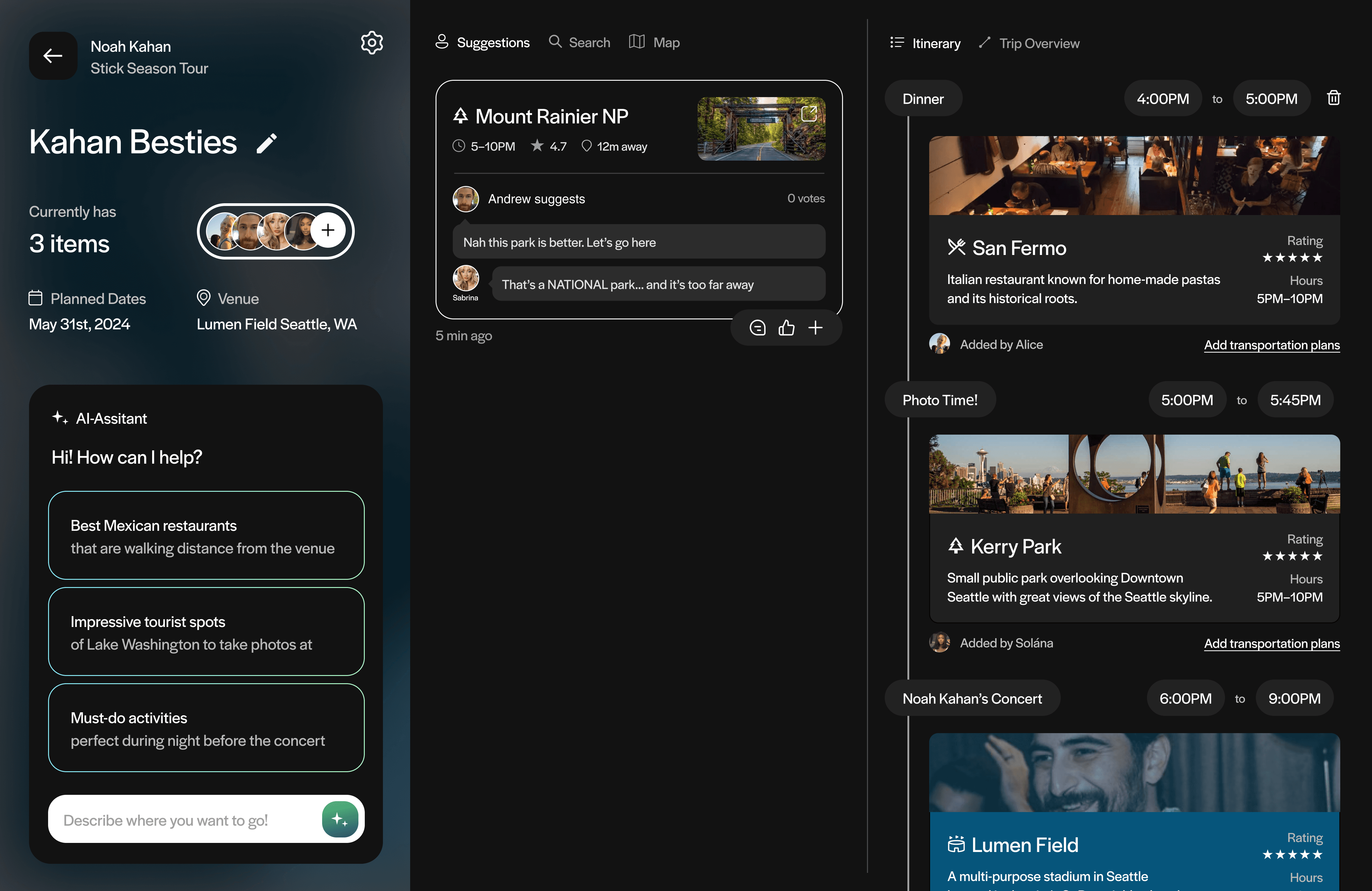
On the desktop touchpoint, with your concert group, build your itinerary by easily discovering places, discussing and voting which ones to go to, and organizing your timeline around the show-time and venue.


AI-generated search matches
1/4
Get quick suggestions using the AI assistant to narrow your search by asking prompts like, "Give me photo-worthy Italian restaurants near the venue".
Make suggestions to your group
2/4
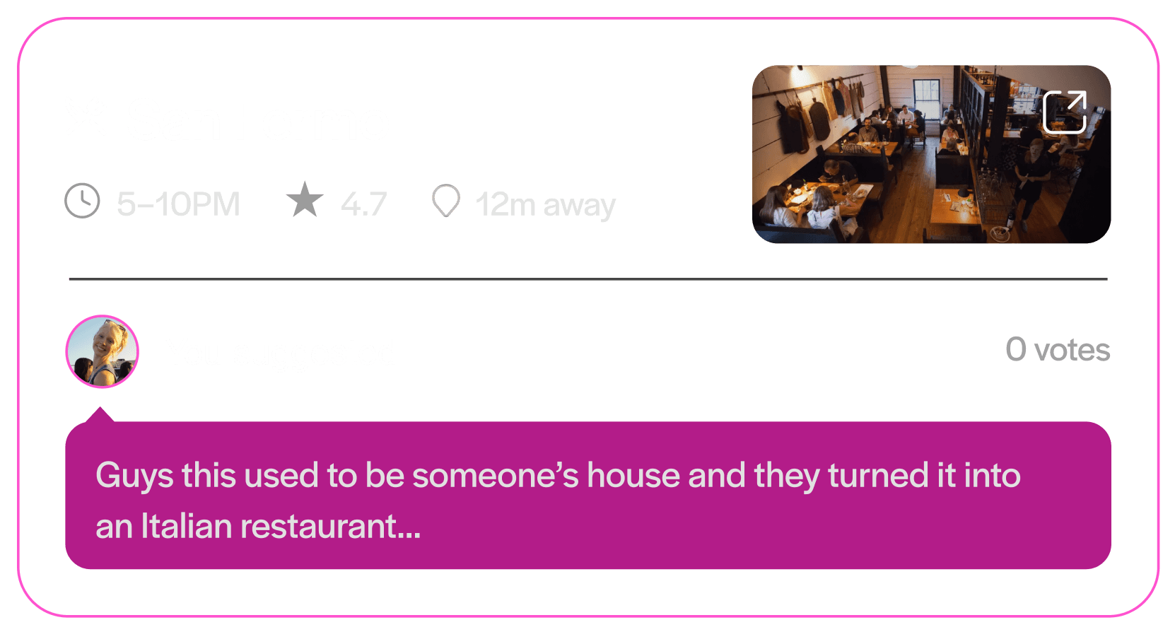
Get an overview of each location's descriptions and ratings, and once you find one you like, share them to your friends by suggesting it. Even add a reason for why you want to go.
Vote and add places to your itinerary
3/4
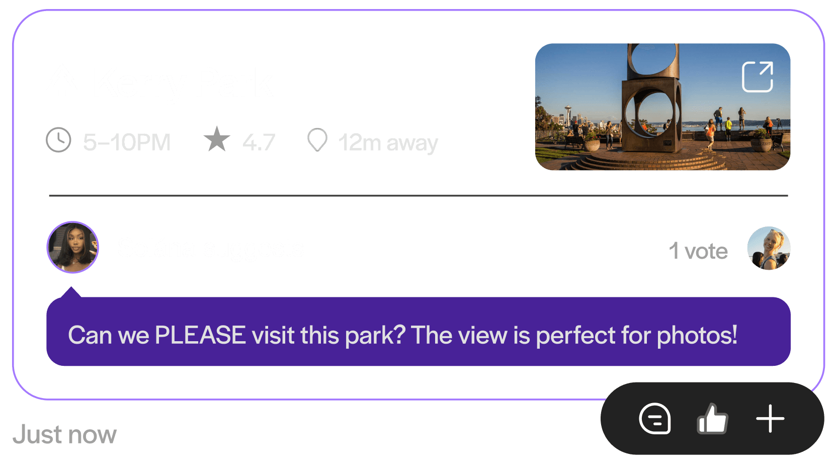
Give likes and comments on each suggestion to figure out where the group should have dinner, take photos, and other concert-day activities.
Edit your itinerary timeline
4/4
Rearrange the order, adjust the times, and label each event for what's suitable for your group to finalize your itinerary.
WATCH TOUCHPOINT
Roll out your itinerary and concert day.
Never track behind or miss your concert-day plans by moving through the itinerary with synchronized time-based updates.
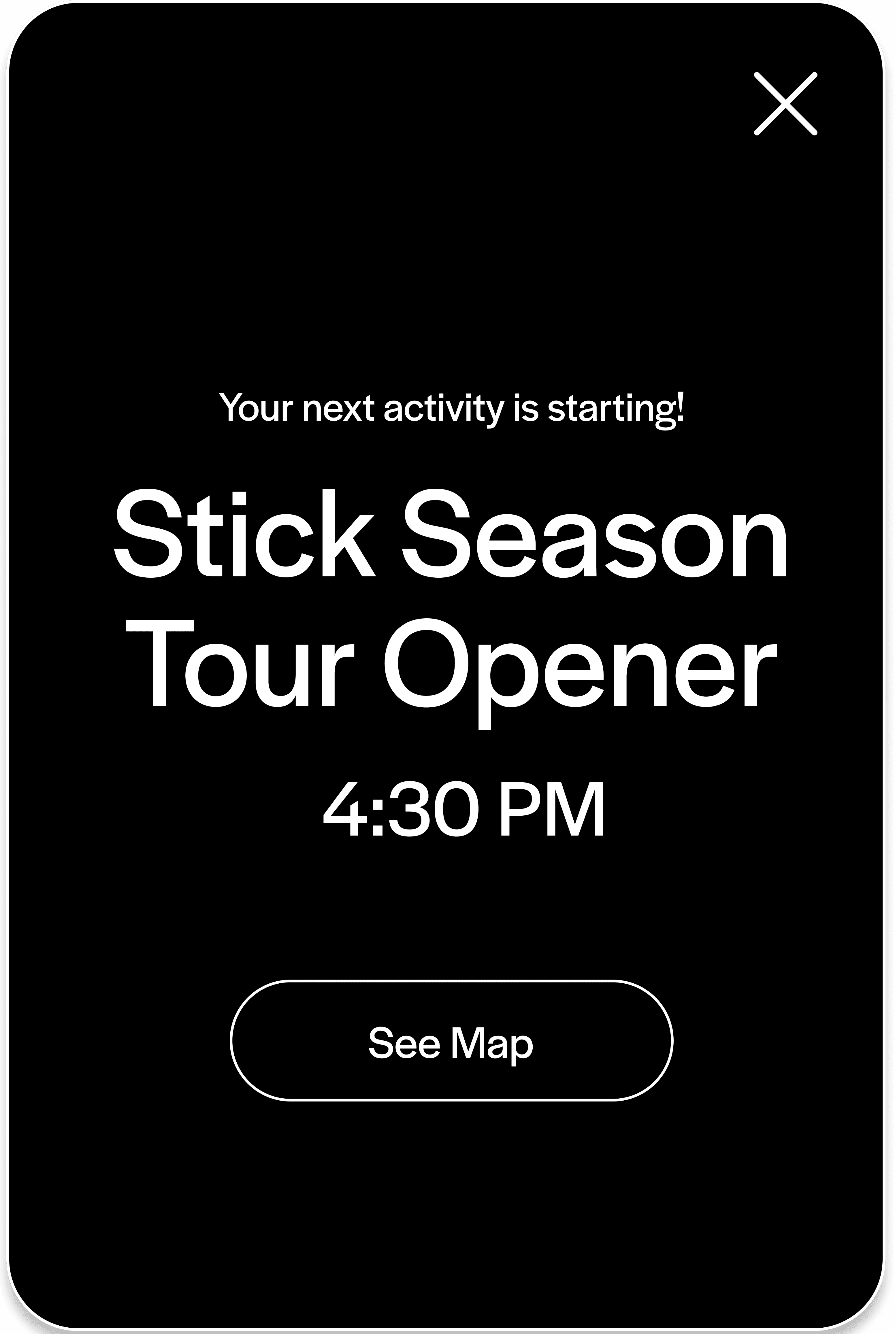

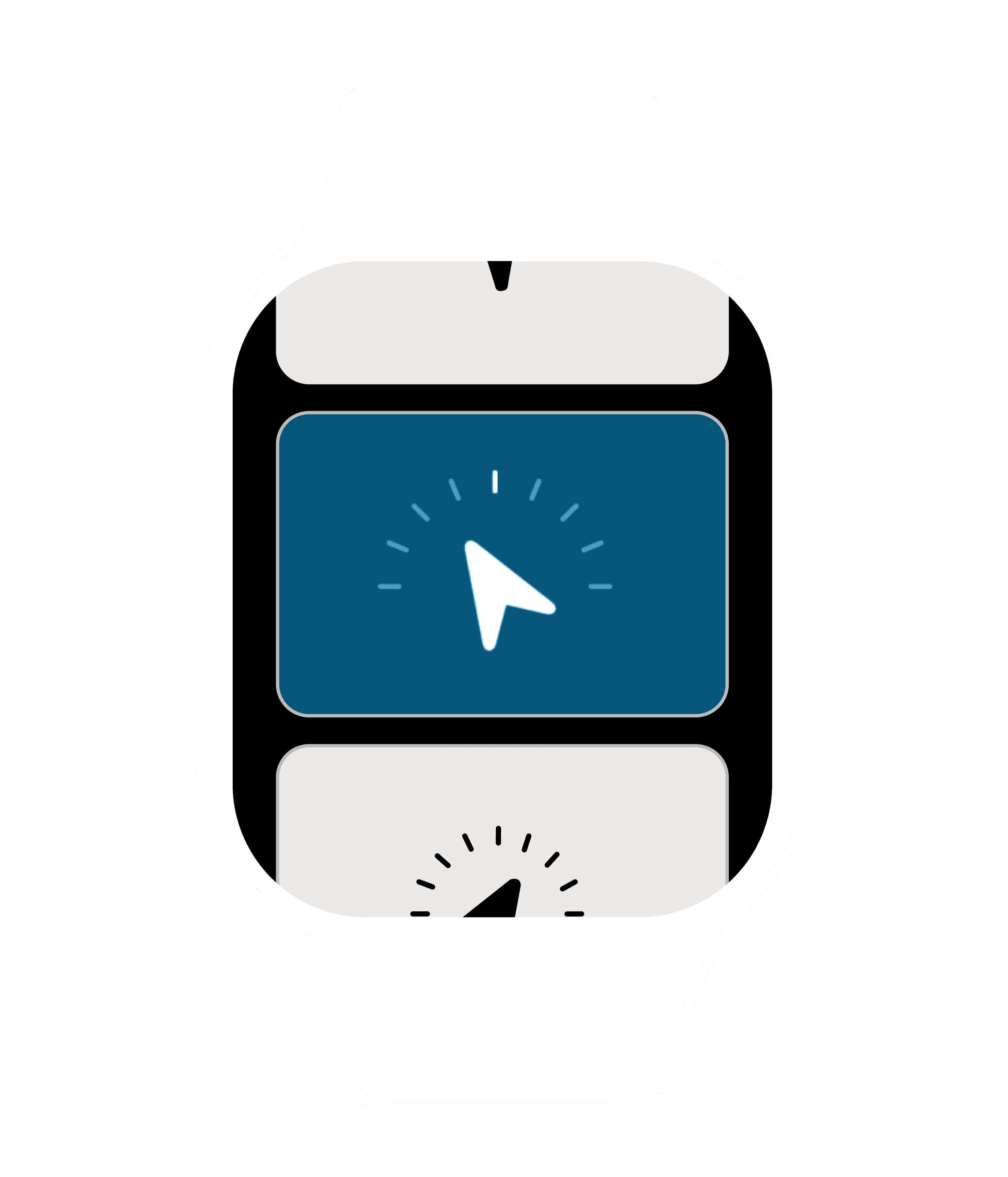
Know what's next and where to go
1/2
When the time reaches a new event time slot, the group will get a notification and can navigate to the place with the map.
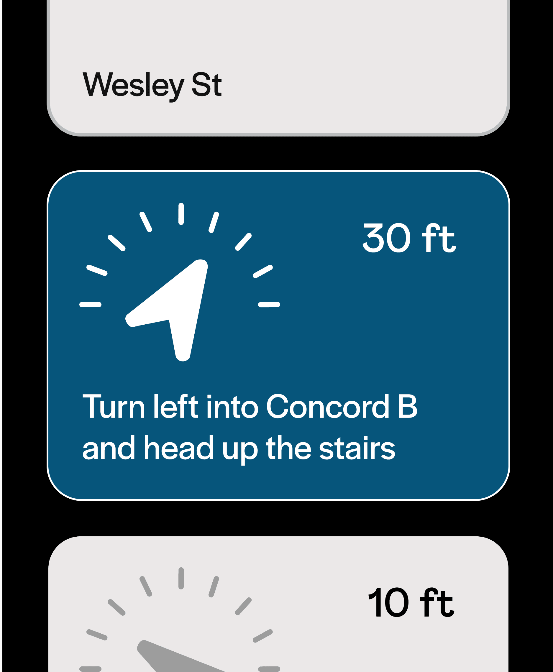
Seat navigation
2/2
With a paired watch, you can get to your next location or even your venue seats at the concert with real-time directions based on your current location.
MOBILE TOUCHPOINT
Wrap up with a memory reel of your concert experience!
The fun doesn’t end after the show, use your memories from the day in return for a special highlight reel, giving you an exclusive look into yours and your artist’s concert experience.



Store memories into your itinerary
1/4
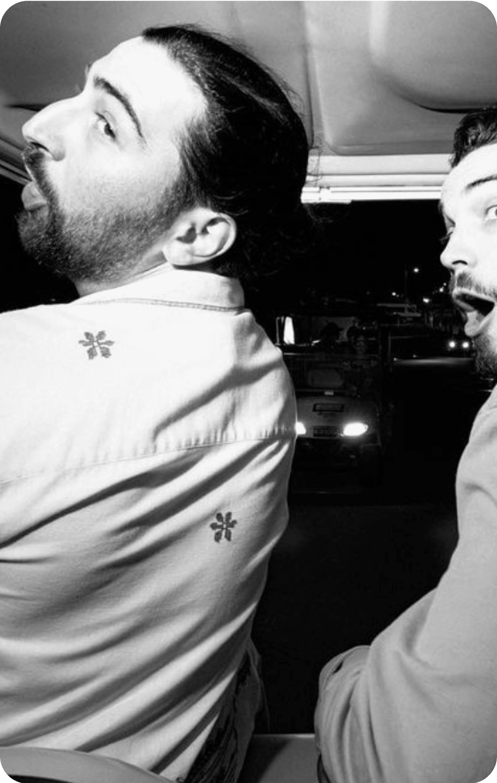
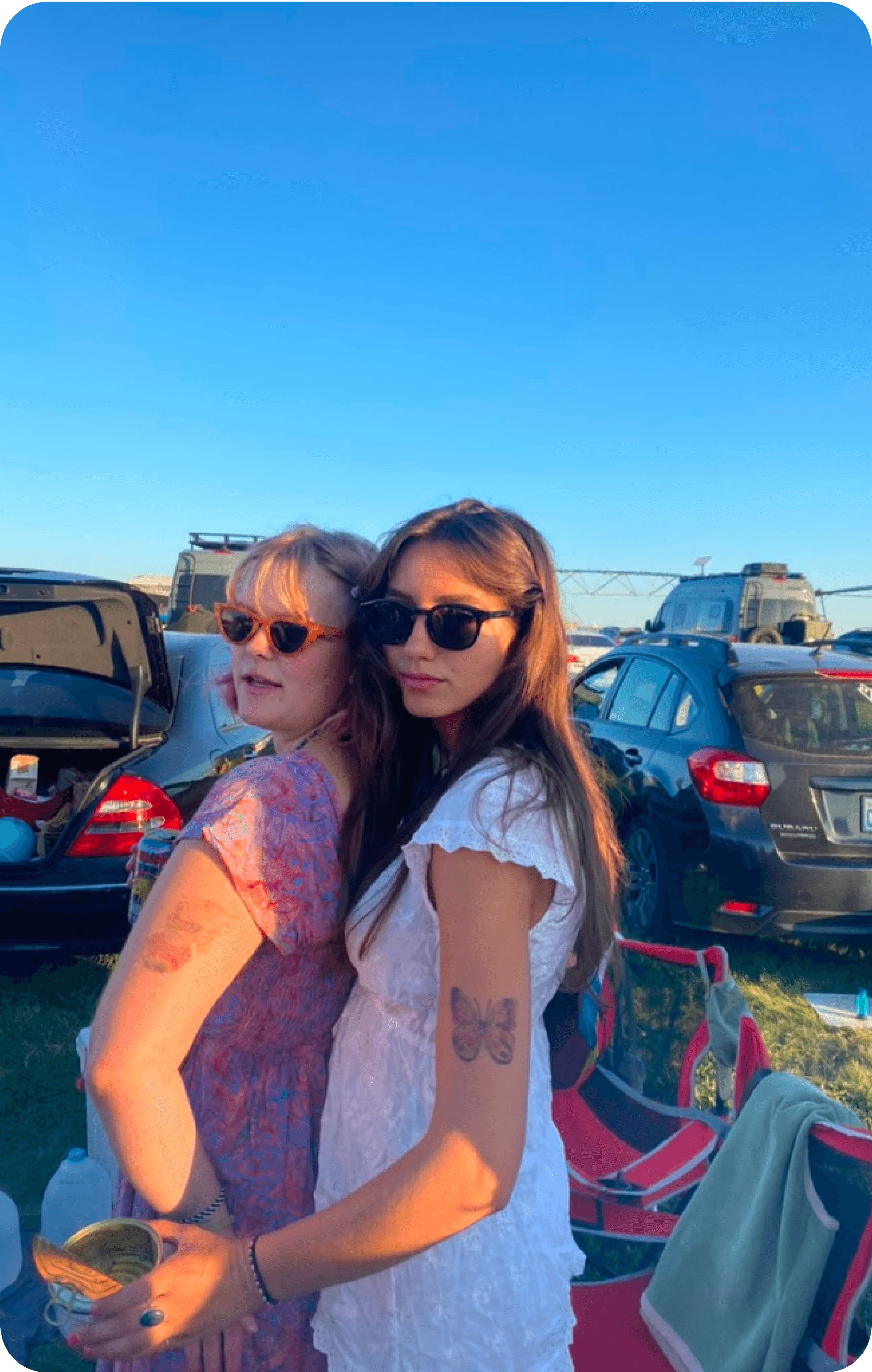
Add pictures to your itinerary to capture memories from the concert and provide content for your personalized highlight reel.
Get an exclusive message from the artist
2/4
After the concert ends, the highlight reel will be ready to watch on the way back home. The video begins with an exclusive message from the artist.
Your concert experience + the artist's
3/4
Look back on your memories you've made with friends on concert day and what your artist was doing on the same time, which includes backstage content for you to enjoy.
Save and share your reel!
4/4
Now that your concert day is over and you've received a special concert reel as a token of your experience, store it in your gallery and share it with others!
Loosely is a three touchpoint app!
Hover over each one to know why:
MOBILE
1
DESKTOP
2

WATCH
3
CONTEXT
Unearthing the Complexity of Concert Planning
As a group, we searched a topic for our digital service that we were excited or passionate about to explore for the entire quarter. We looked at various different industries and brainstormed different challenges within them in a quick ideation session:
As we were brainstorming, one team member shared her difficulties with preparing for an upcoming concert. Learning the songs, choosing what to wear, coordinating with friends were only a few tasks she had to do before the big day.
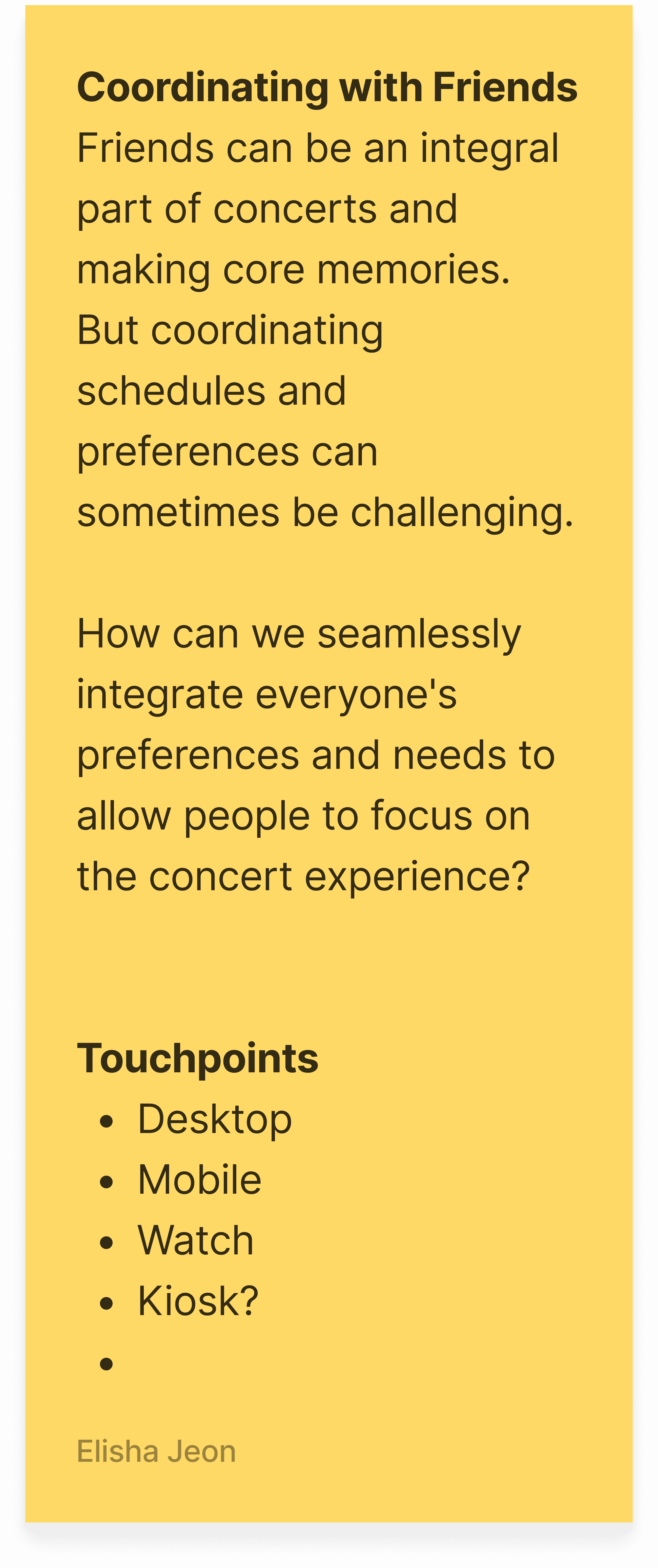
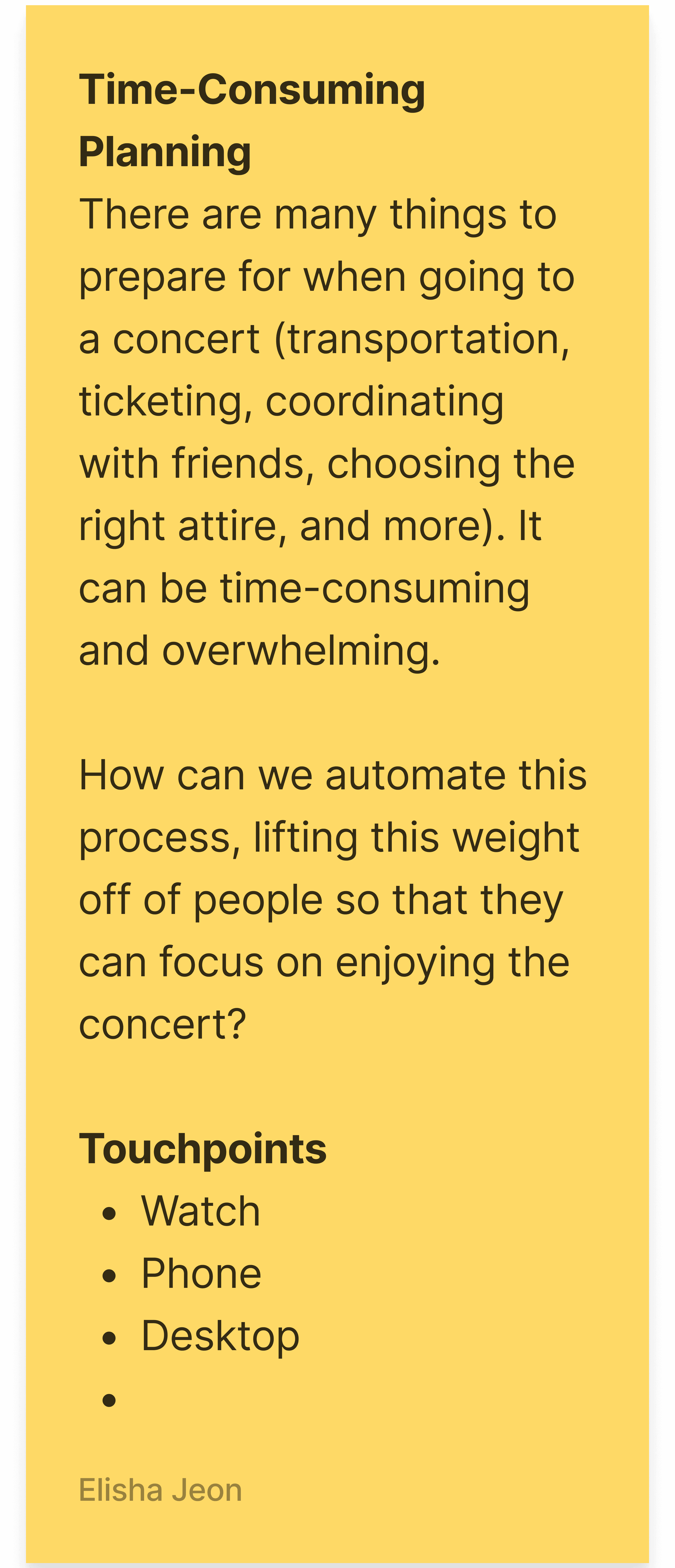
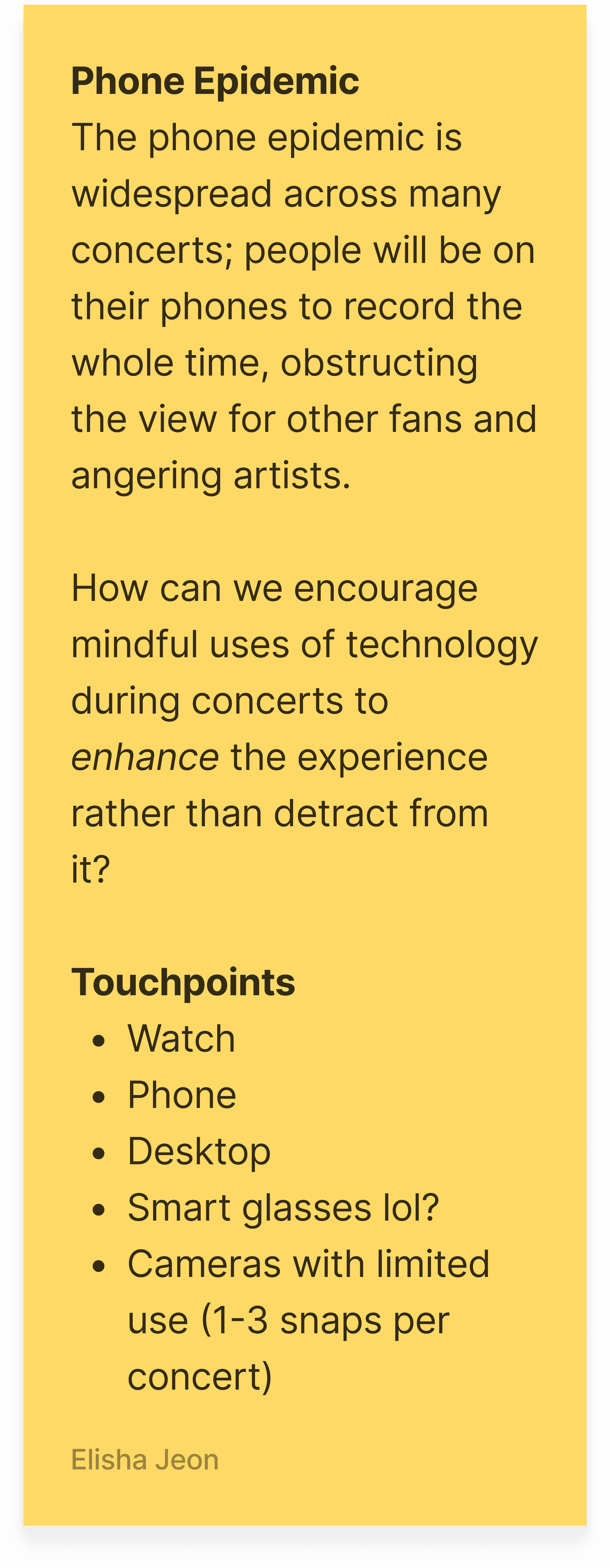
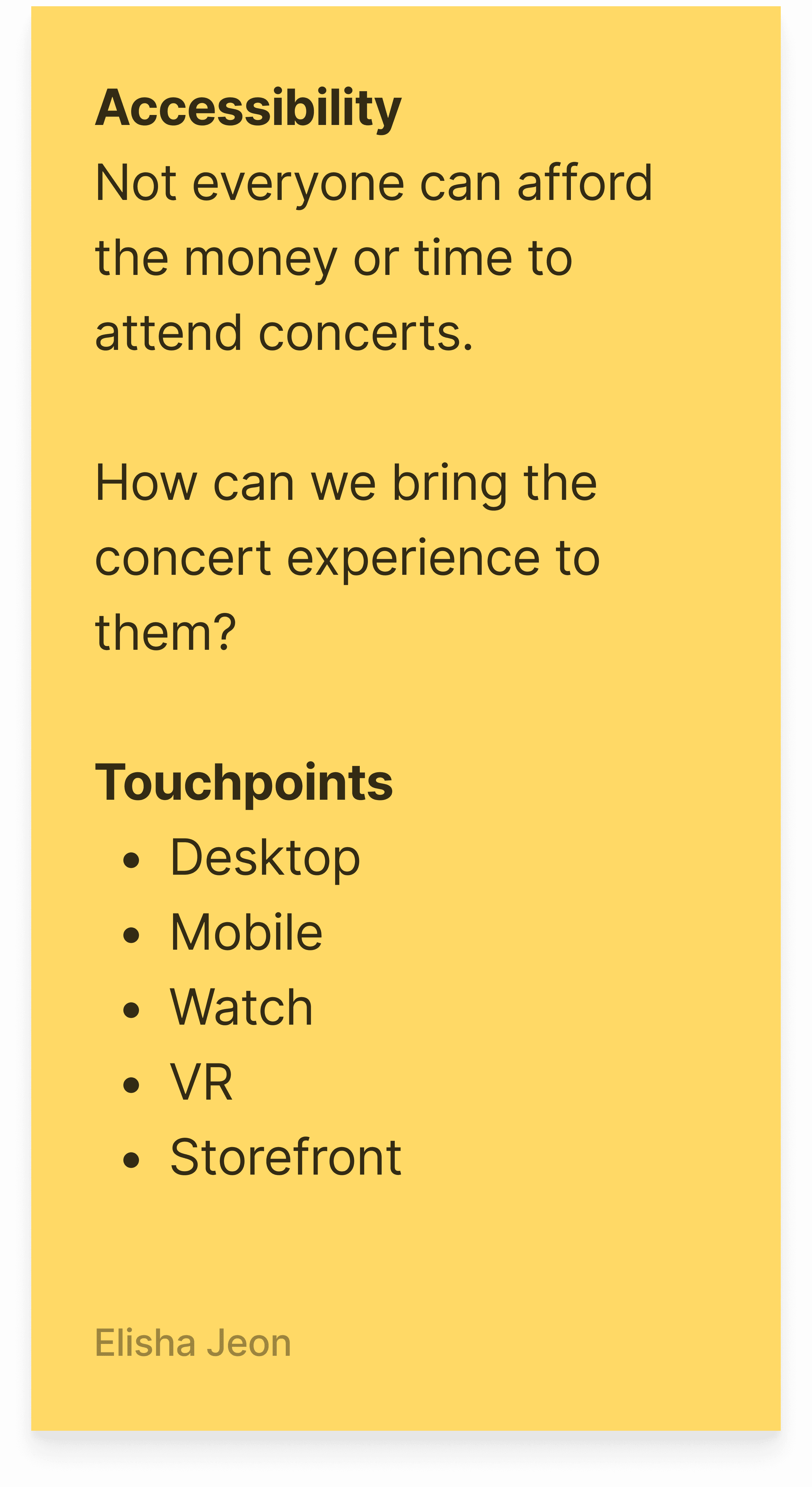
Intrigued by the unexpected complexity behind what seemed like a simple concert experience, we explored this topic further by writing down problems within the concert world. We ultimately moved forward with the selected problem below as it was expansive enough for a multi-touch solution and could encompass the other related problems.
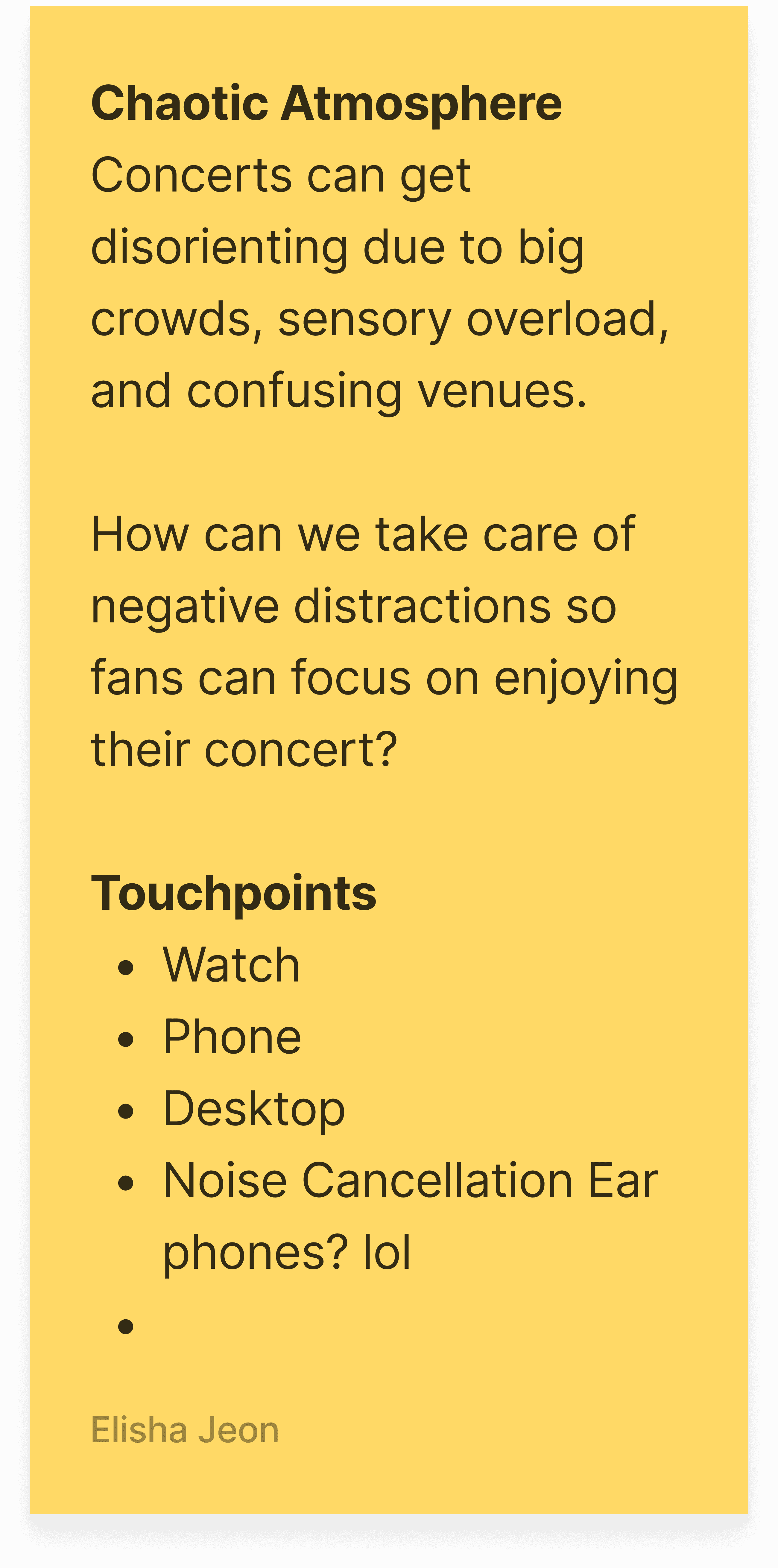
SELECTED PROBLEM
THE CHALLENGE
The Concert Planning Dilemma
While concerts are fun to be at, planning and coordinating can be overwhelming, confusing, and time-consuming, and instead of focusing on the thrill of the concert and enjoying the day with friends, the planning becomes a series of logistical hurdles. This creates a situation where the excitement is overshadowed by the anxiety of managing the details.
Problem Statement
How can we bring excitement and clarity into every aspect of the concert, from preparation, experiencing, to reflecting on your experience?
High-Level Goals

Bring all vital concert information into one place to minimize stress and confusion.

Break down the different steps of concert planning into more digestible ones.

Make coordination between friends simpler and collaborative.
COMPETITIVE ANALYSIS
Too Many Steps, Too Many Apps
Direct Competitors
We found that our competitors only cover one portion of the whole concert experience — like getting tickets or getting information about the concert. This means concertgoers have to piece together information from different places themselves, which disrupts the excitement of the experience and adds unnecessary stress.
Discovery
Searching
Logistics
Booking
Reviews
Planning
BandsInTown

Gigit

Ticketmaster

Vivid Seats
LiveNation

Inspirational Competitors
To get inspiration and reference for planning tools, we selected inspirational apps that featured properties we wanted to incorporate. We then identified five key observations to guide our design and the features we would include to achieve the same result:





01
Interactive Observation
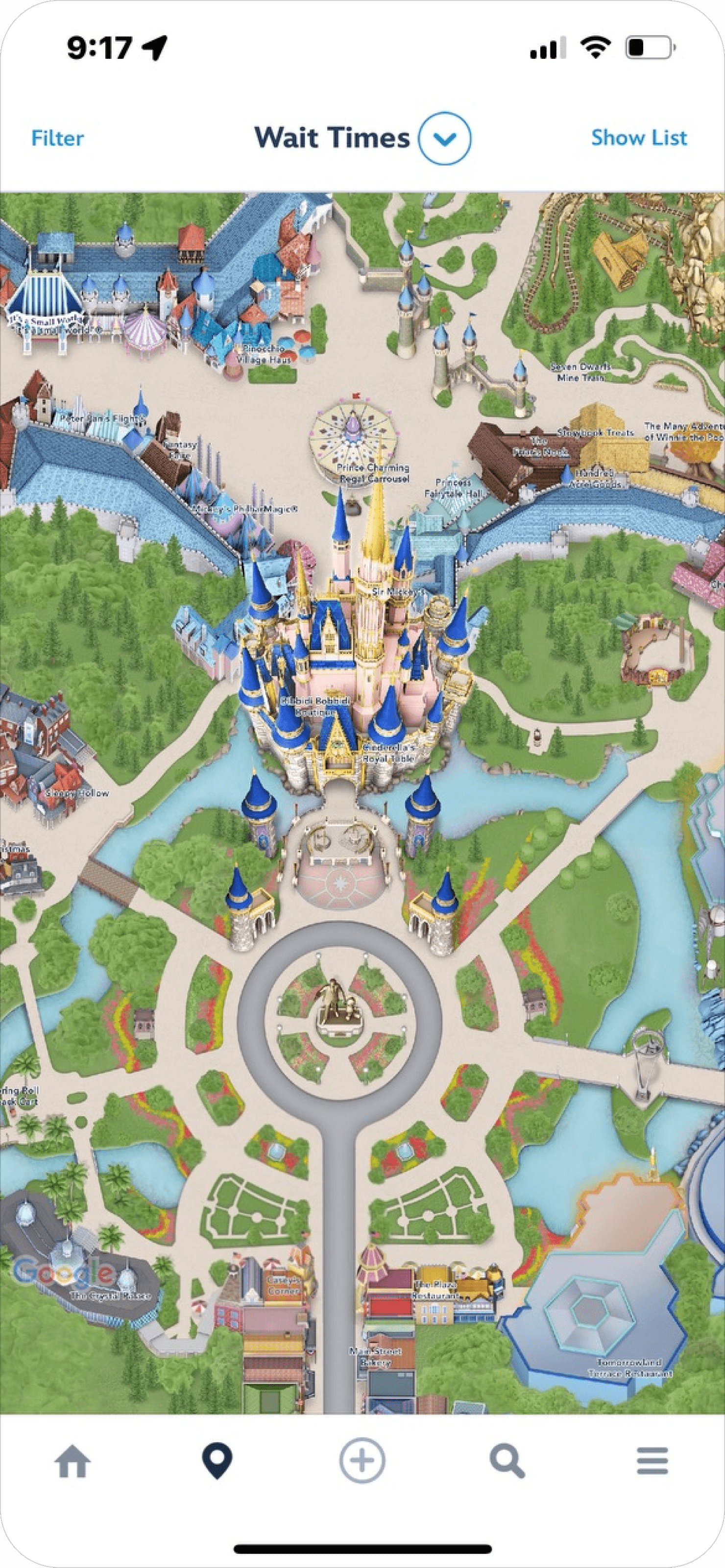
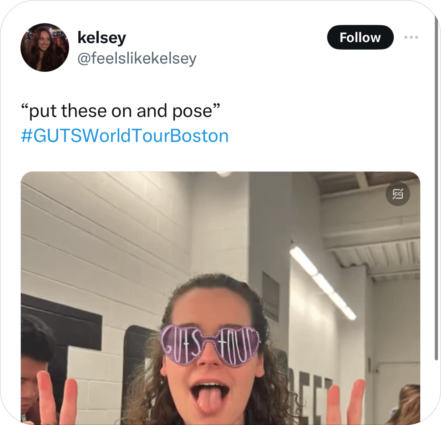

Providing a space for attendees to engage with the experience before they enter the venue whether it’s a direct interaction with experience or connecting with others queue. This helps elevate the connection to the experience as well as ease the waiting time.


02
Pre-Made Schedules
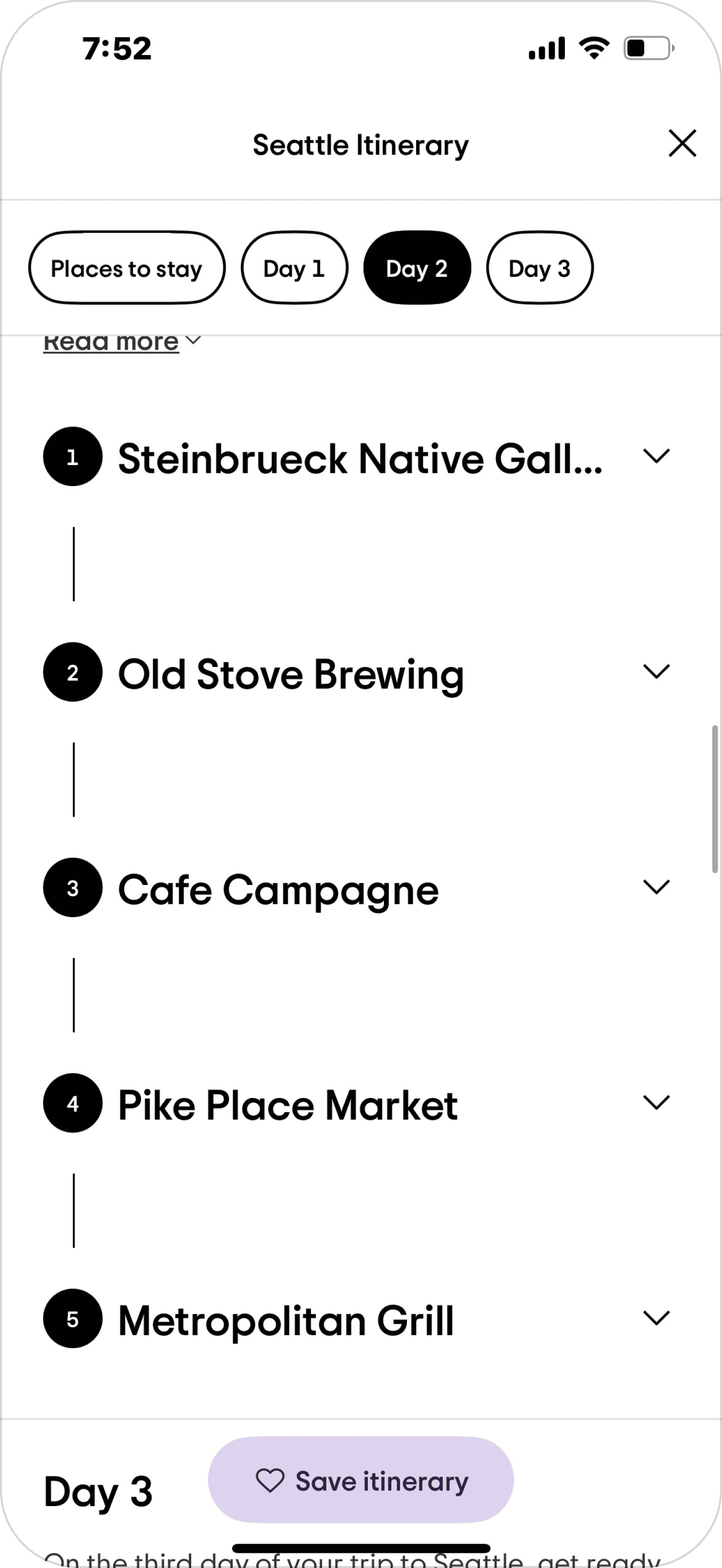
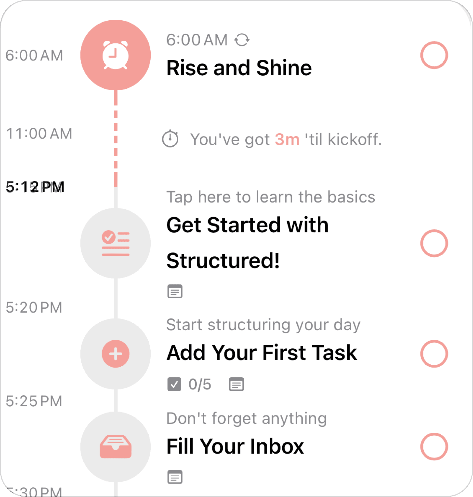
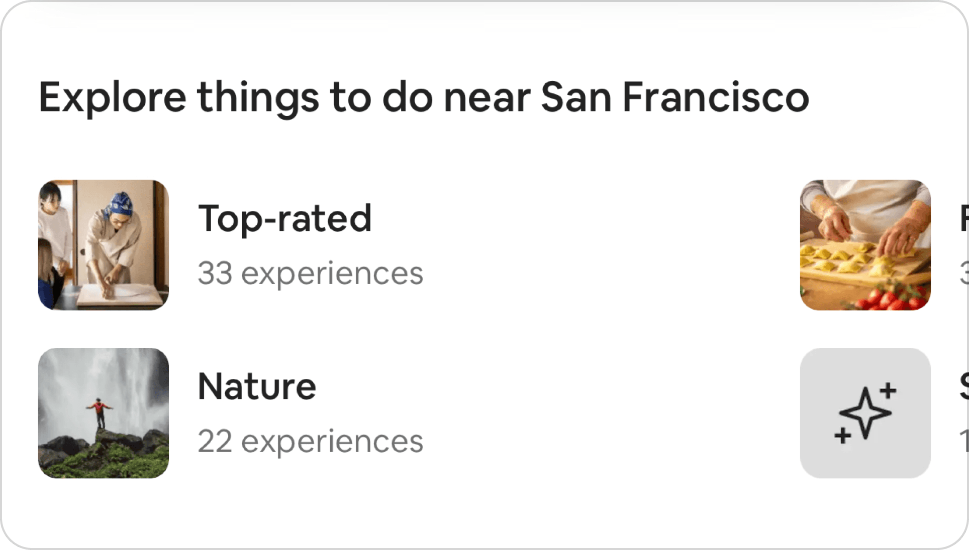
Auto-generated schedule skips the burden of planning the day. Getting suggestions based on previously known information allows to get personalizable and feel at ease.


03
Going an Extra Step
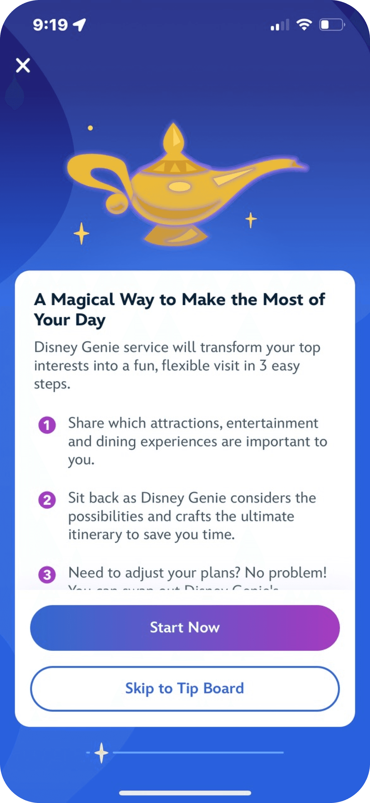
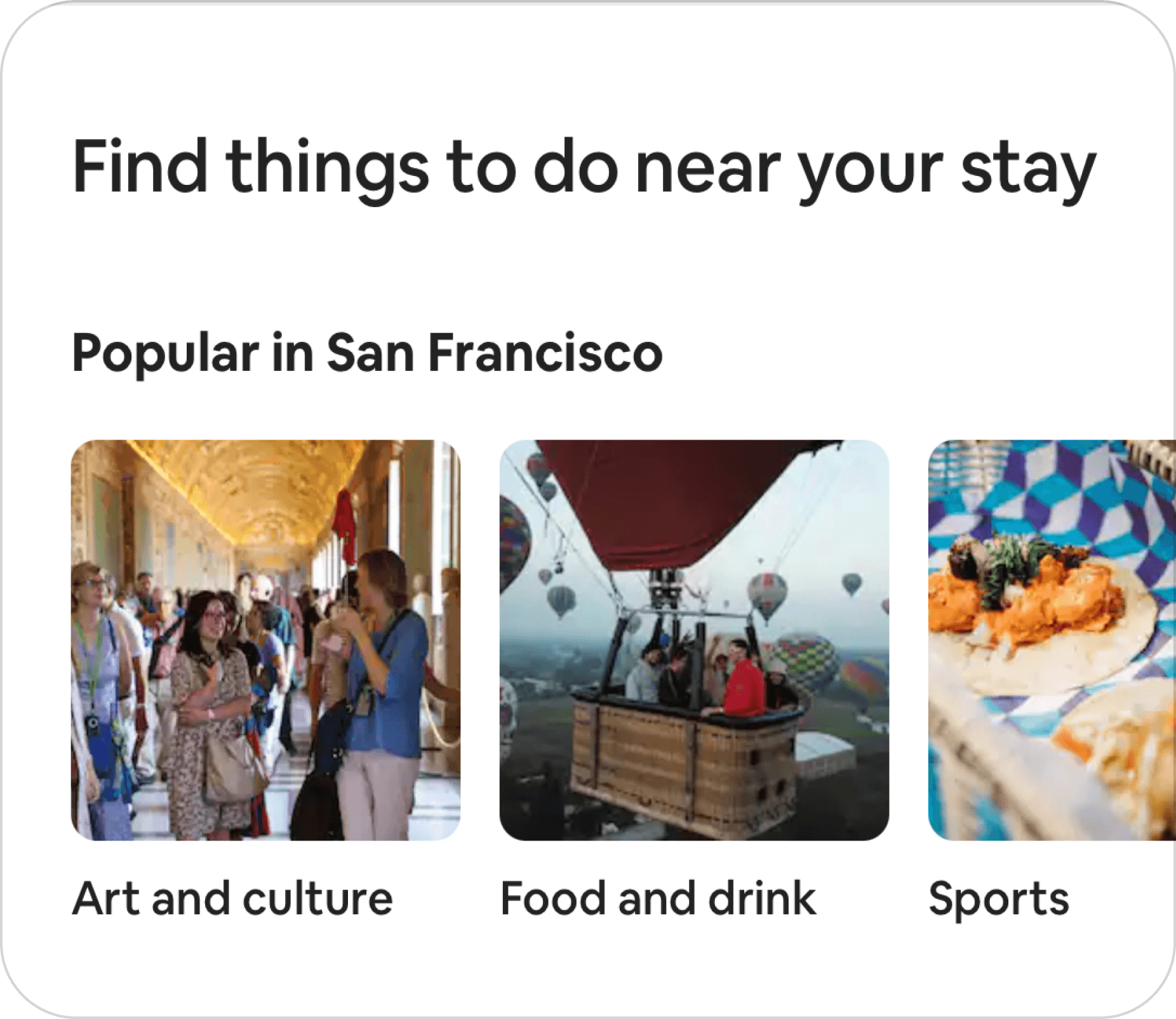
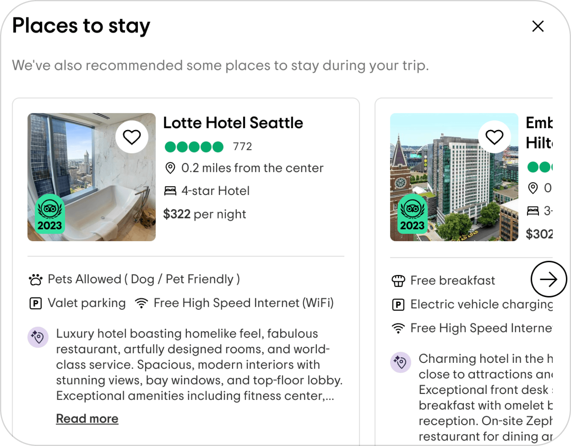
Prioritizing convenience for the user by going an extra step from what their original step was initiates further engagement with the platform and sense of thoughtfulness.


04
Elevating Trusted Community Experts
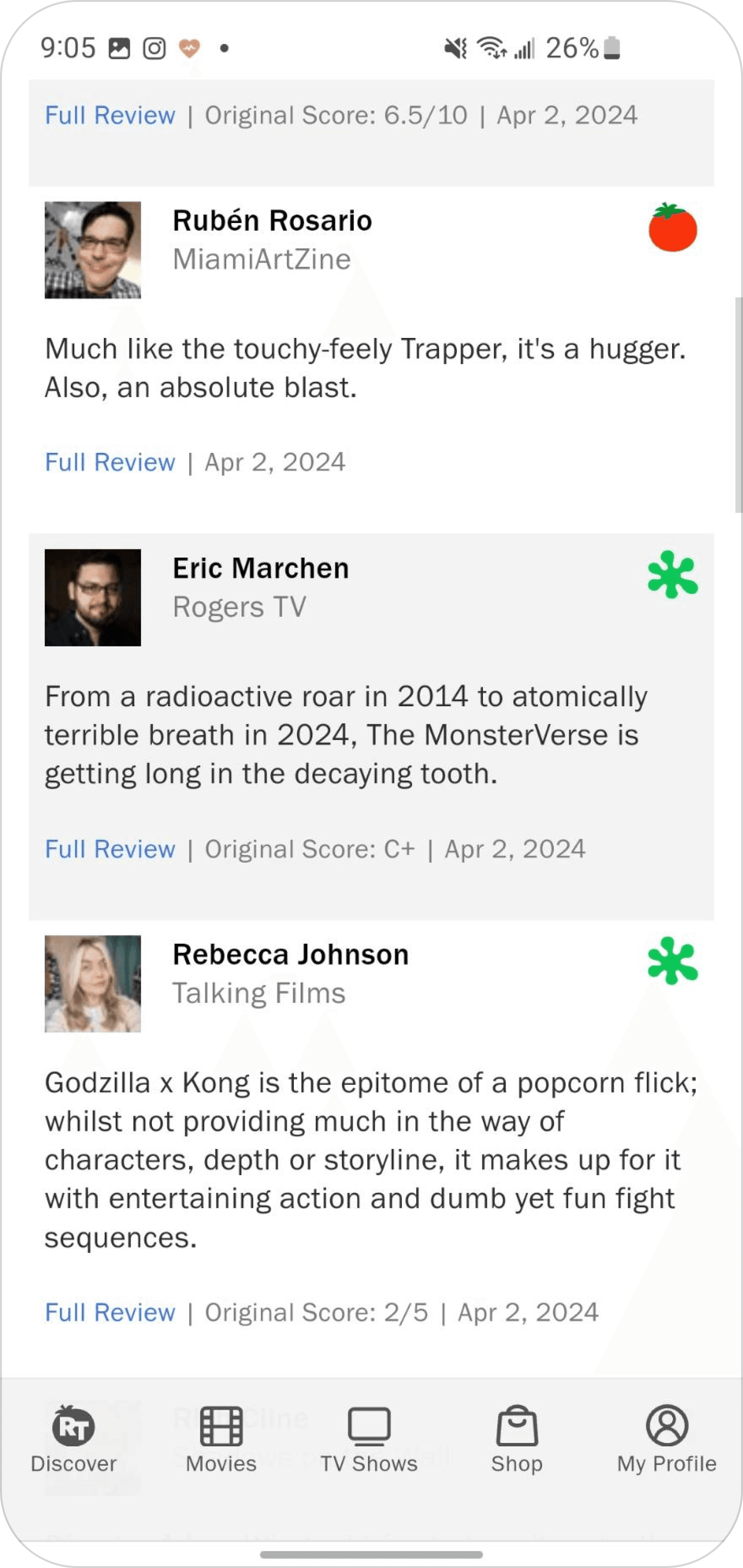
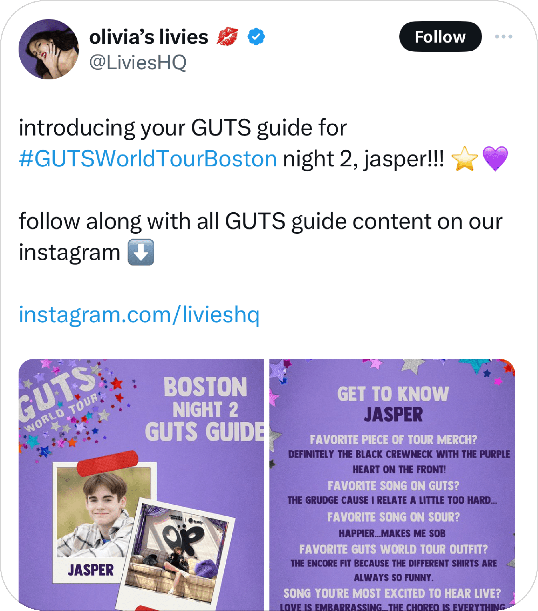
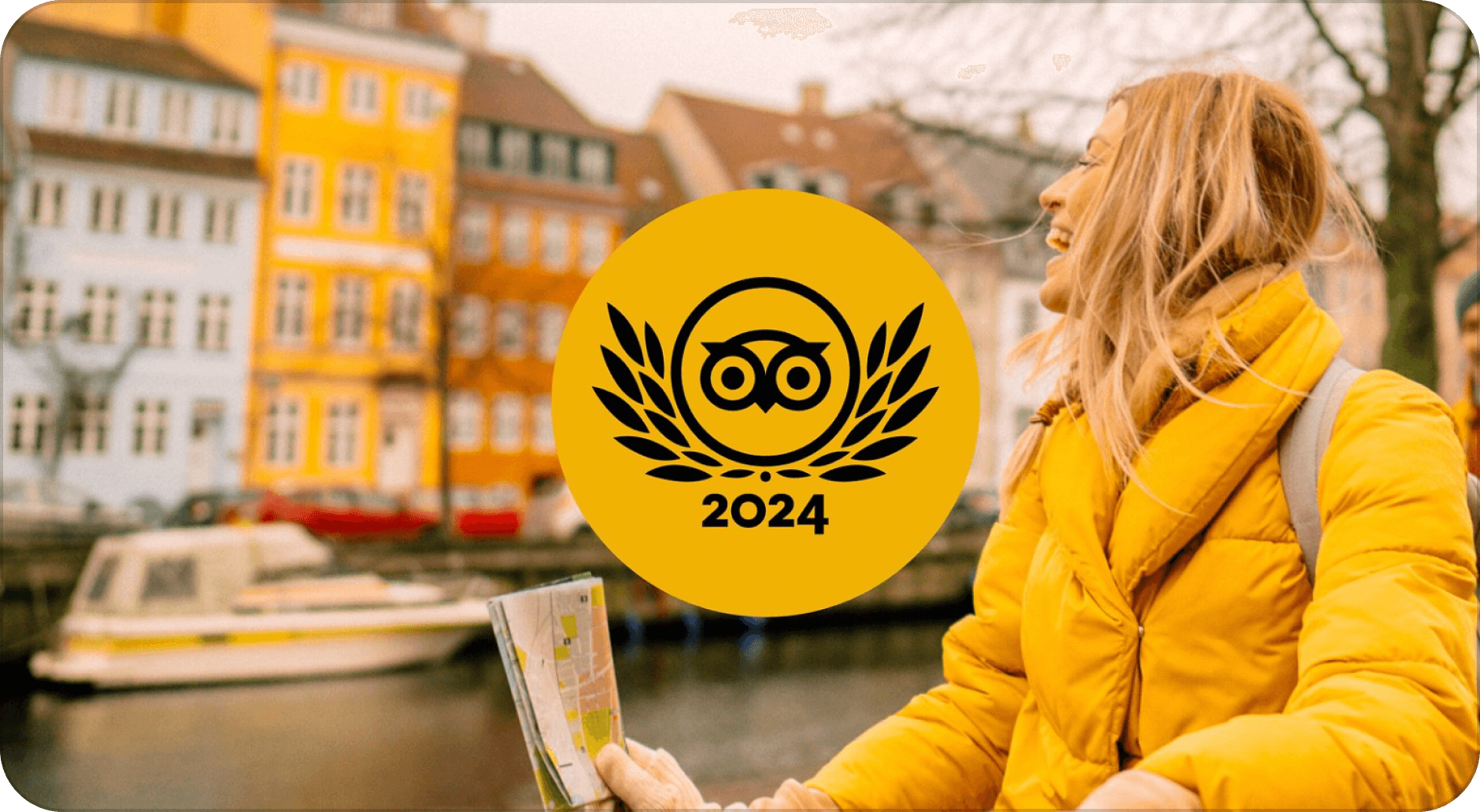
Curated top voices in the community allows for a more curated and authoritative experience for users seeking trusted perspectives.


05
Freedom to Explore
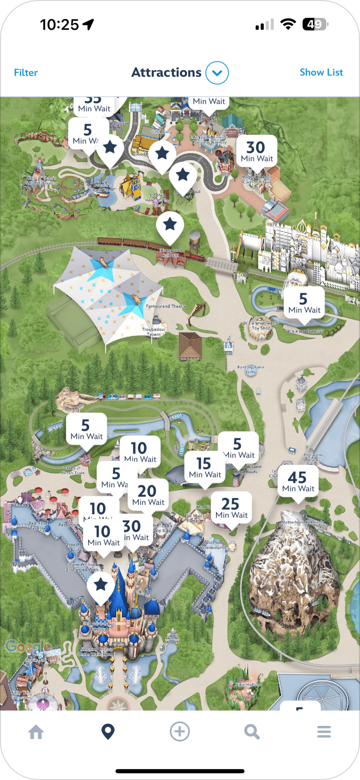
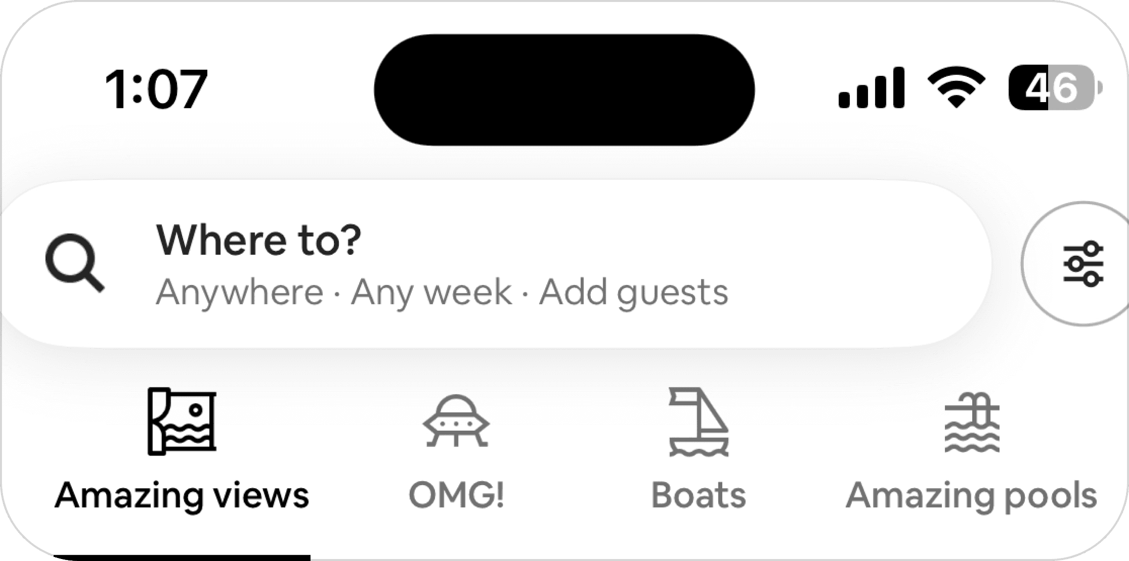
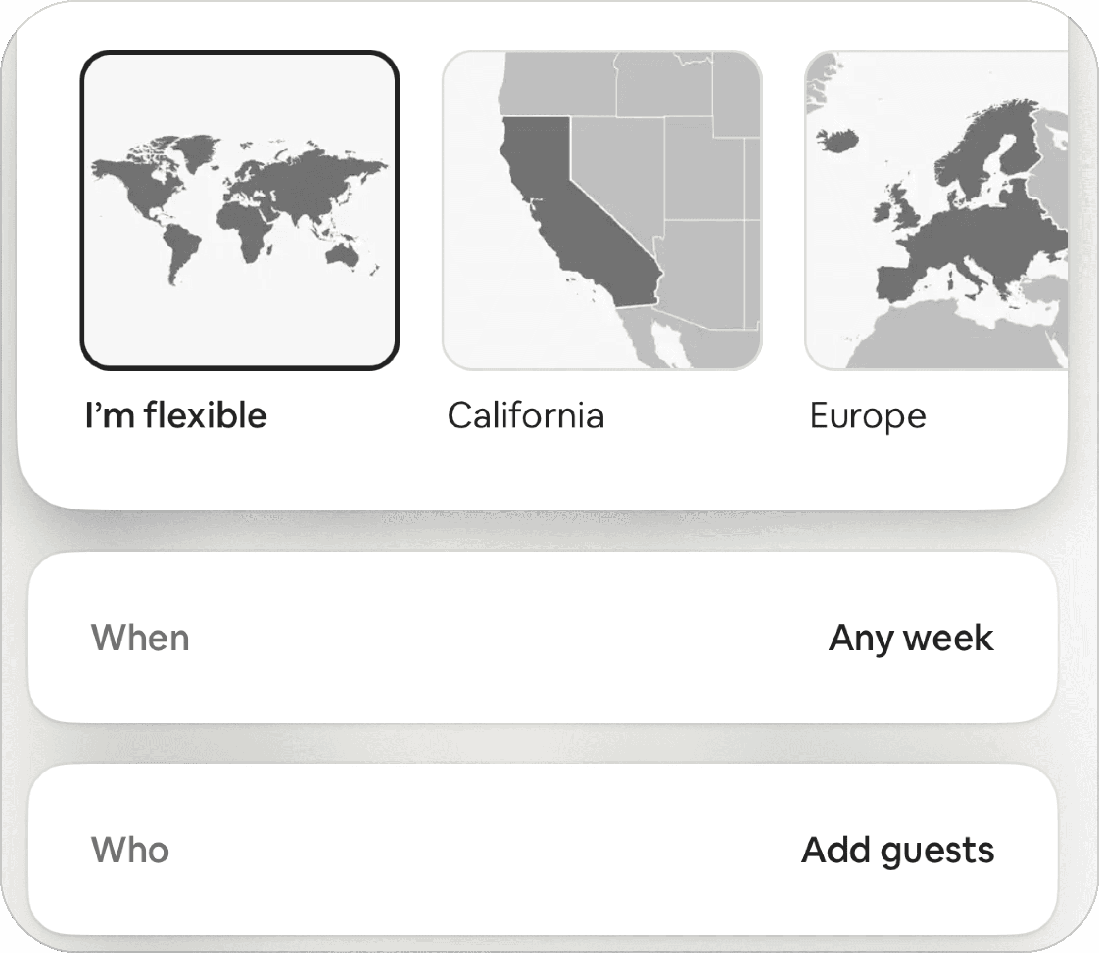
Not restricting user experience with a certain plan while still guiding and supporting can lead to unexpected pleasant discoveries.


Positioning Matrices
With a better understanding of the market of concert apps, we realized a more consolidated planning experience was needed. We aimed to target devoted concertgoers who enjoy planning out a whole day out of their concert experience.
Plan and Experience Together
Our service would cover both the planning and experience phases, enabling users to prepare in advance with their group and continue finding use of the platform on the day of the concert.
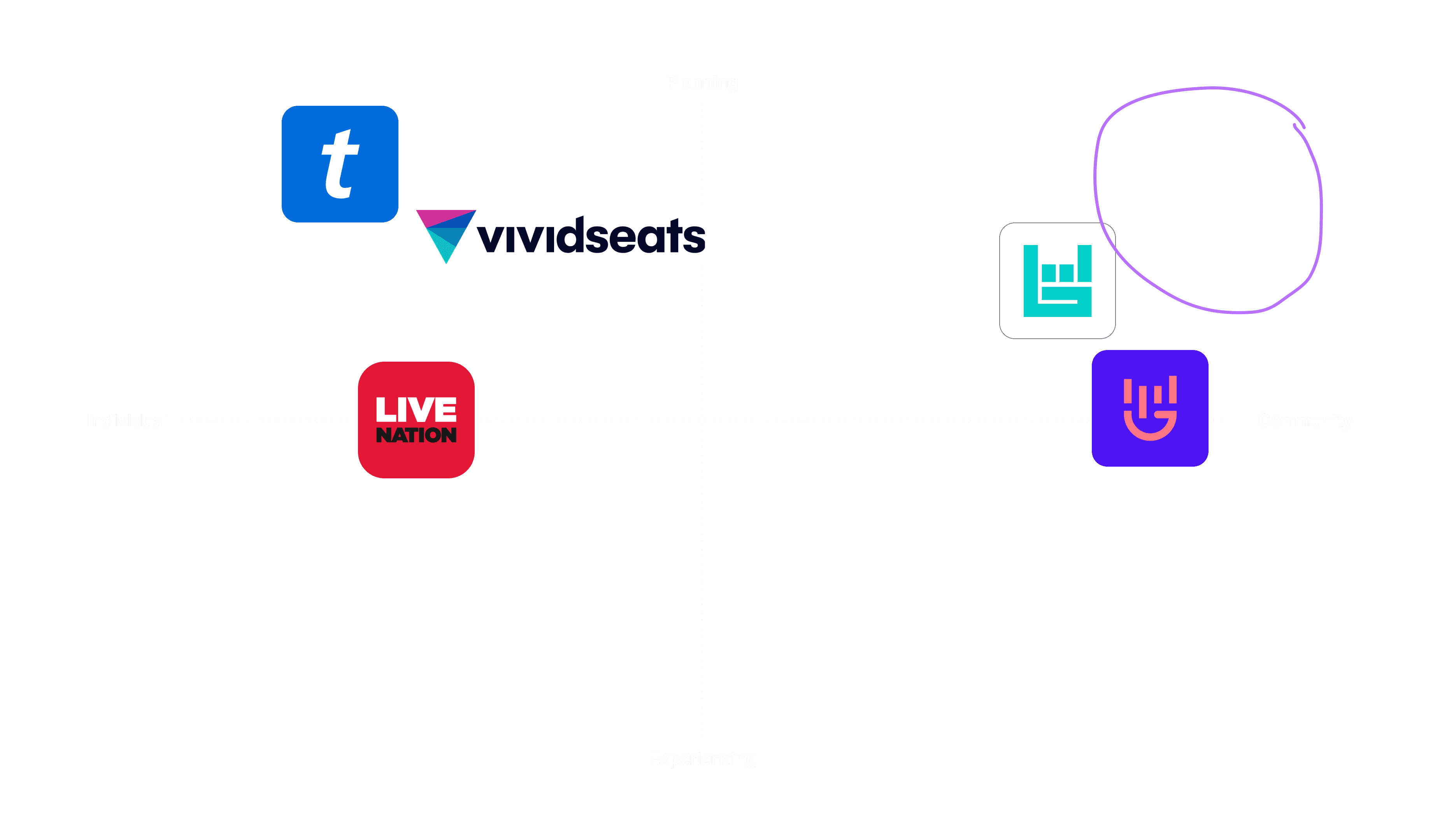
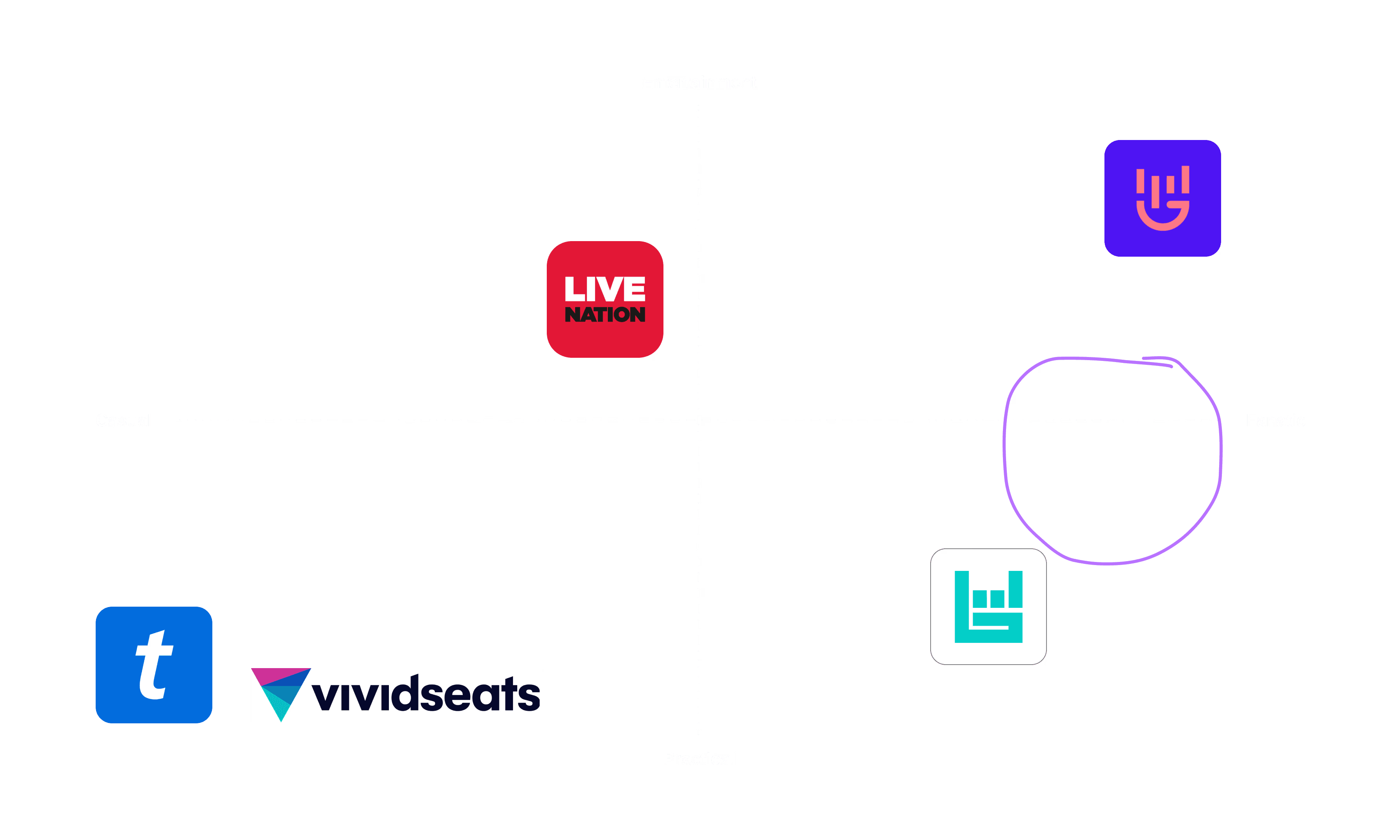
Designed for Concert Enthusiasts
We aim to provide a practical planning tool while incorporating entertaining features and maintaining a fun, exciting tone throughout the app.
USER RESEARCH
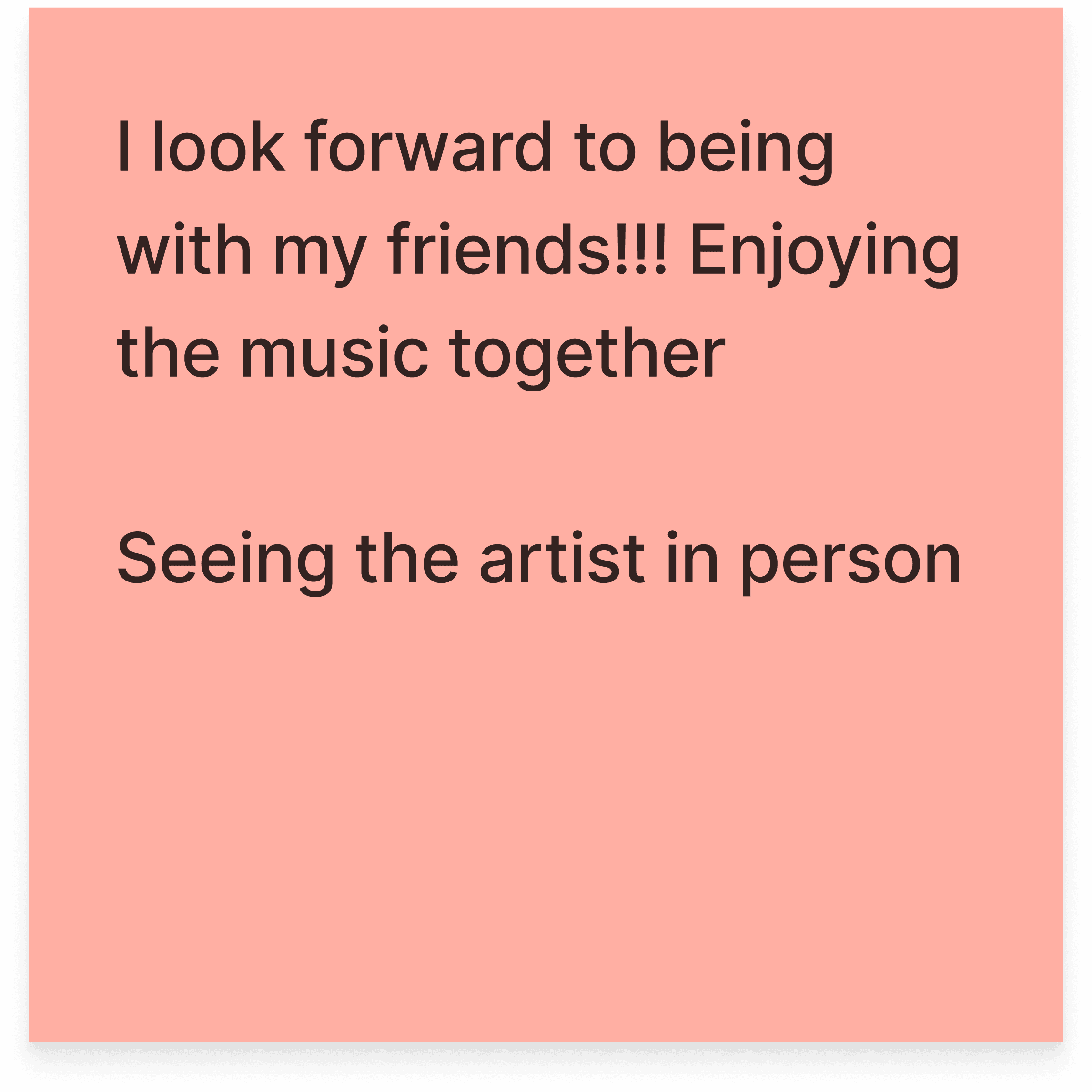
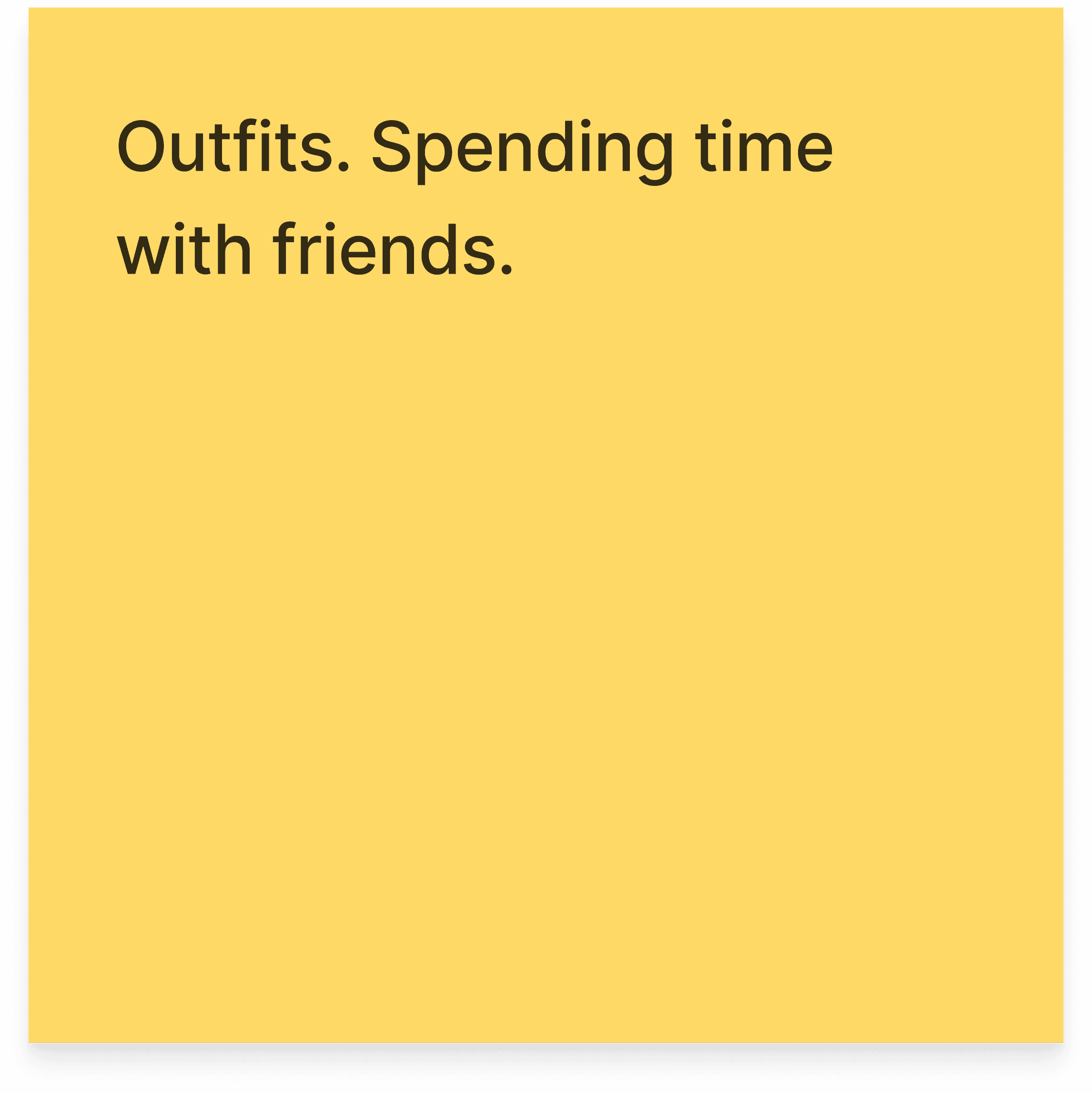
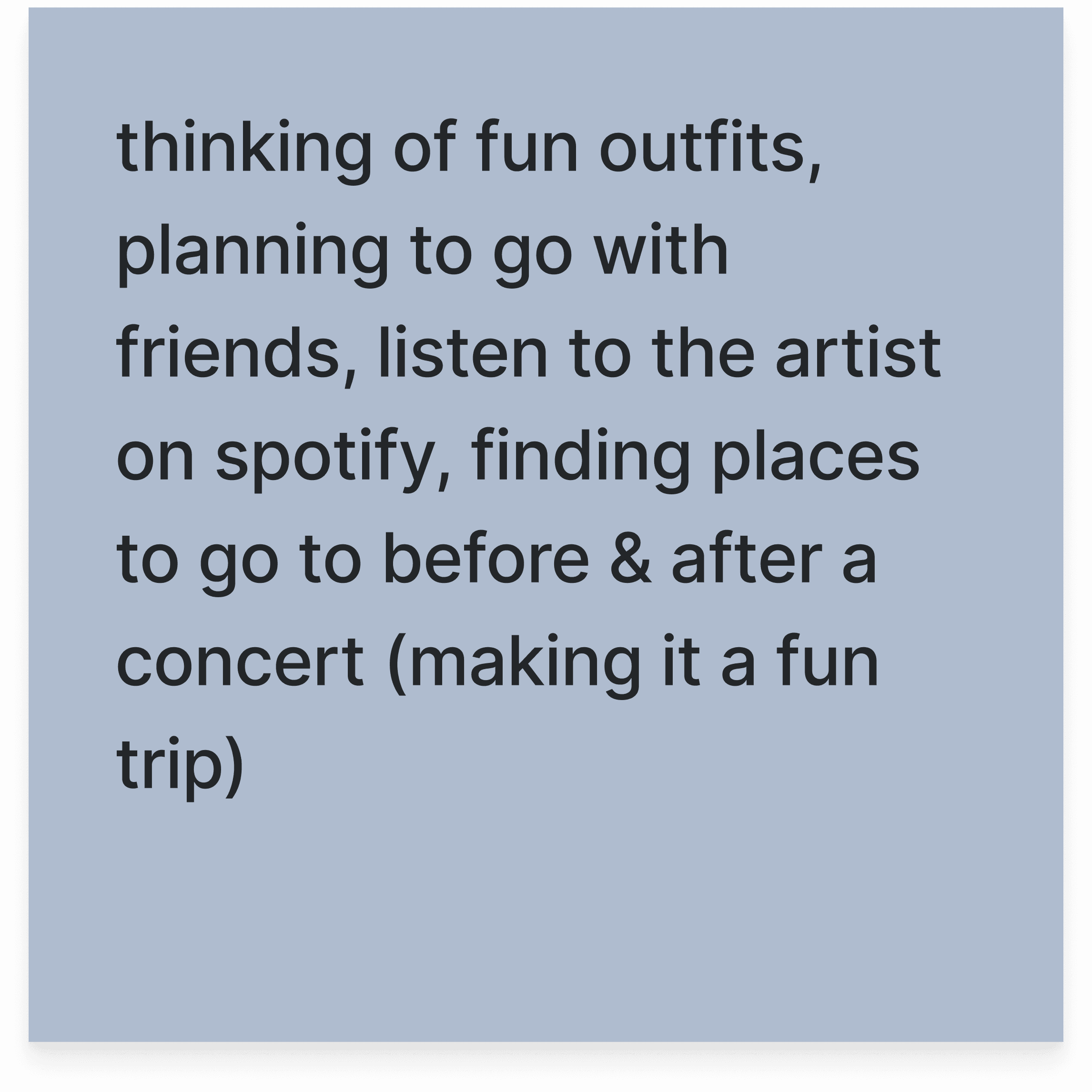
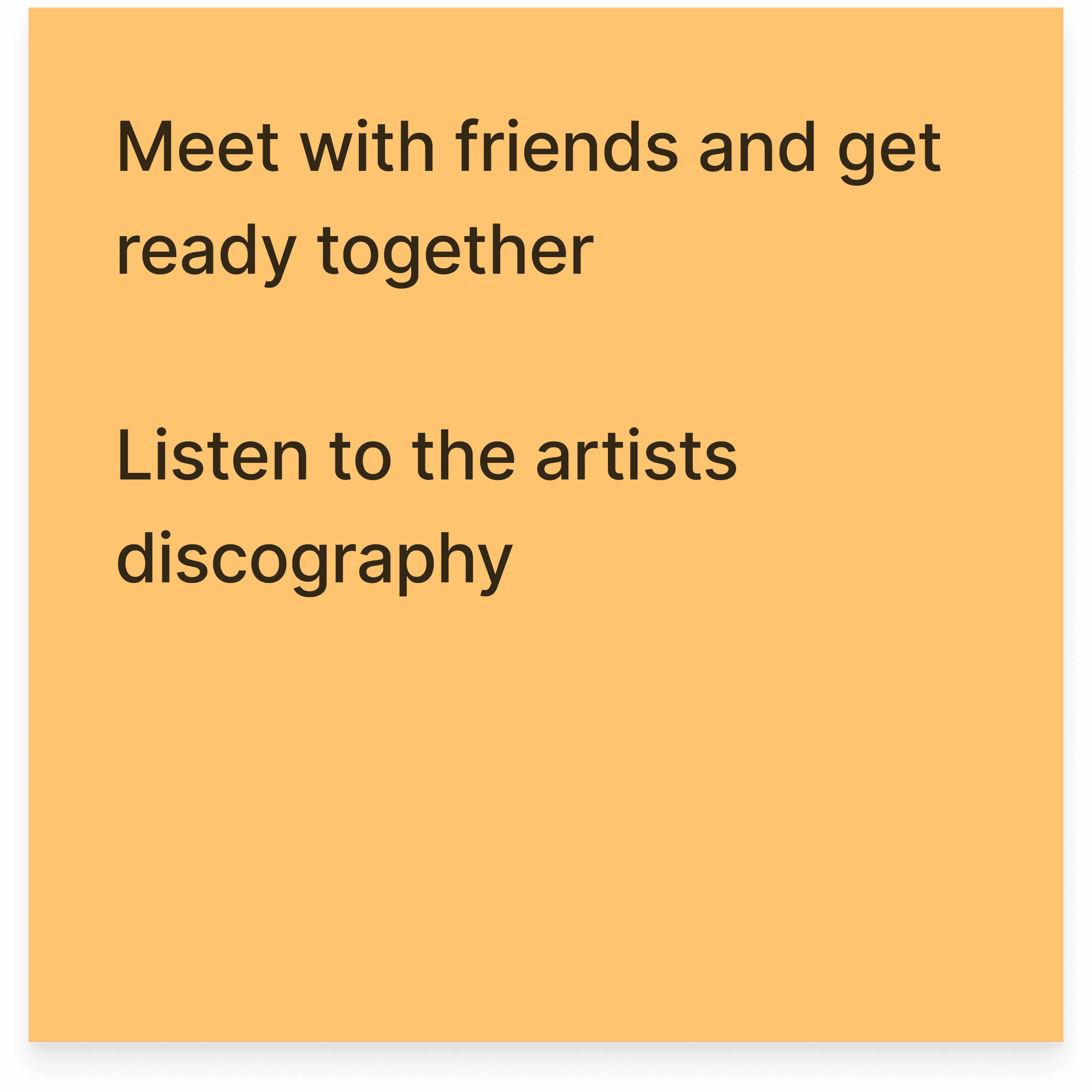
Concertgoers look forward to time with friends but face logistical hurdles.
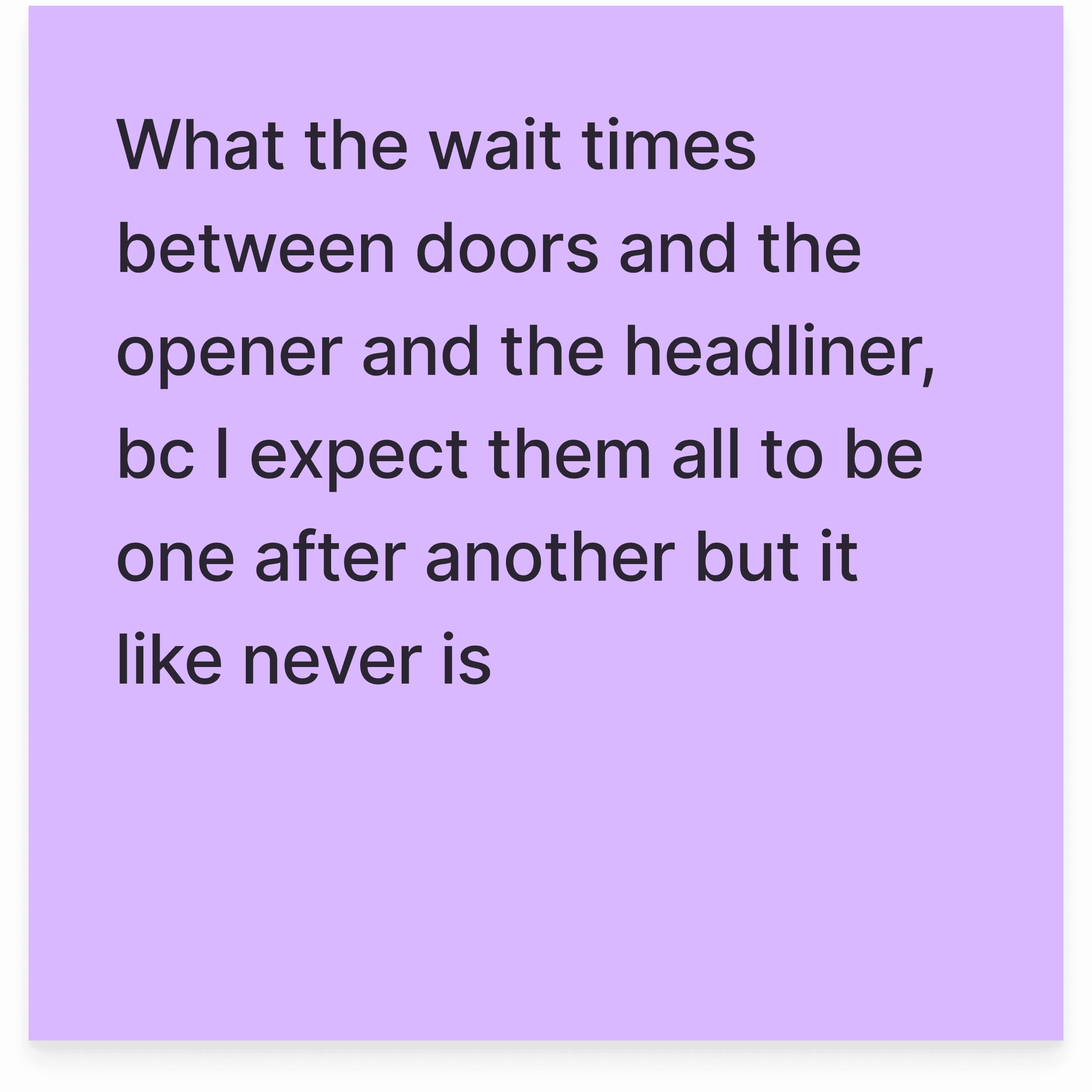
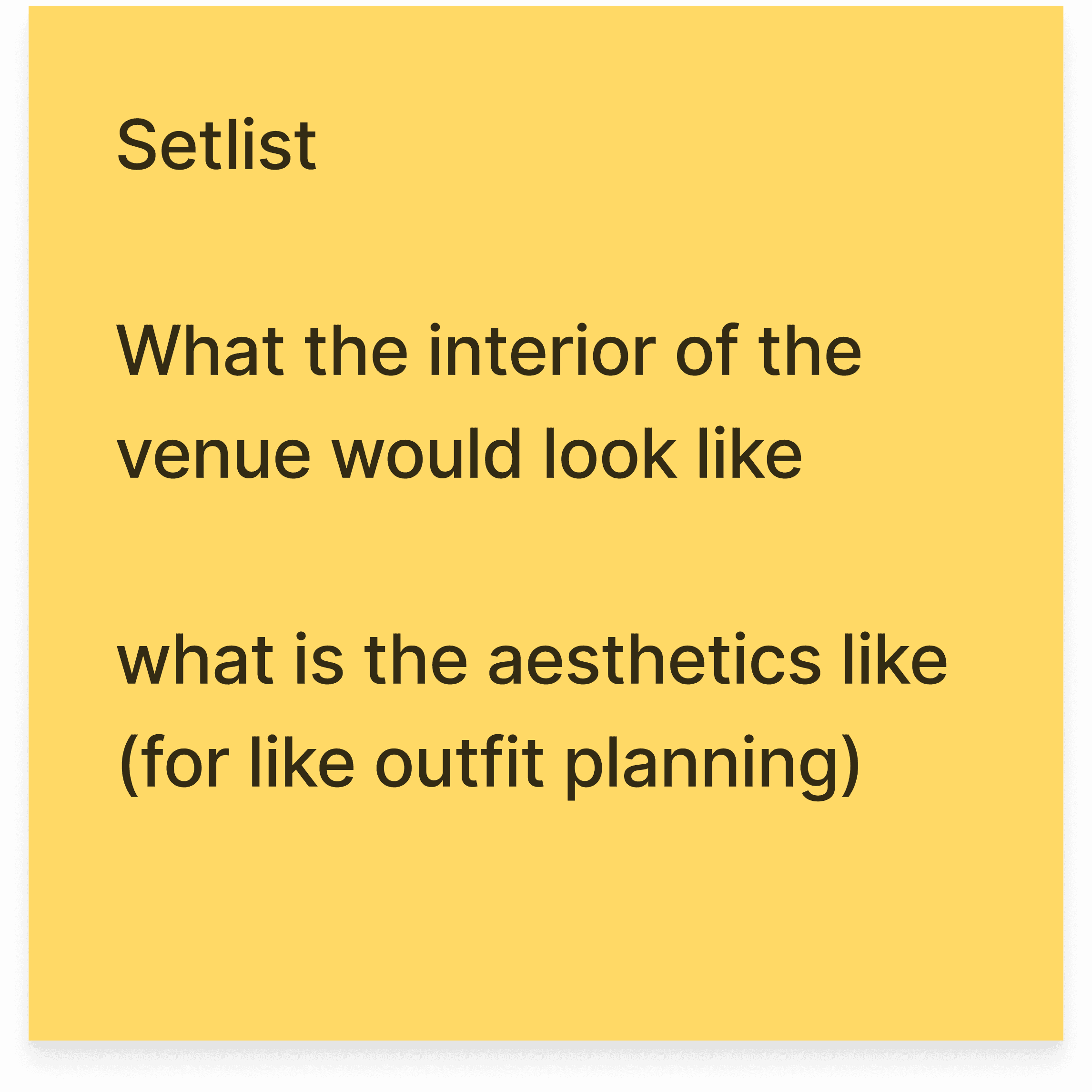
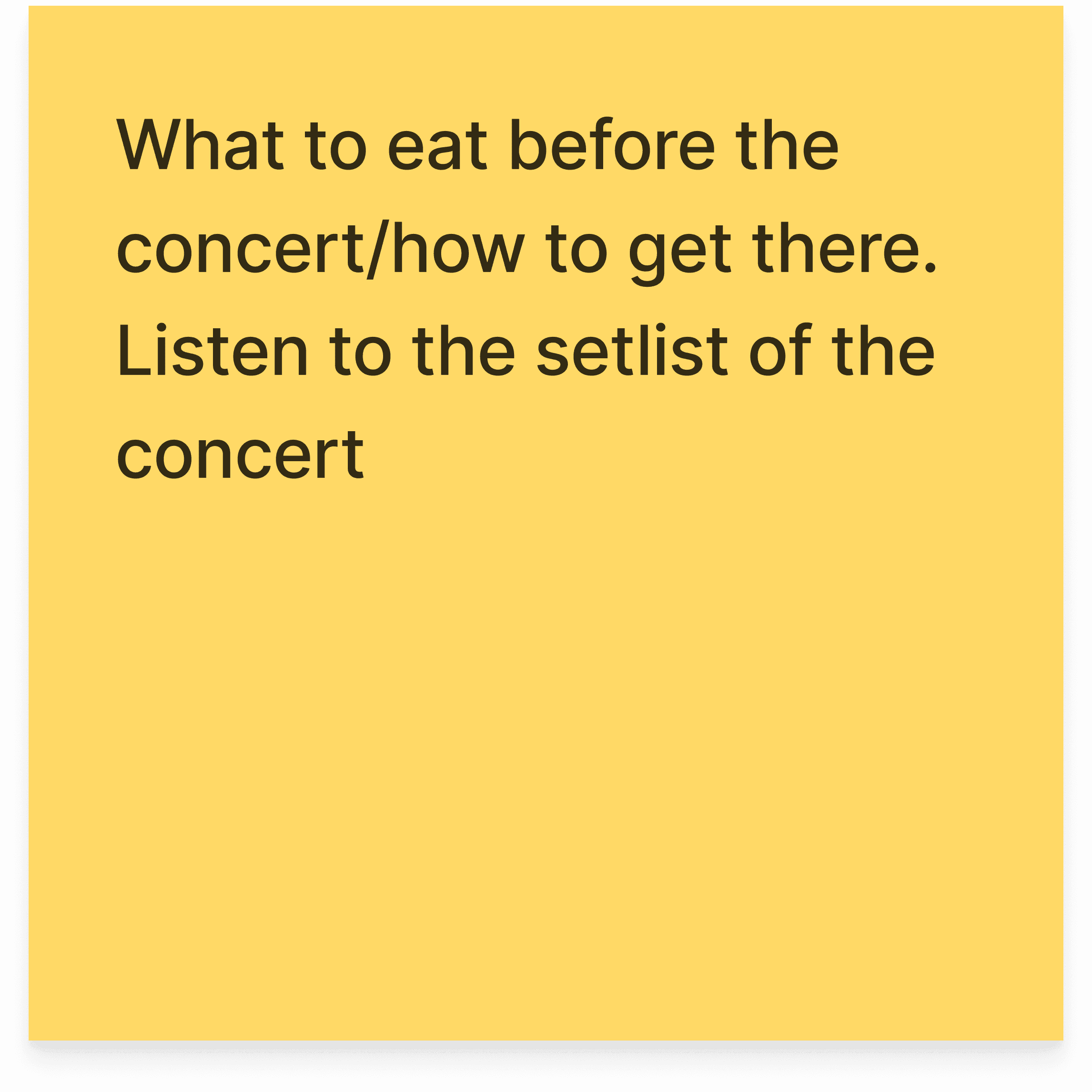
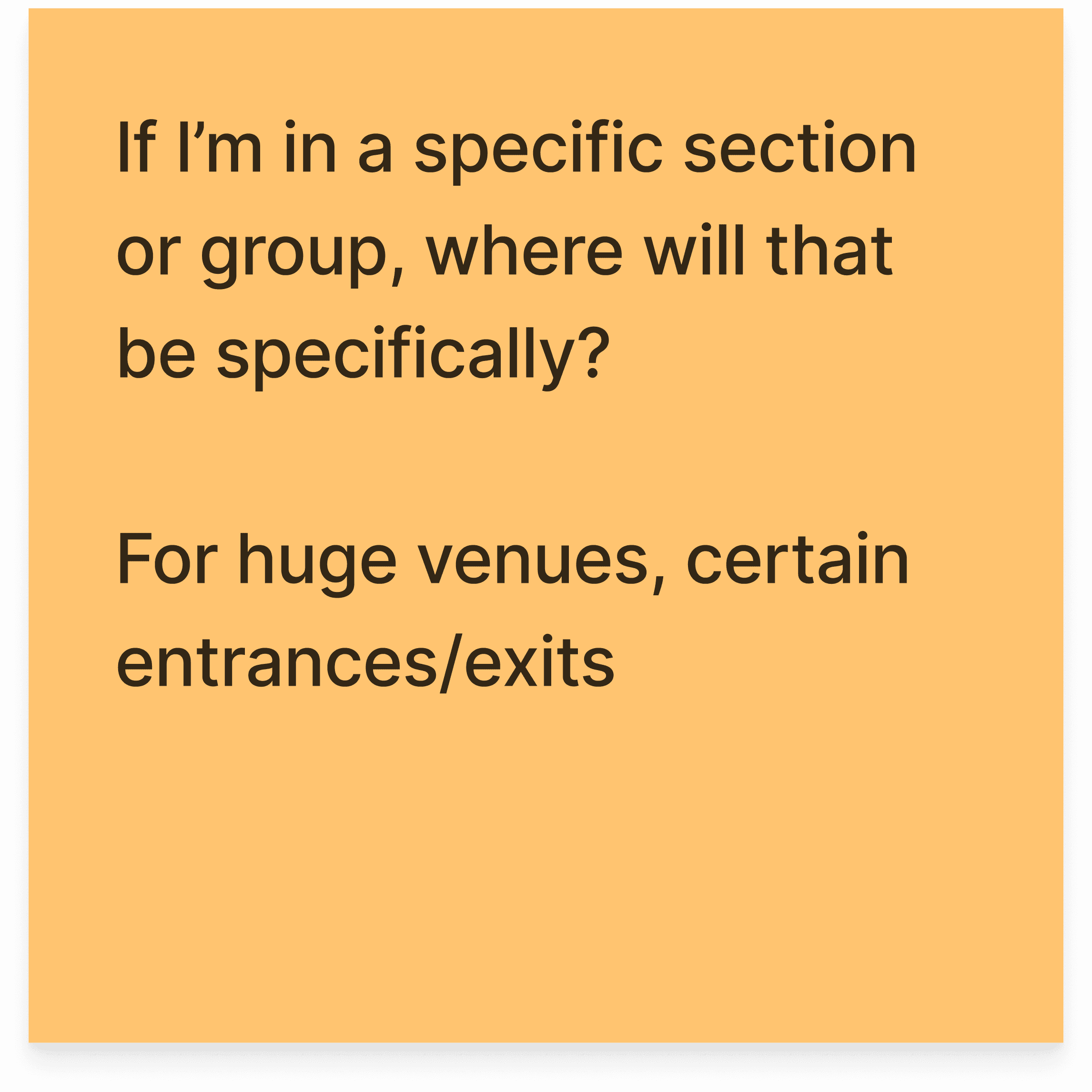
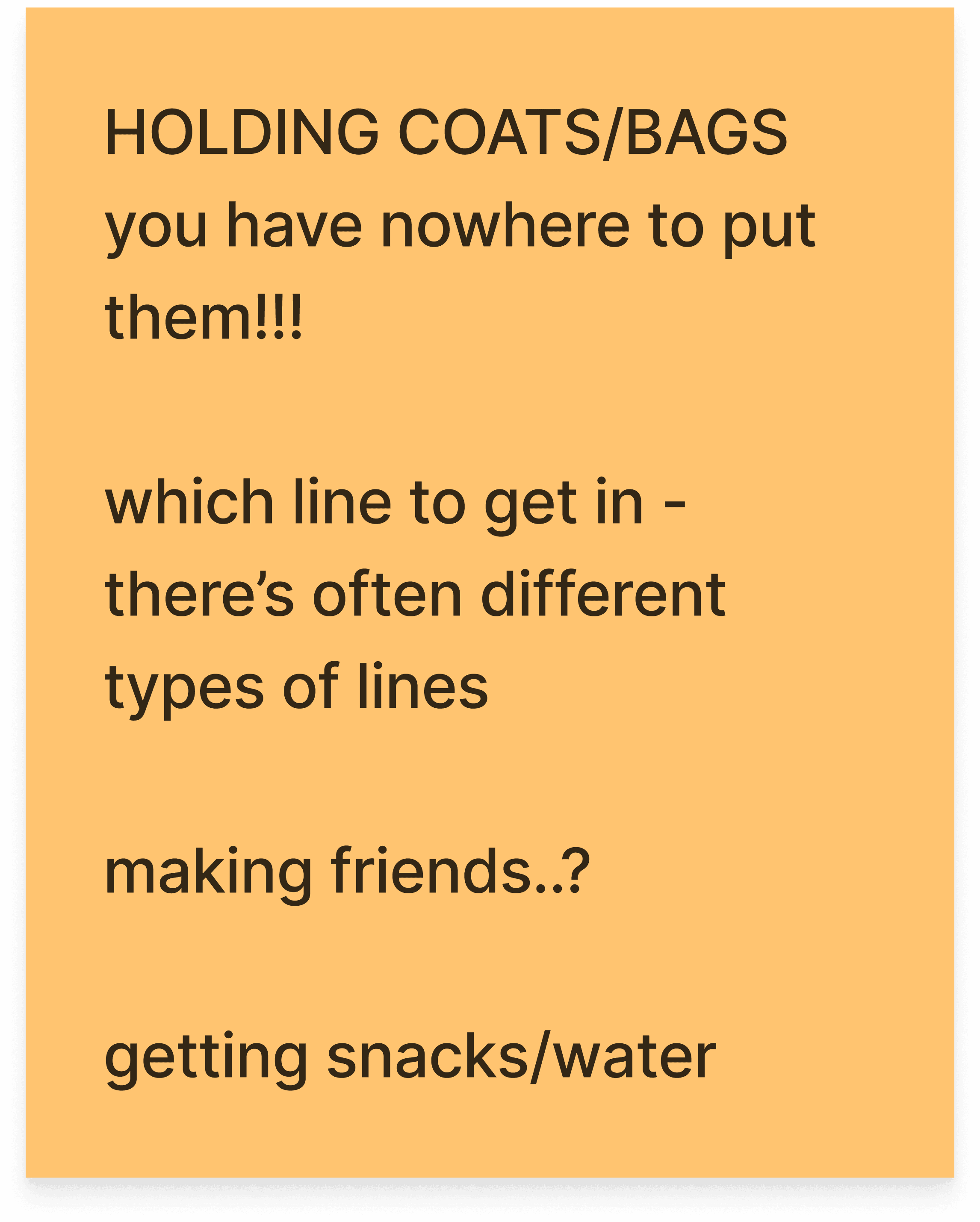
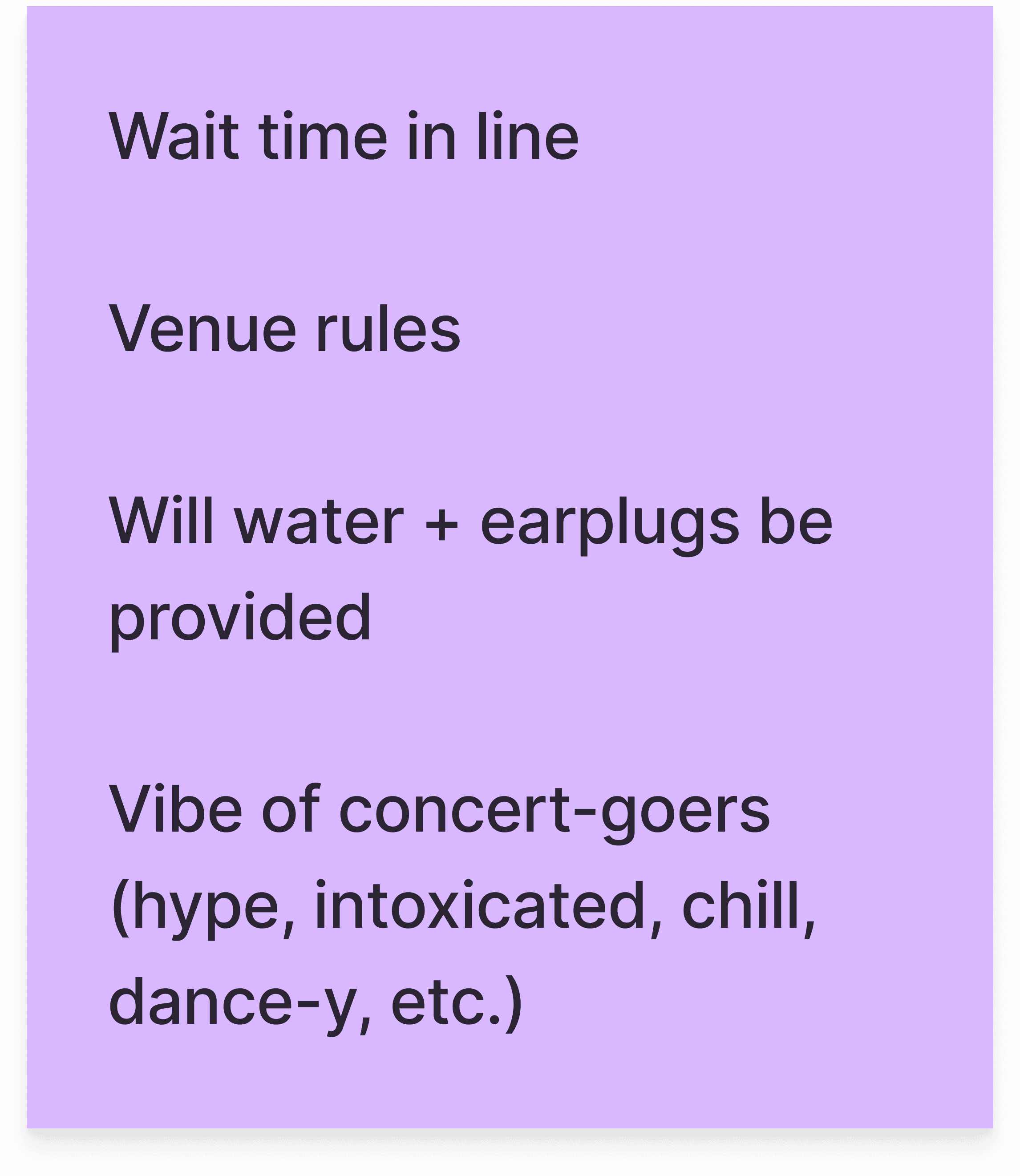
We conducted an interview workshop with five concertgoers to get a fuller understanding of how they get ready for a concert, what tools they use, along with things that matter to them in that experience.
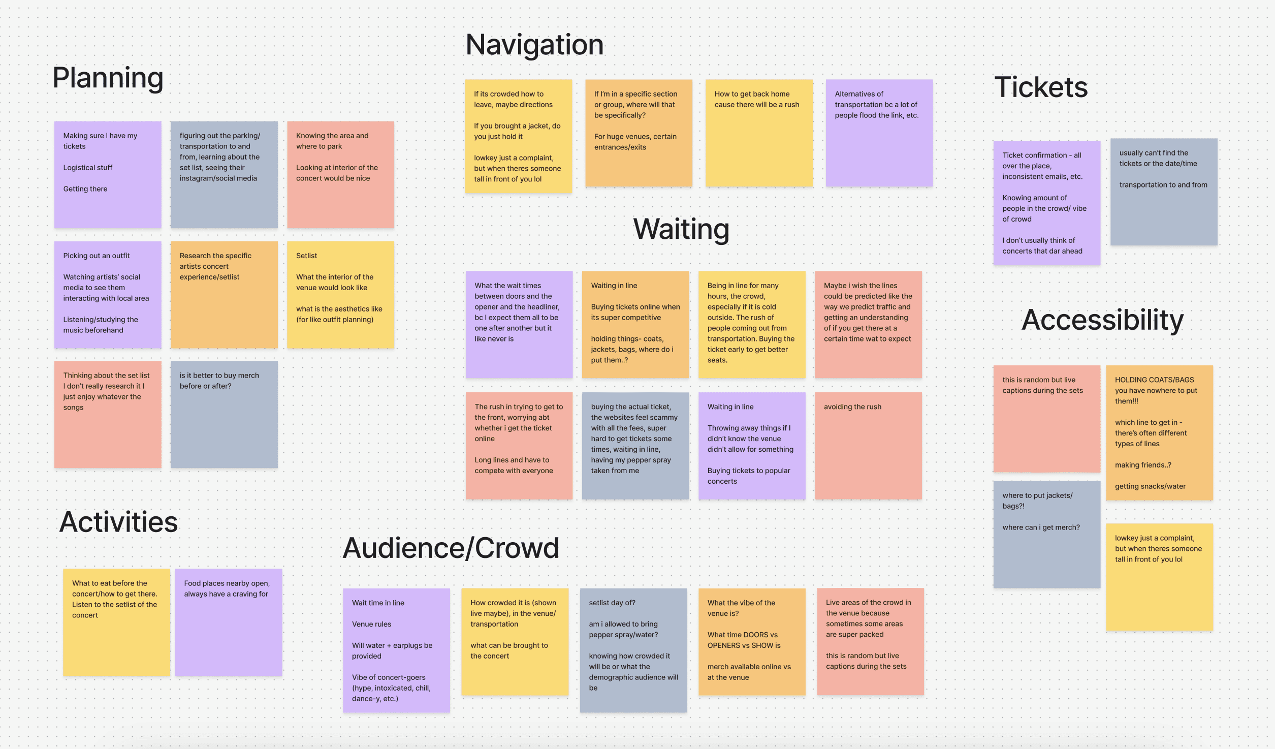
From this, we identified three key insights, highlighting the need for more structured processes that enable informed concert planning experiences:
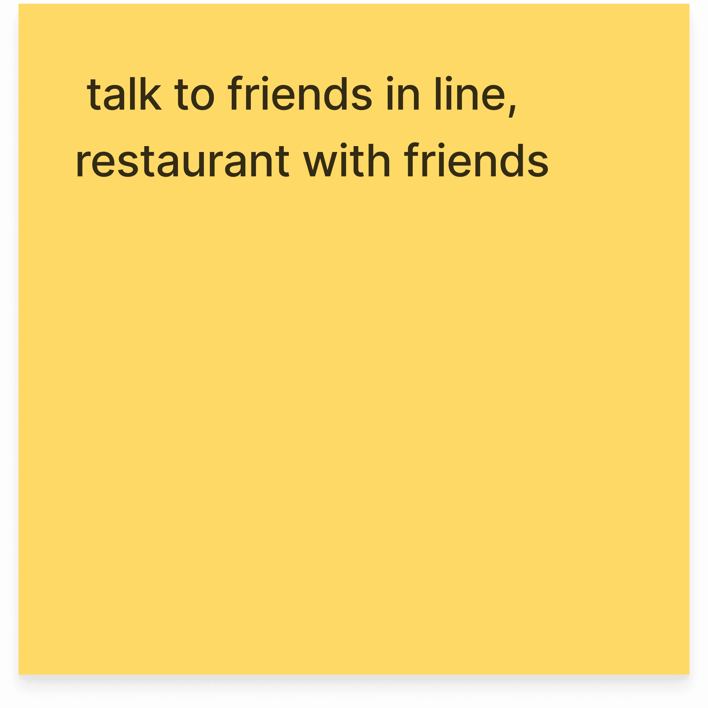
Sharing the experience with friends is a high motivator into attending concerts.
There's a lot of unclarity of what to prepare and what’s allowed to bring at concerts.
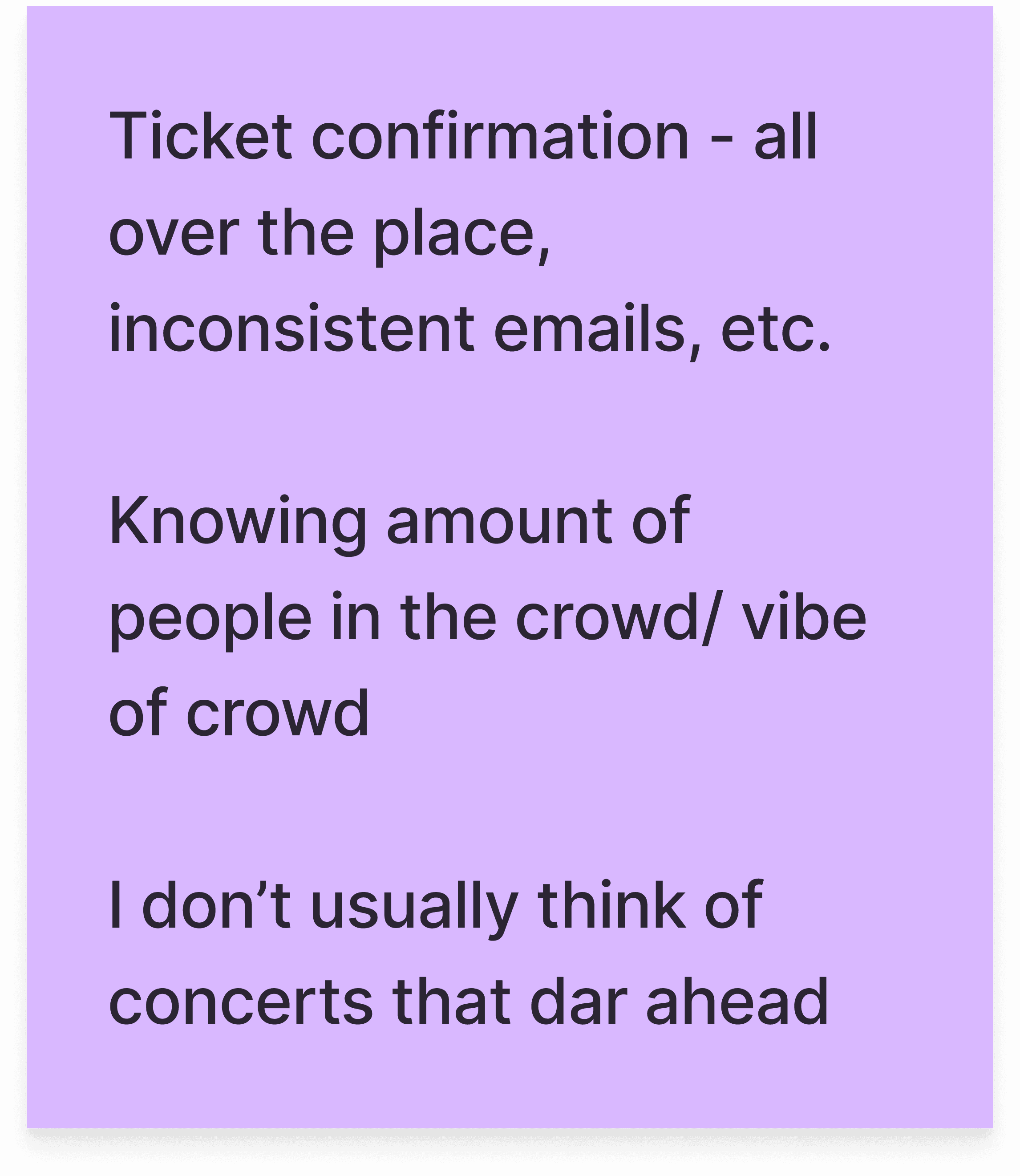
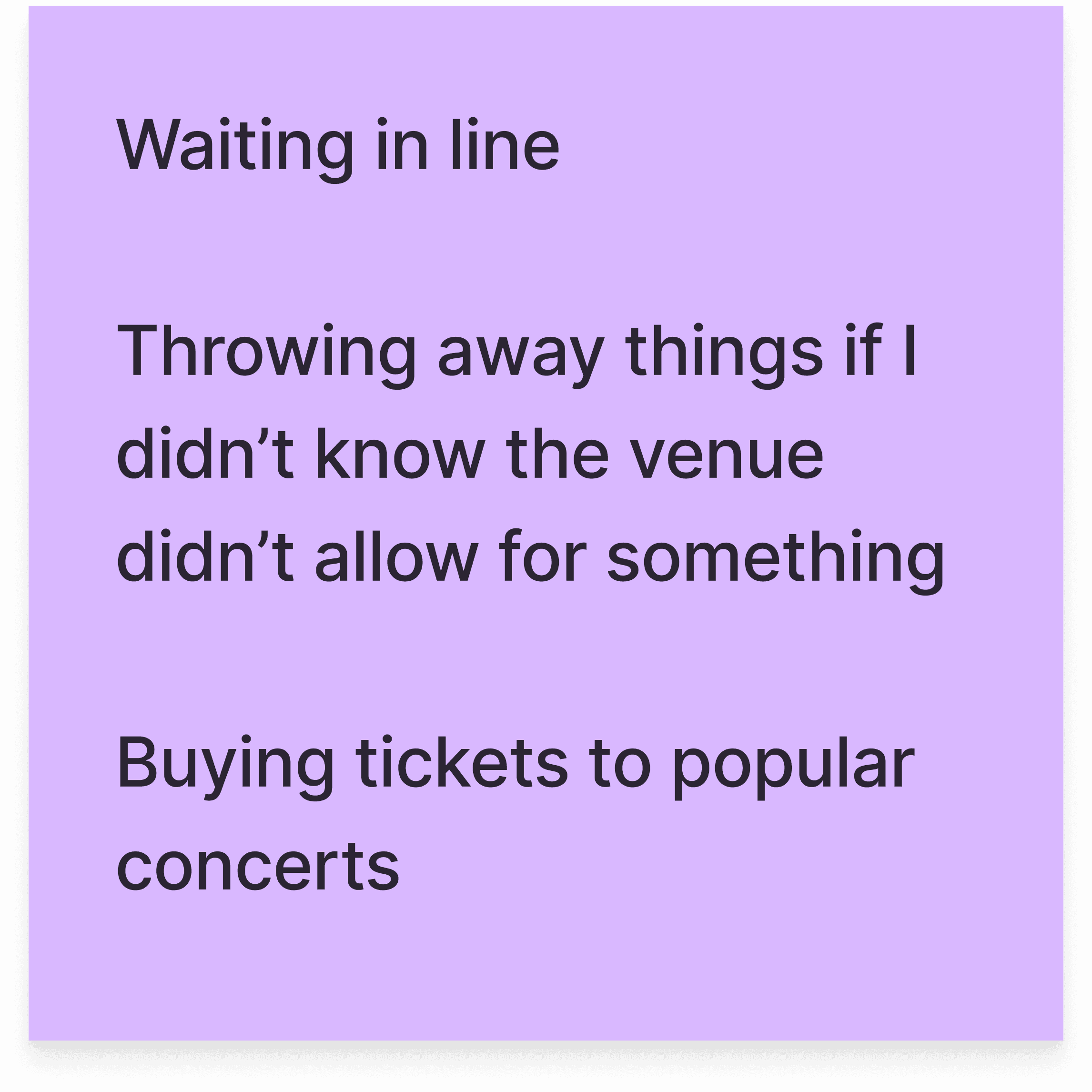
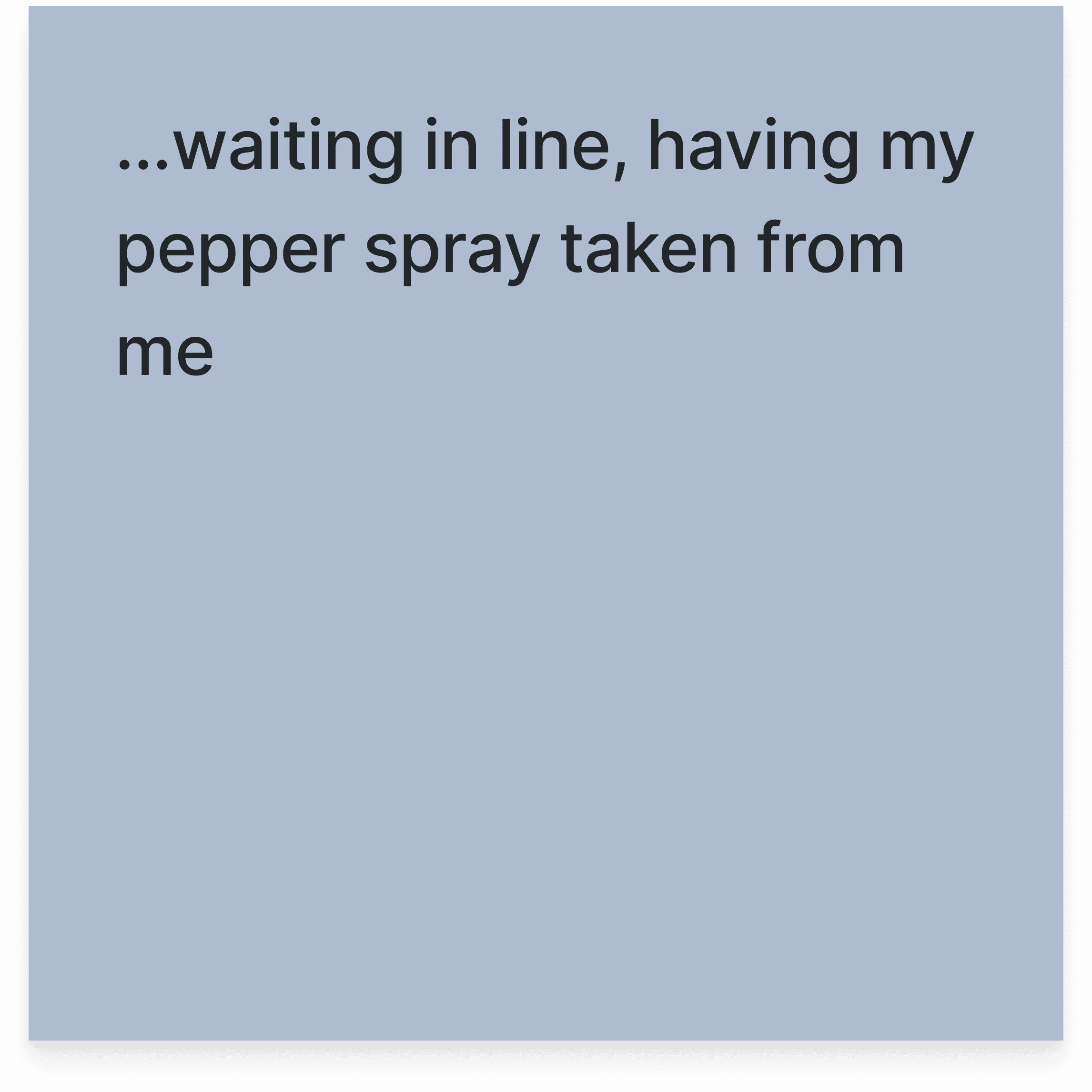
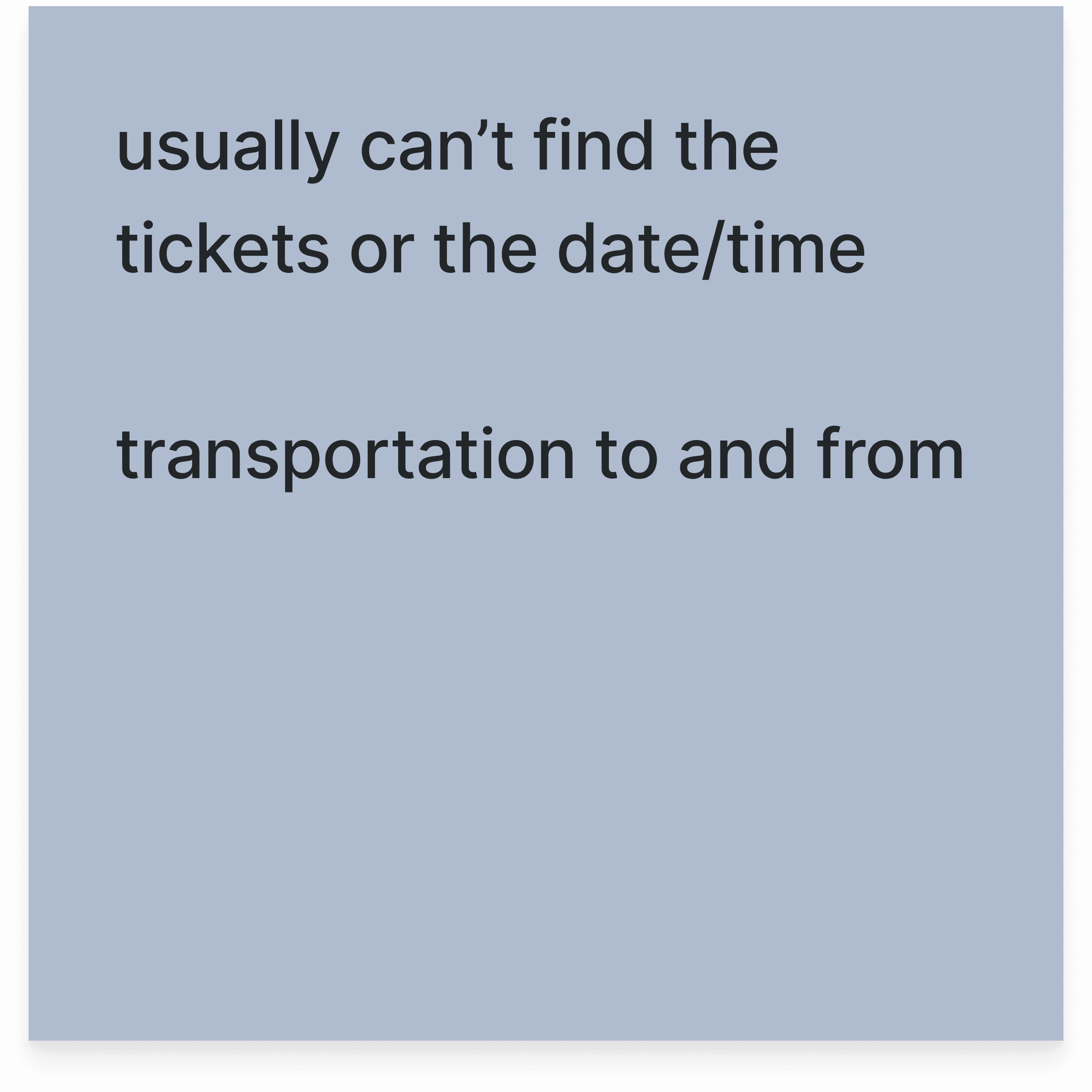
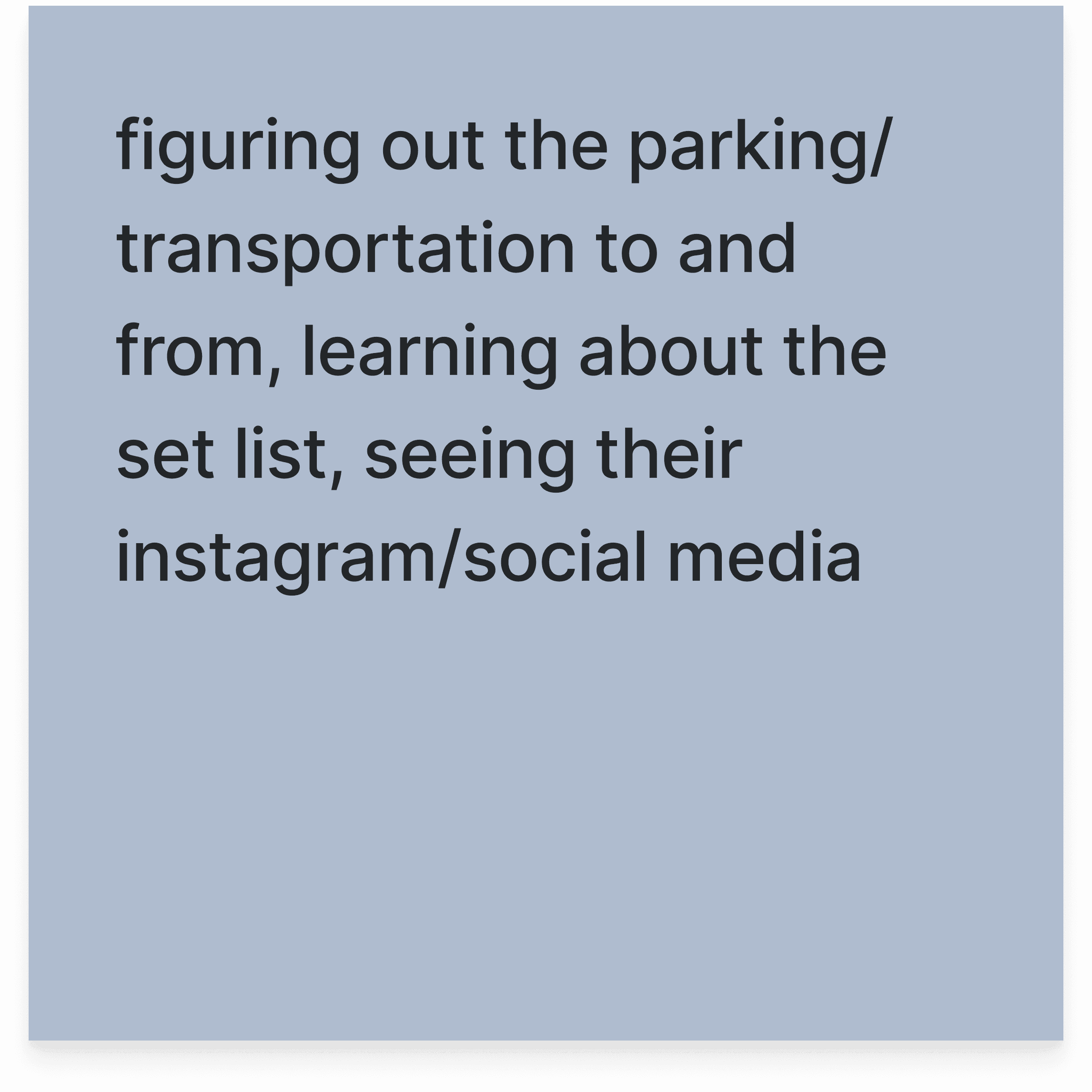
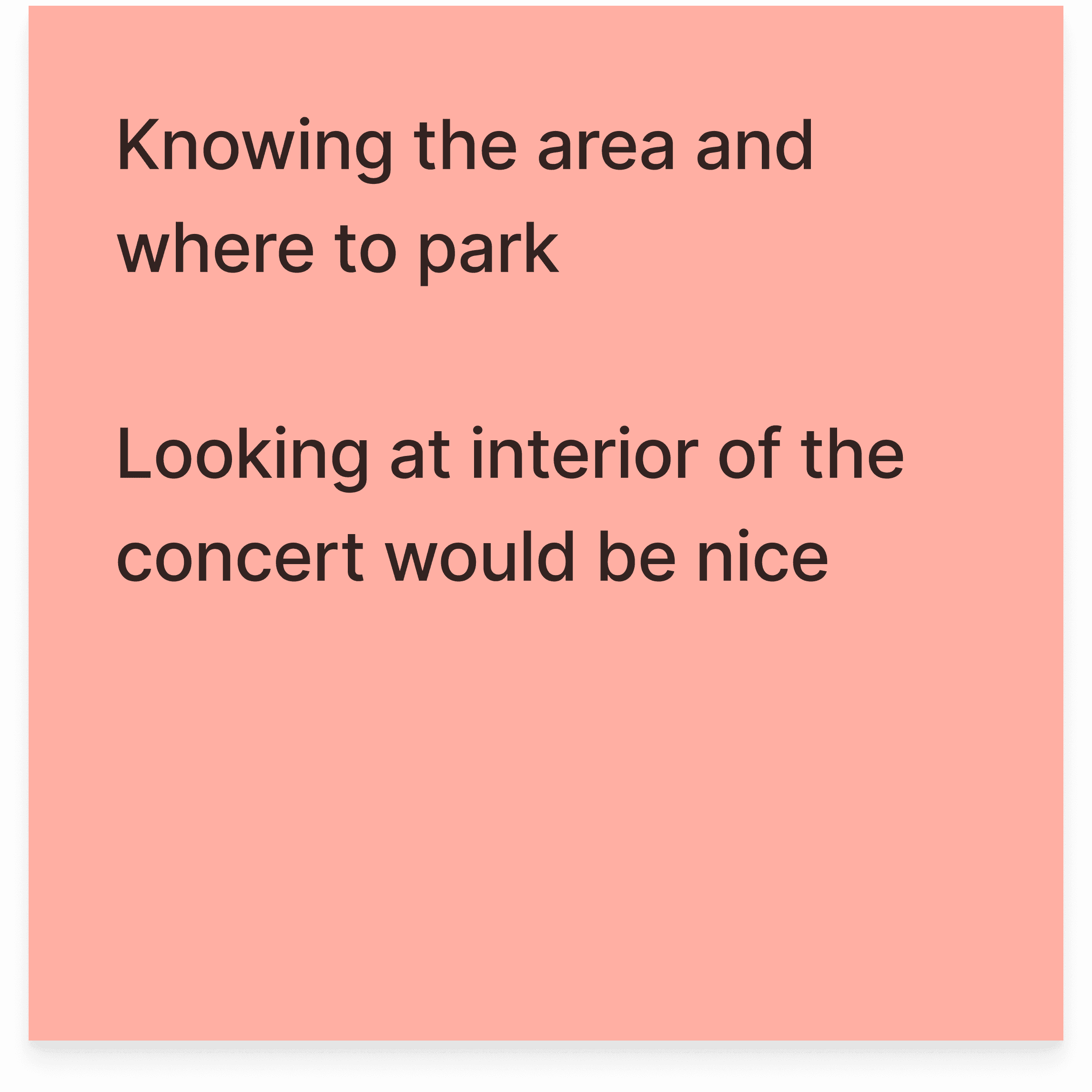
Attendees are often uninformed about what’s next which is inconvenient.
DEFINEMENT
Setting the stage: value proposition, UX pillars, and vision statement
Now that we were better informed, the next step was forming our foundational elements. A key takeaway from our insights was that concertgoers are excited to experience the concert with their friends but find the planning process often complicated and fragmented, which detracts from the excitement.
Therefore, we geared our focus toward developing a platform that could streamline the planning process and include features to keep users informed and aware of their current and upcoming plans.
Problem Recap
Concerts are fun to be at, but planning and coordinating can be overwhelming and time-consuming. How can we bring excitement into every aspect of the concert, from preparation, experiencing, to reflecting on your experience?
Value Proposition
A platform that excites fans to build plans with friends hassle-free, and rewarding them with exclusive content from the artist, ensuring each attendee experiences the event to the fullest.
Experience Pillars
Personalized
Tailored and exclusive memories for every attendee
Directive
Guiding information at the right moment
Community
Connect friends through exciting memories
Assistive
Adaptive plans so you can be present
Vision Statement
For concertgoers who want to feel prepared and excited to roll on their concert day, Loosely is a planning tool that helps you make a plan that they can just plug and play on the day of the event unlike other concert apps that present static information, our product elevates their experience both inside and outside the venue.
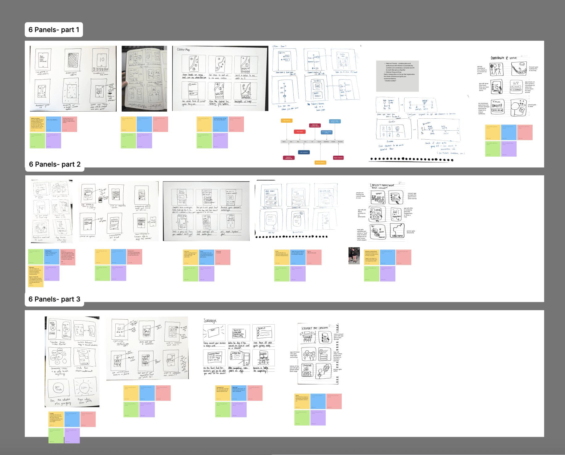
SIX PANELS
Ideating various features, interactions, and experiences
My team and I then brainstormed potential app ideas and interactions through quick, comic-strip-style 'six panels.' We came up with rough yet tangible visualizations of our ideas, which we shared on the board and selected the strongest concepts by leaving comments under each. Most of all with this exercise, I was able to quickly translate abstract ideas into visual concepts, helping to clarify and refine our direction.
PERSONAS AND STORYBOARDS
Accounting for the experience of concert fans at every level.
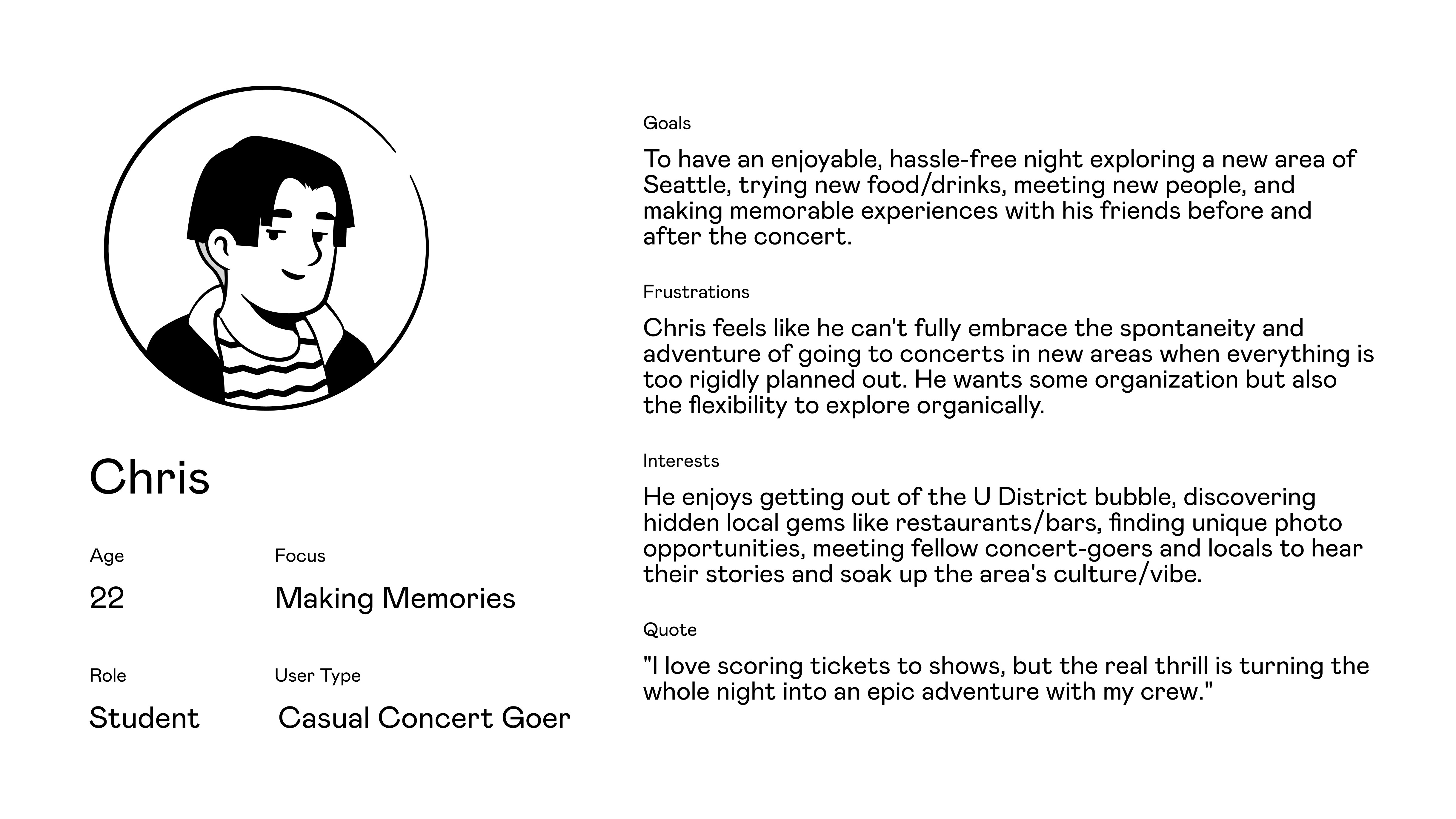
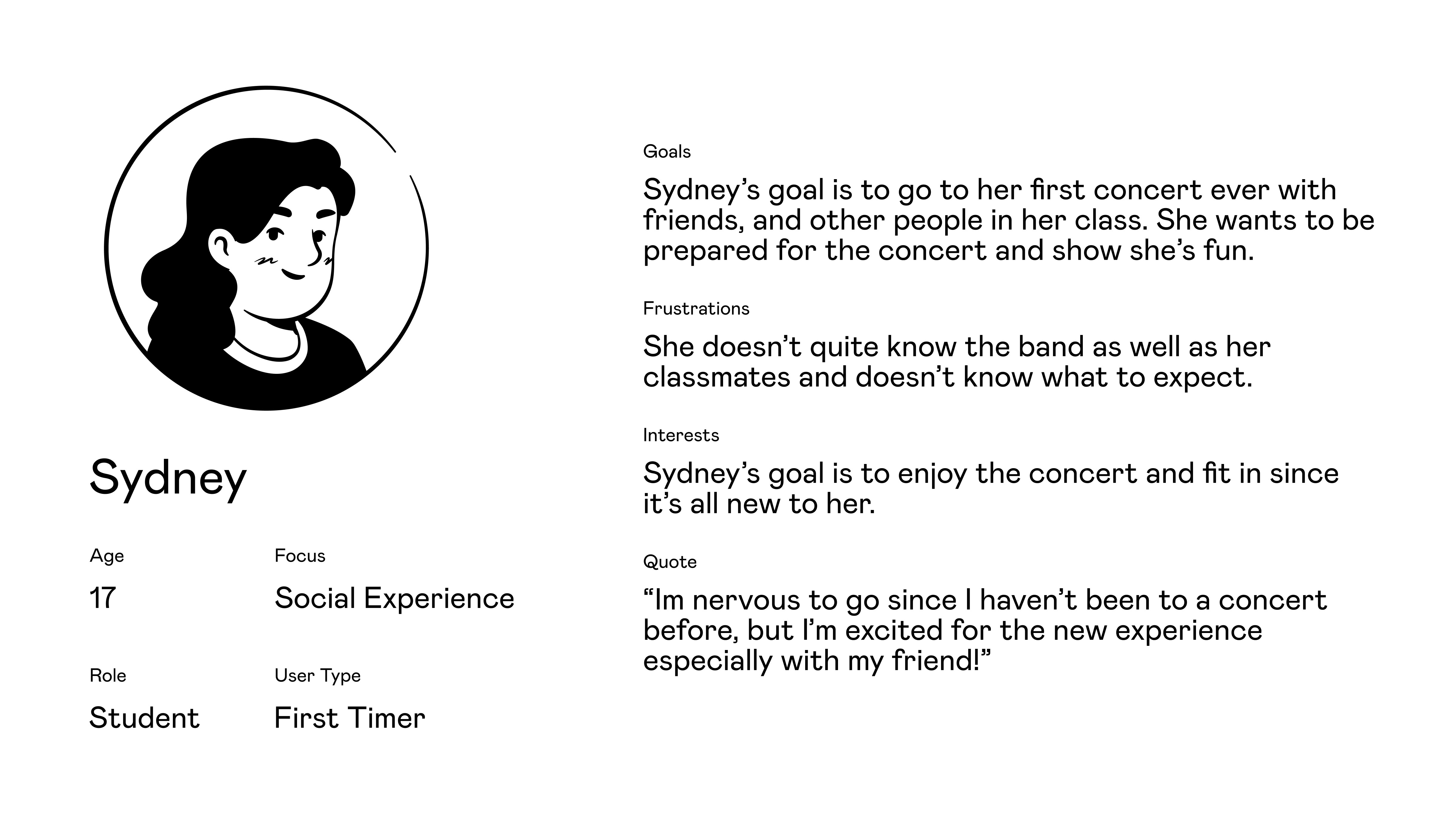
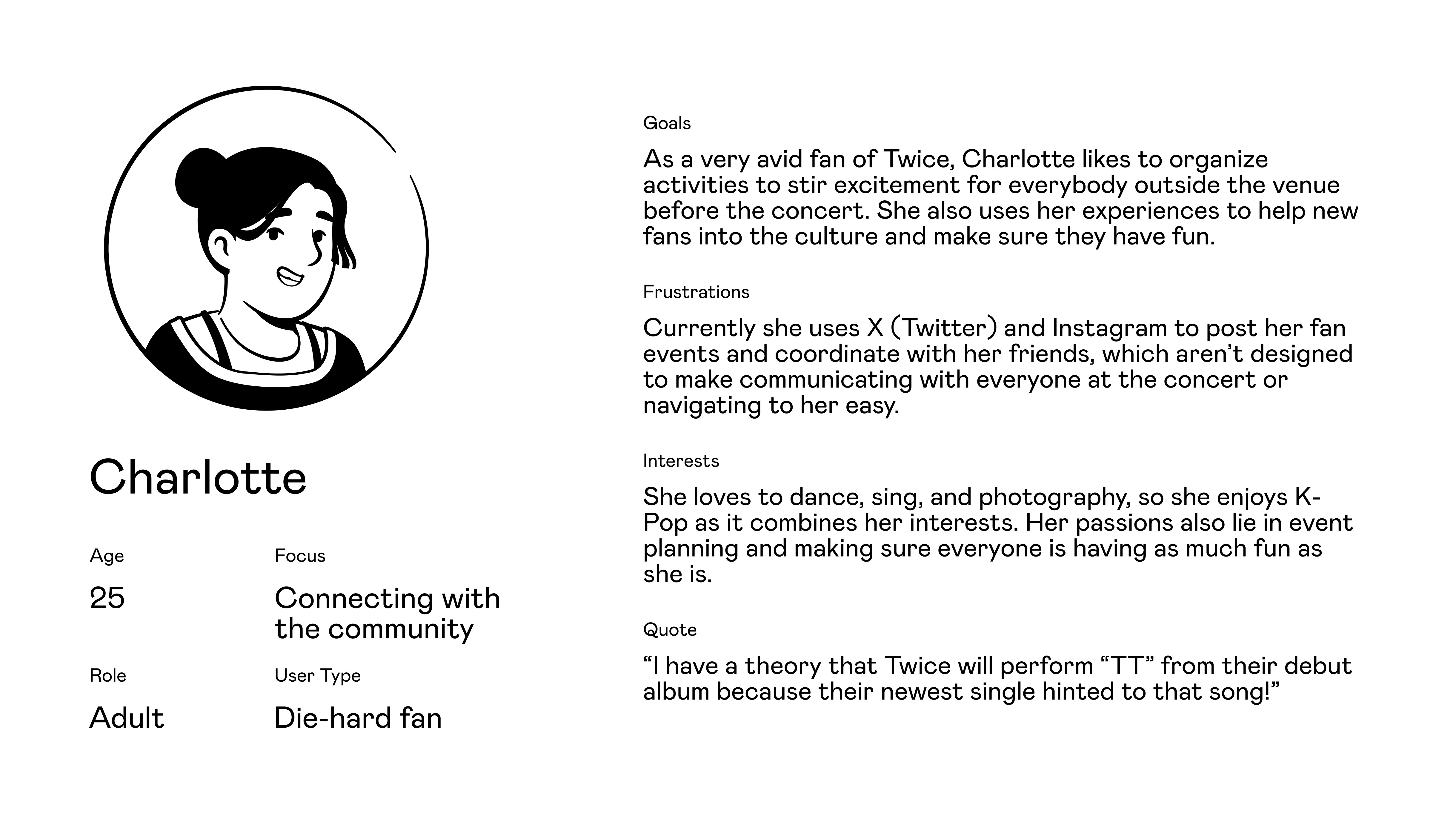
To elucidate who we were designing for, we created personas and of three different kinds of concertgoers: the first-timer, casual attendee, and die-hard fan. While we're mainly designing features to support and be liked by more fervid fans, we still wanted to make it easy for these transitional users to enjoy our app, so we also explored the journeys of other fan levels.
Exploring these use cases enabled us to get a better sense of the scope of our app and how to cater to various levels of user engagement.
Casual Attendee
First Timer
Die-Hard Fan
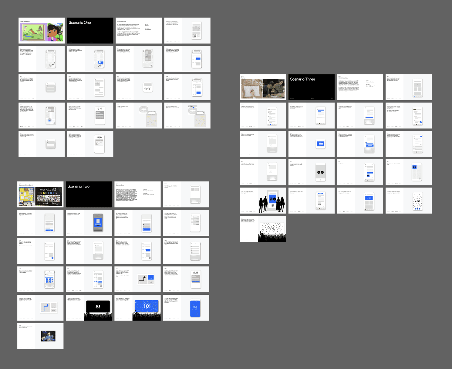
Use case storyboards
IDEATION
Co-Ideating with our participants
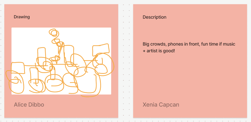
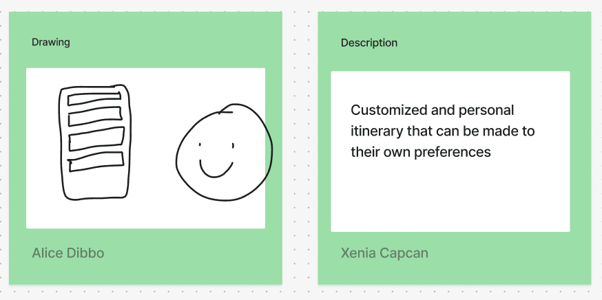
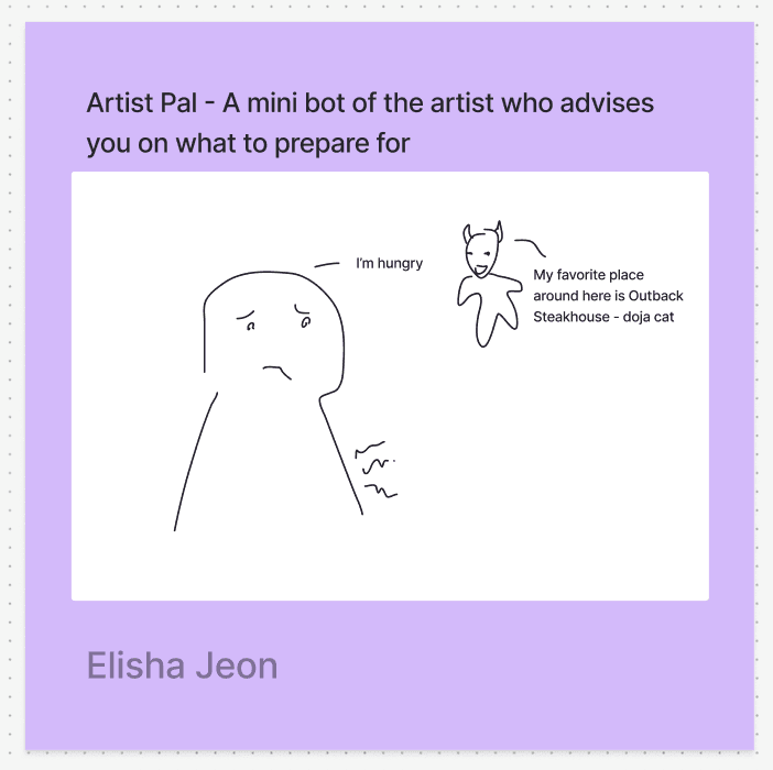
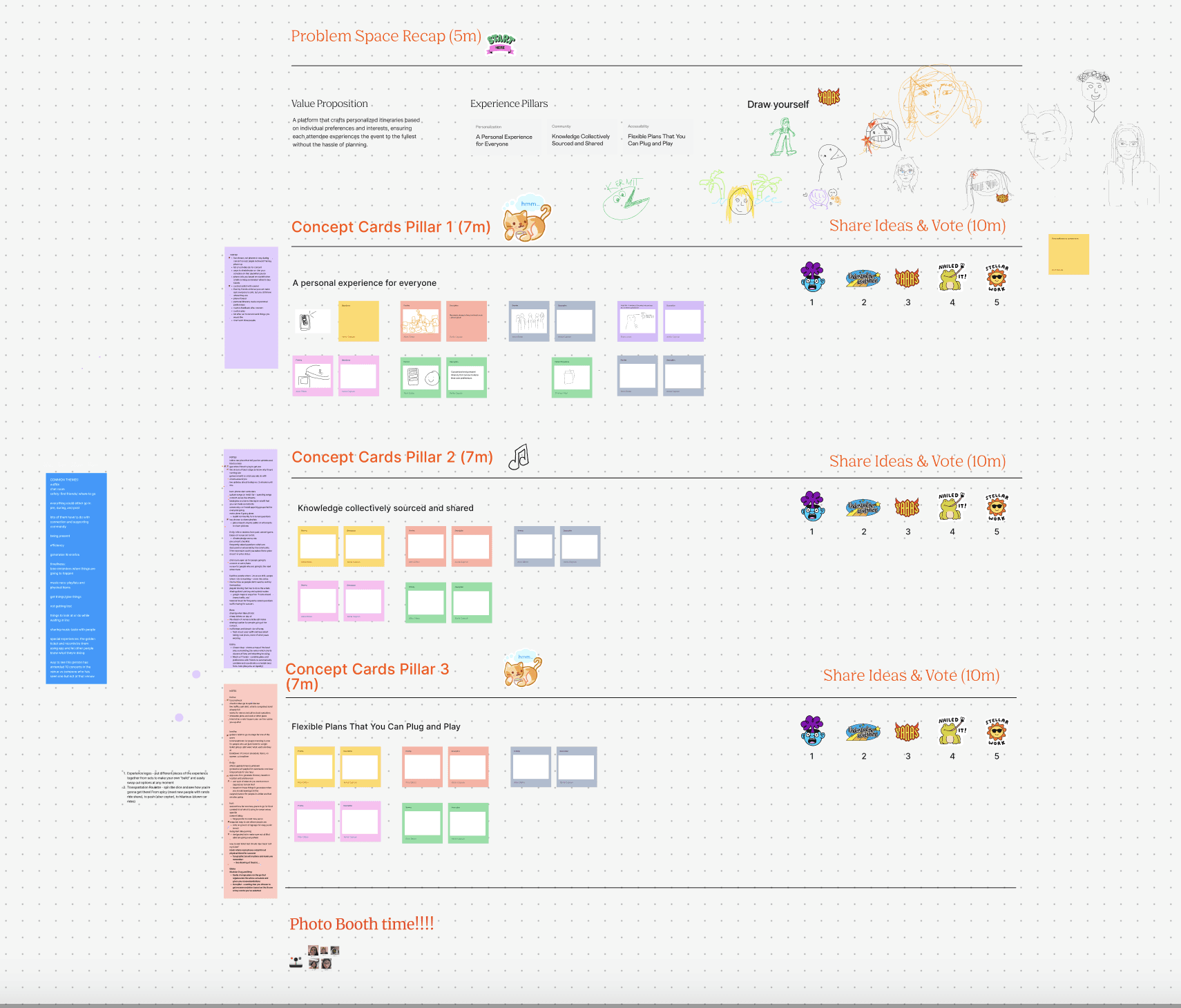
We had the opportunity to meet with our interviewees and conduct an ideation workshop focused on developing user-centered solutions and features that directly addressed their needs. As a group of 10, we generated over 50 ideas, voted on them, and held a feedback session to identify the most promising ones.
Following this, our team conducted another round of thematic analysis to identify common themes and further refine the pool of ideas.
SKETCHES
Picking the right aesthetic and mental model for our users.
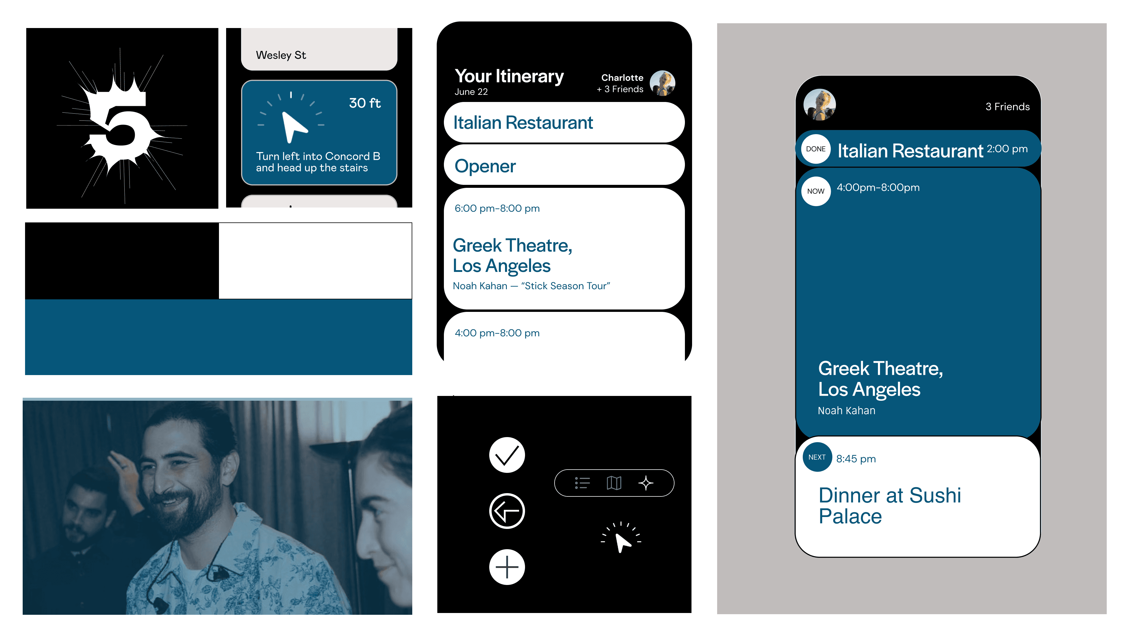
Next, we transitioned to the design phase. Our team created three distinct UI styles to explore different aesthetics and determine the best direction to pursue.
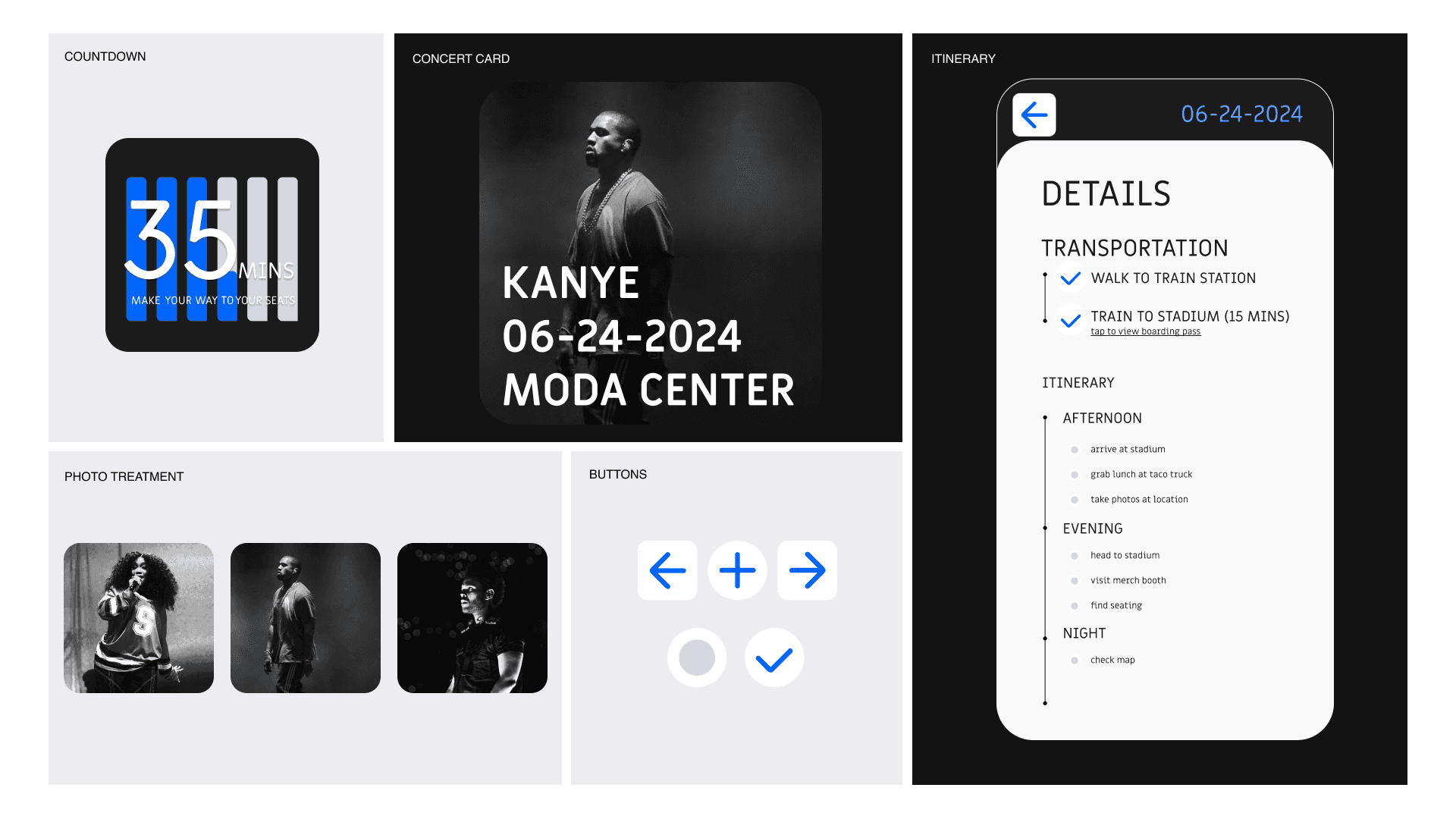
Sketch 1: Cadence (mild)
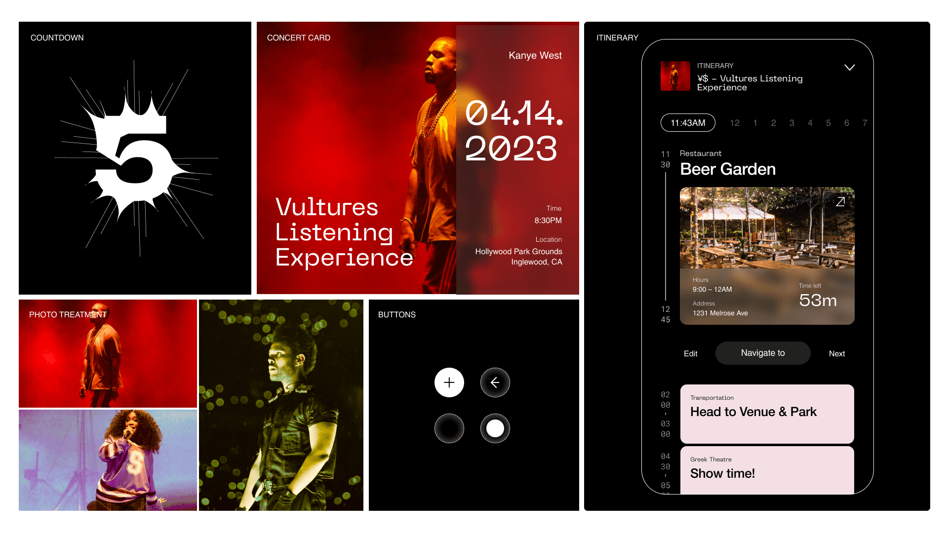
Sketch 2: Resonance (medium)
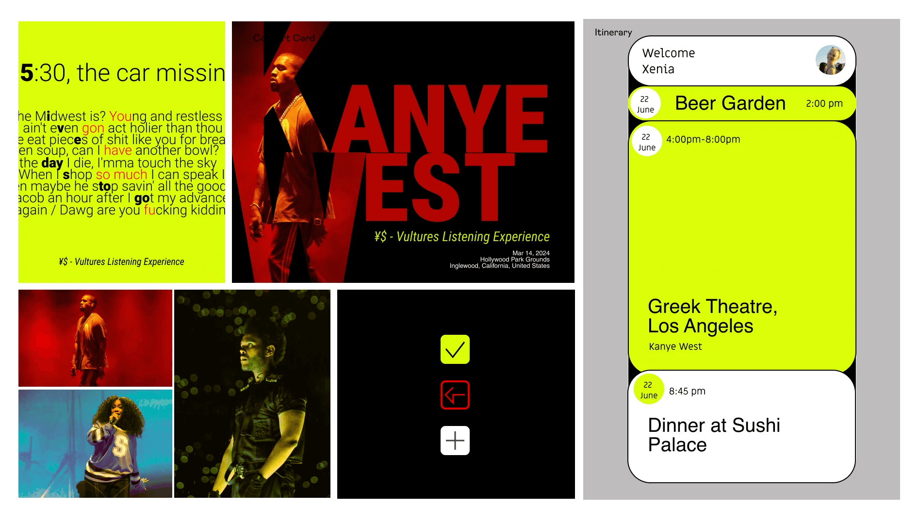
Sketch 3: Pulsar (spicy!)
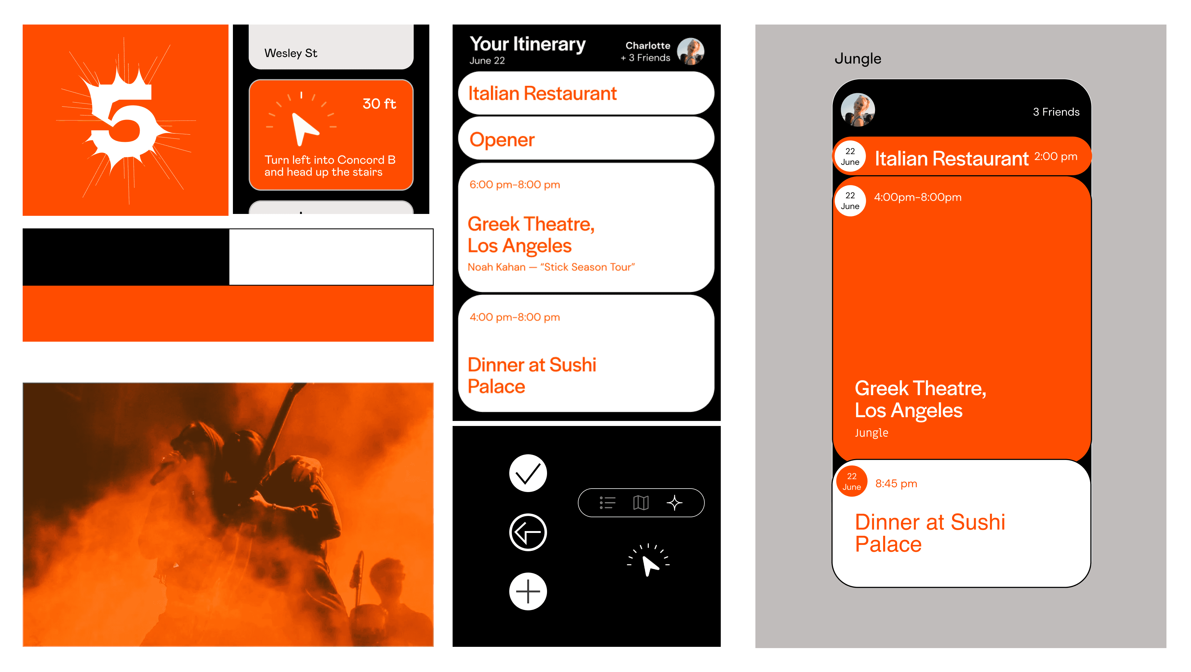
Based on feedback and our own analysis, we moved forward with the visual direction of Sketch Three, as it captured the excitement of concerts and its mental model supported users to follow plans in the moment easily.
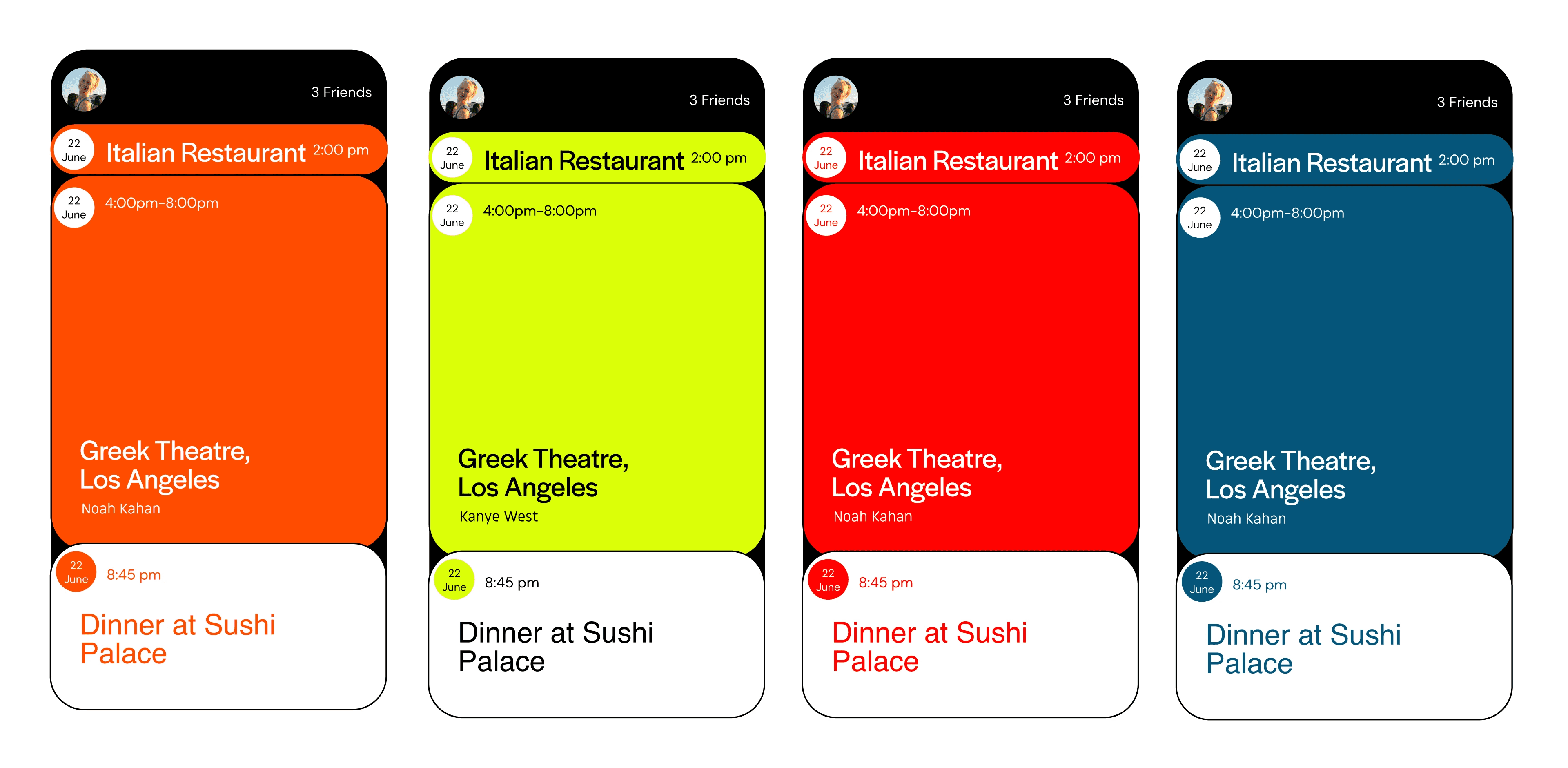
We then refined the concept further, introducing dynamic color themes that would change based on the artist's album or signature color, immersing users in the artist's concert experience and creating a more personalized connection.
NOTABLE ITERATIONS
Improving friend collaboration and on-the-go interactions.
One of the biggest feedback we received was to bring out more of a fun social aspect into the planning process on the desktop. Initially, the version of our itinerary planning UI lacked the essence of the concert experience — it came across more like an airport site.
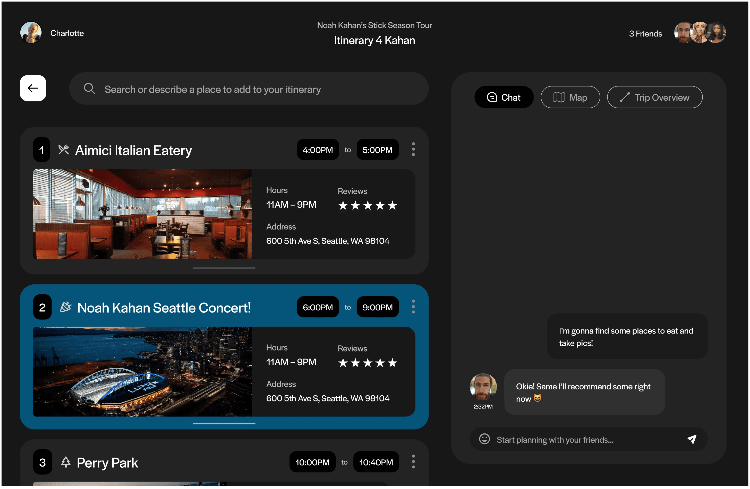
BEFORE
Lacks collaboration, Incohesive with other touchpoints, "Airport vibes"
I originally had a chat box for groups to plan together. However, this felt too restrained, and our main feedback was to make the platform more collaborative and engaging.
AFTER
Interactions geared towards collaboration, More optimal layout
I completely redesigned the interaction and user flow of the collaborative planning page, introducing features like suggestions, comments, and voting/likes to enhance collaboration. By adding multiple points for users to engage with one another, I felt it created a more interactive planning experience.
Additionally, I integrated the artist's colors and photos and refined the layout to provide clearer navigation from discovery and search to finalizing the itinerary.
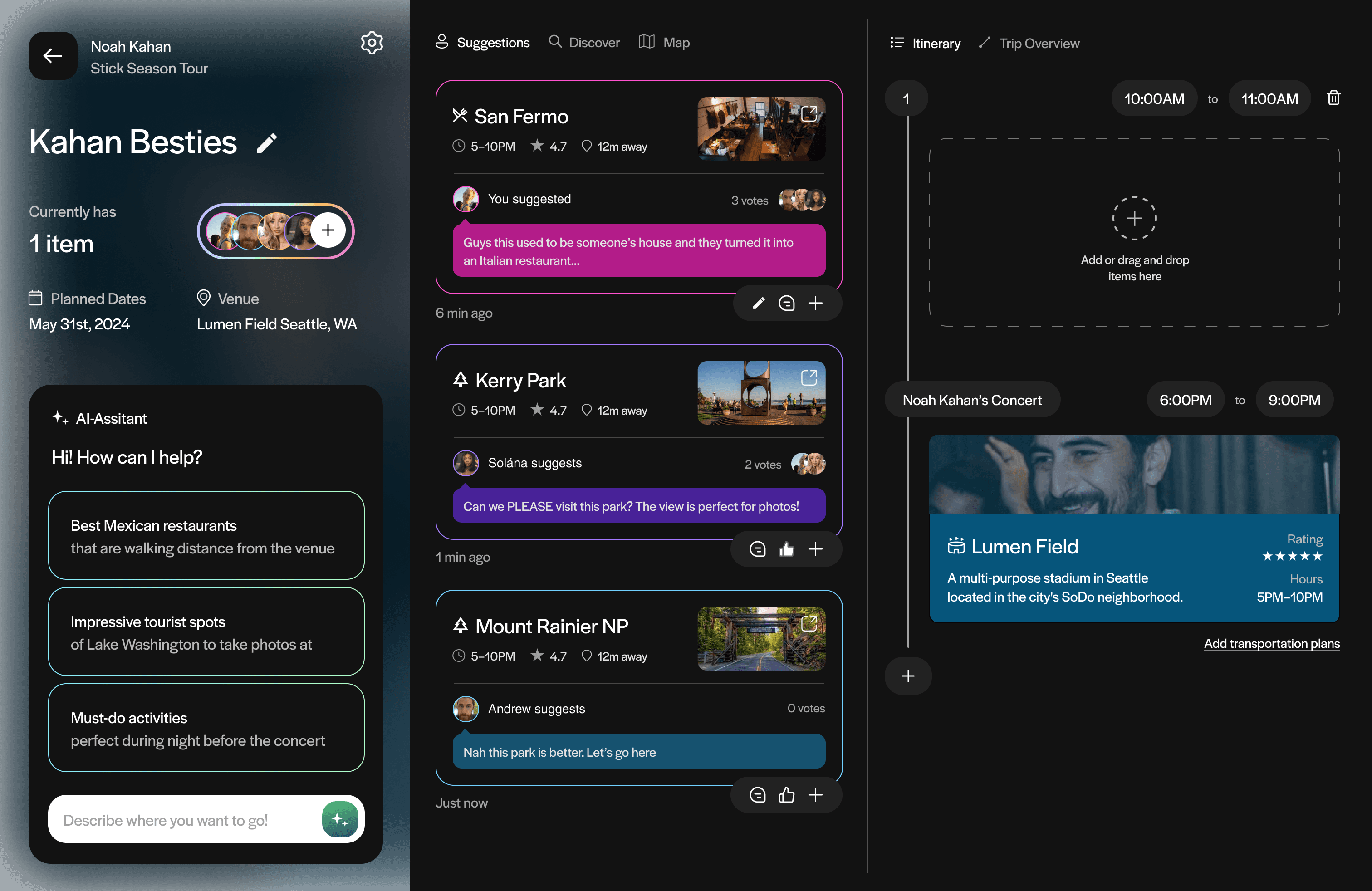
BEFORE
Room for visual polish, Unclear Interactions,
We received feedback on our visual design, specifically regarding spacing and typography, which we hadn't fully refined at the time of this deliverable. This feedback provided valuable insights into how we could better present and organize information to make it more readable and useful for users.
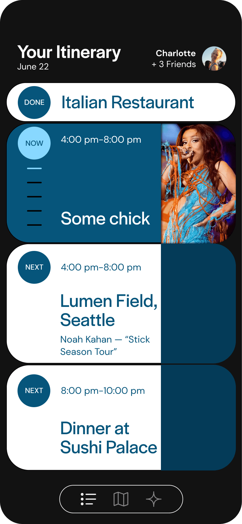
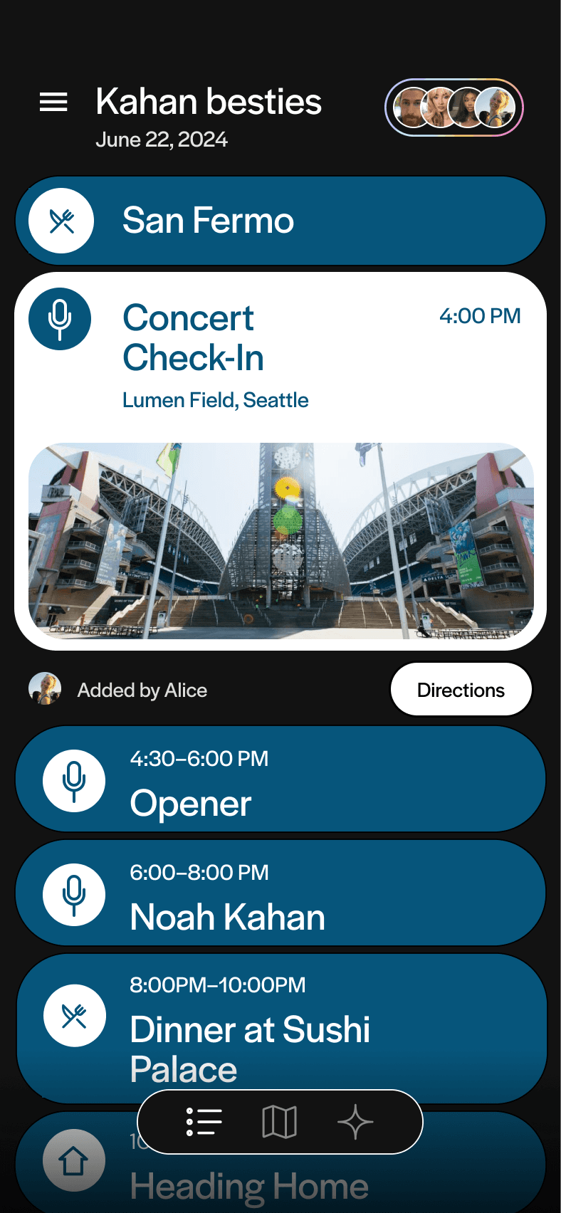
AFTER
Improved visual hierarchy, Clearer Interaction Model
Our original screen lacked clear hierarchy, making it difficult for users to know what to focus on and prioritize.
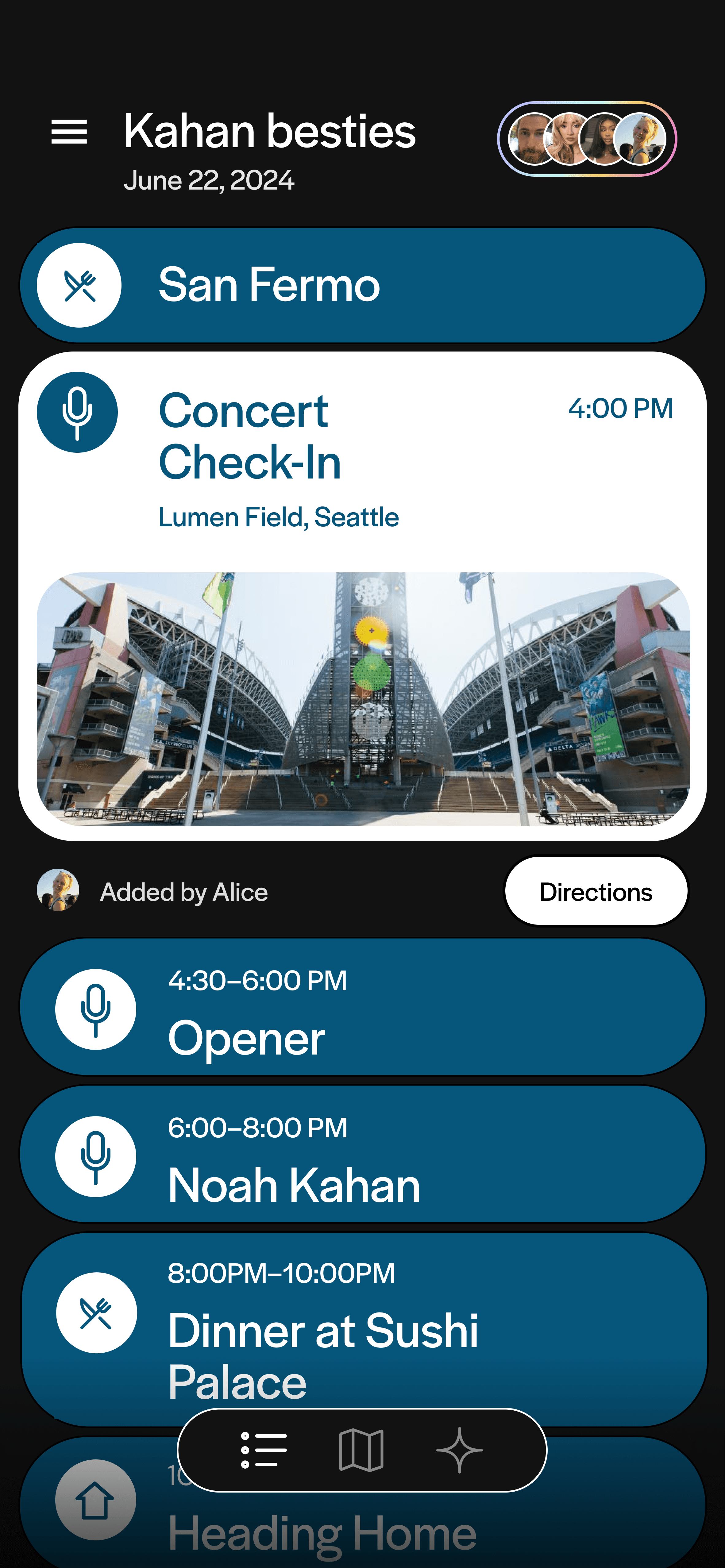
To address this, I adjusted the hierarchy by emphasizing key elements like the event's start time and title, and moving the photo below the title to create more space and maintain a clean vertical layout.
Additionally, I incorporated a collaborative element from the desktop version, adding a note to show who found each event and a button for directions, giving users an actionable step instead of just presenting static information.
LOOKING BACK
What I'd Do Differently
Defining our app more.
I wish I had narrowed the app's scope and ensured better cohesion across touchpoints. Defining and refining the user journey and core features earlier would have created a more seamless and focused experience, allowing the design to feel more intentional and cohesive.
Refining our brand, user experience, and design system.
While our screens improved significantly, there's still room for polish. The design system relied more on intuition than strategy, and refining it with artist colors and elements could better immerse users. Enhancing itinerary interactions and app infrastructure would also elevate the experience.
Incorporating exciting and fun features.
Our workshops generated many exciting and promising ideas that could have enhanced the mobile touchpoint. However, time constraints and our focus on the itinerary feature meant we couldn't incorporate them. I’d love to bring these concepts to life in the future, as they hold great potential and are features I’d personally enjoy using.
Lesson 1
The Power of Iteration
For the first time, I was challenged to focus on producing as much as possible in my designs, pushing me to expansively explore different concepts and styles to find the right fit. This approach helped me see the value of covering a lot of ground—not only to refine our solutions but also to understand the paths we didn’t take. This insight proved useful in supporting our final choices and gave us greater confidence in our decisions.
Lesson 2
Aligning User Needs and Business Goals
I learned the importance of prioritizing business goals in design. Conducting competitive audits and market analysis helped me understand how our product could stand out and who it would serve. This process emphasized the need to align design decisions with both user needs and business objectives, making me realize how crucial it is to base our choices on strategic insights rather than just intuition.
Lesson 3
Explaining the Why
I’ve come to realize that explaining the "why" behind design and research decisions is absolutely essential. It’s not just about what I design, but about being able to clearly articulate the reasoning behind it. It helps everyone stay aligned with the project’s goals and ensures that decisions are intentional, not just based on gut feeling. This process also makes me reflect on the choices I make, pushing me to continuously evaluate if they’re truly serving the user and the overall vision.
Special thanks to my team and professor :')



Elisha Jeon © 2024
9.14.24


