Sun Mode

updated 12.18.25
Azure IoT / Dashboard & App
Intelligent monitoring for the production line.
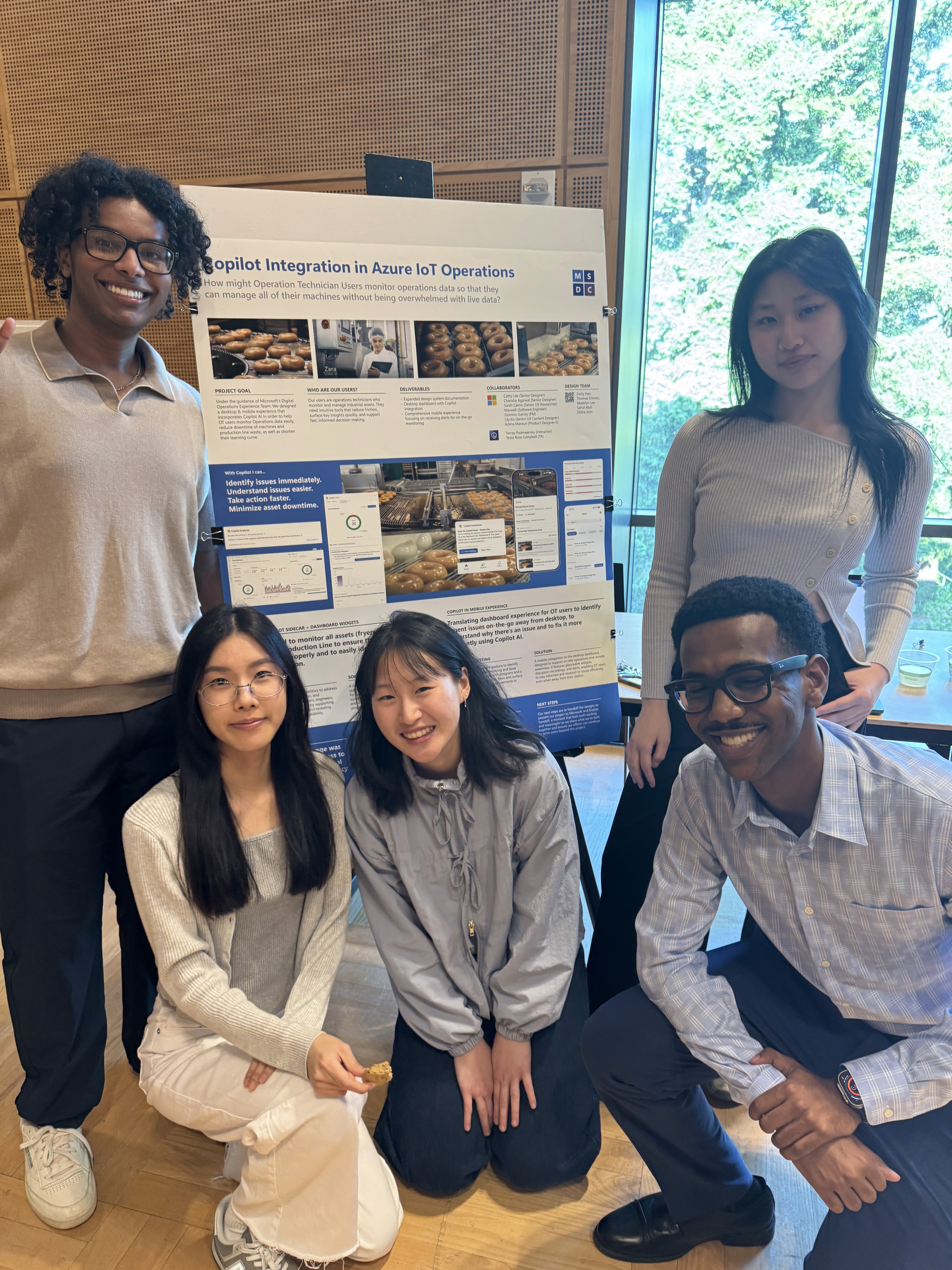
Designing an AI-powered dashboard and mobile companion that helps Operation Technicians manage thousands of machines without cognitive overload.
Role
UX/UI Designer
Timeline
6 months
January – June 2025
Team
Sahal Abdi, Madelyn Lee, Thomas Emnetu, Emily Hao, & Elisha Jeon
Skills
Overview
How might we help Operation Technicians monitor thousands of machines without being overwhelmed by data?
A 6-month journey redesigning enterprise monitoring.
As one of five designers on this sponsored capstone for Microsoft, I reimagined how Operation Technicians use Azure IoT. The first three months focused on dashboard redesign with AI Copilot integration. The next three explored net-new mobile experiences for on-the-go monitoring. I personally led the design of glanceable summaries and remote monitoring on the mobile app.
The Problem
Monitoring thousands of machines creates cognitive overload.
When everything is urgent, nothing is.
Azure IoT helps Operation Technicians manage production lines — think donut factories or automotive plants with hundreds of machines running simultaneously. The current experience? A flood of raw data with no clear priorities.
KEY GAPS
Dashboard floods with alerts during critical situations with no priority system.
Wastes time piecing together information from multiple sources
Must physically leave station to investigate, leaving the dashboard behind
No mobile access — OT's can't monitor on-the-go
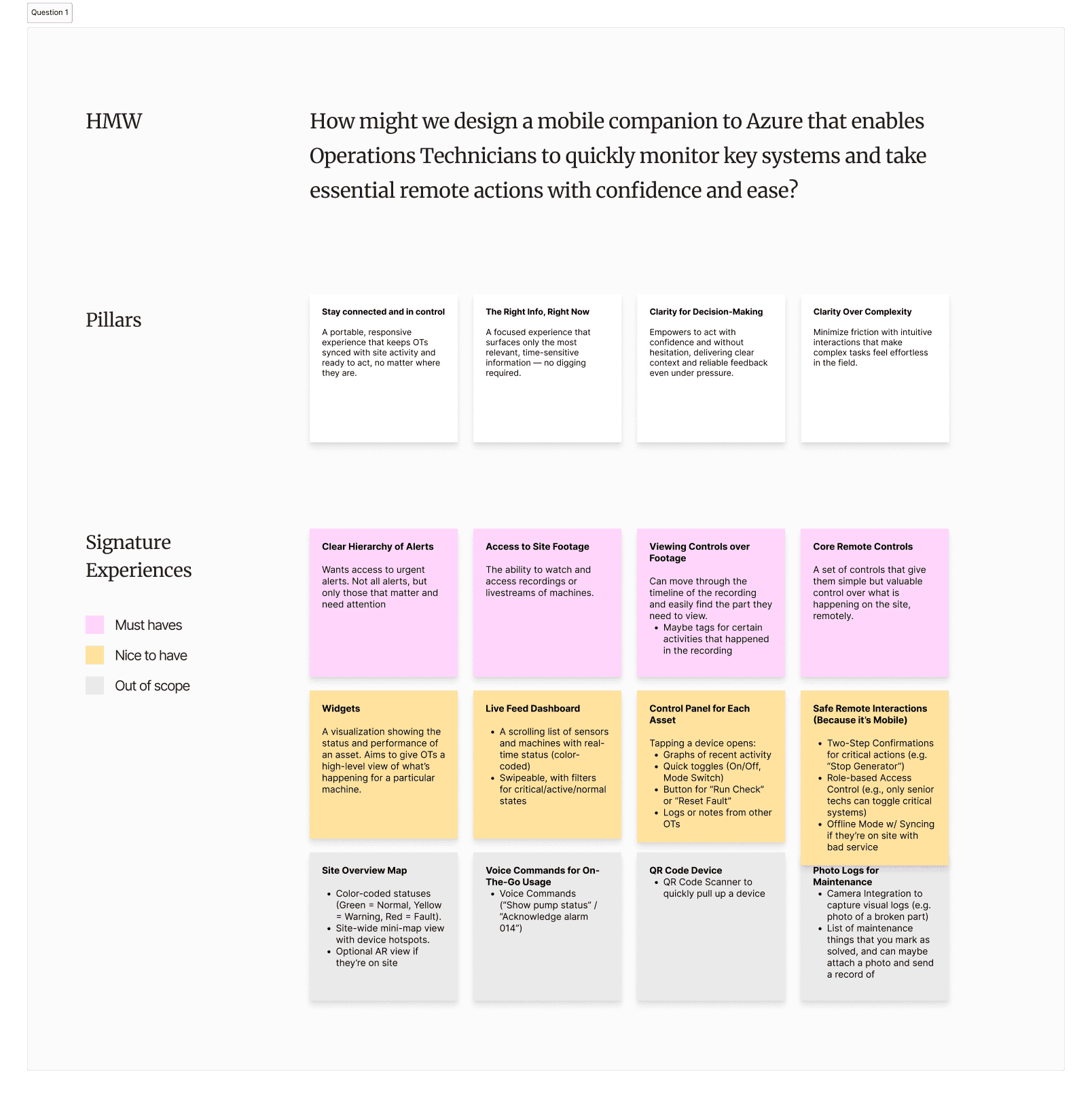
Solution
Introducing a Copilot AI integrated dashboard + mobile companion.
AI-powered monitoring across platforms.
We redesigned the Azure IoT experience across two platforms: an intelligent desktop dashboard with Copilot integration for comprehensive monitoring, and a mobile app for on-the-go checks and essential remote actions.
Core flows
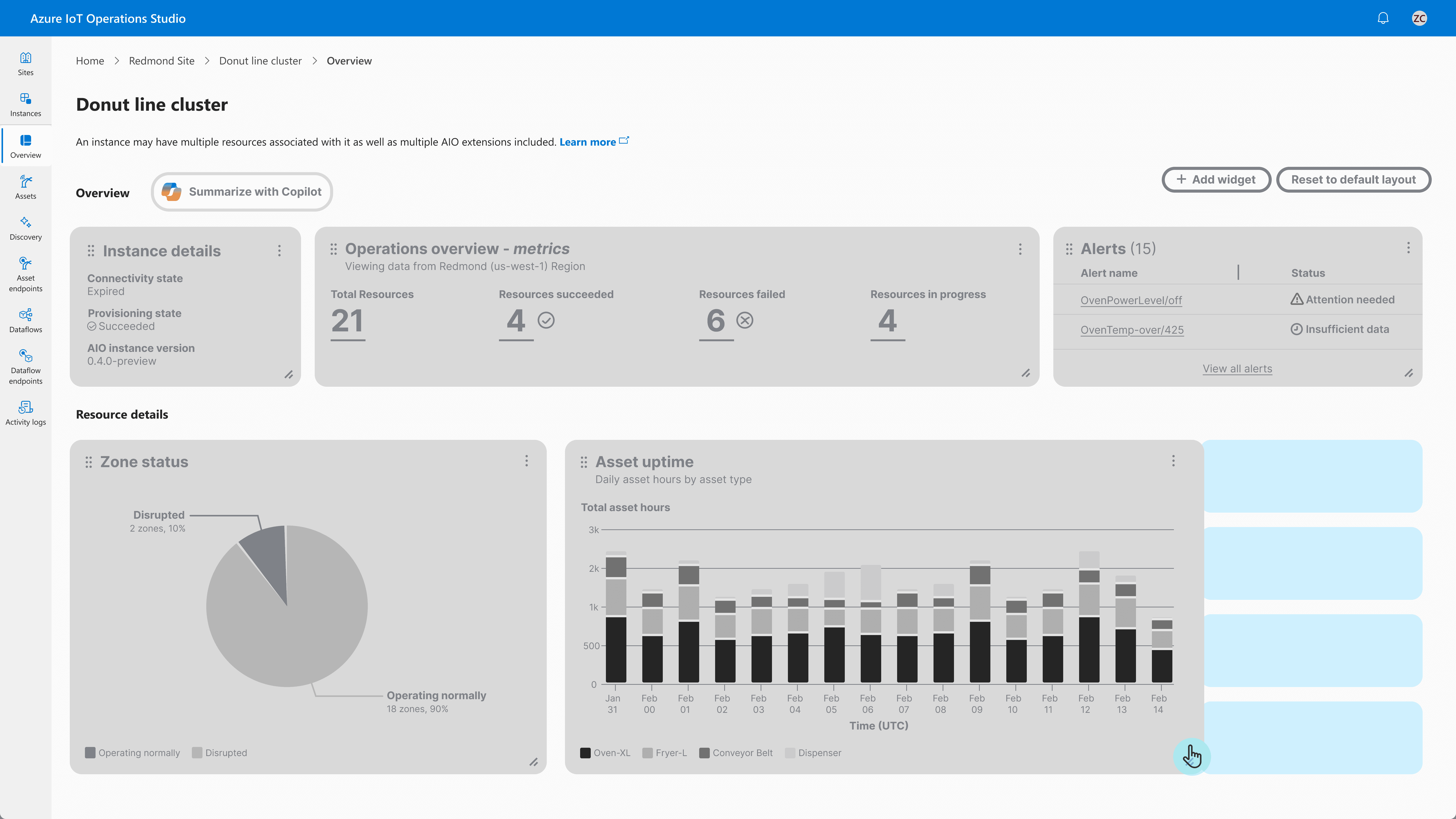
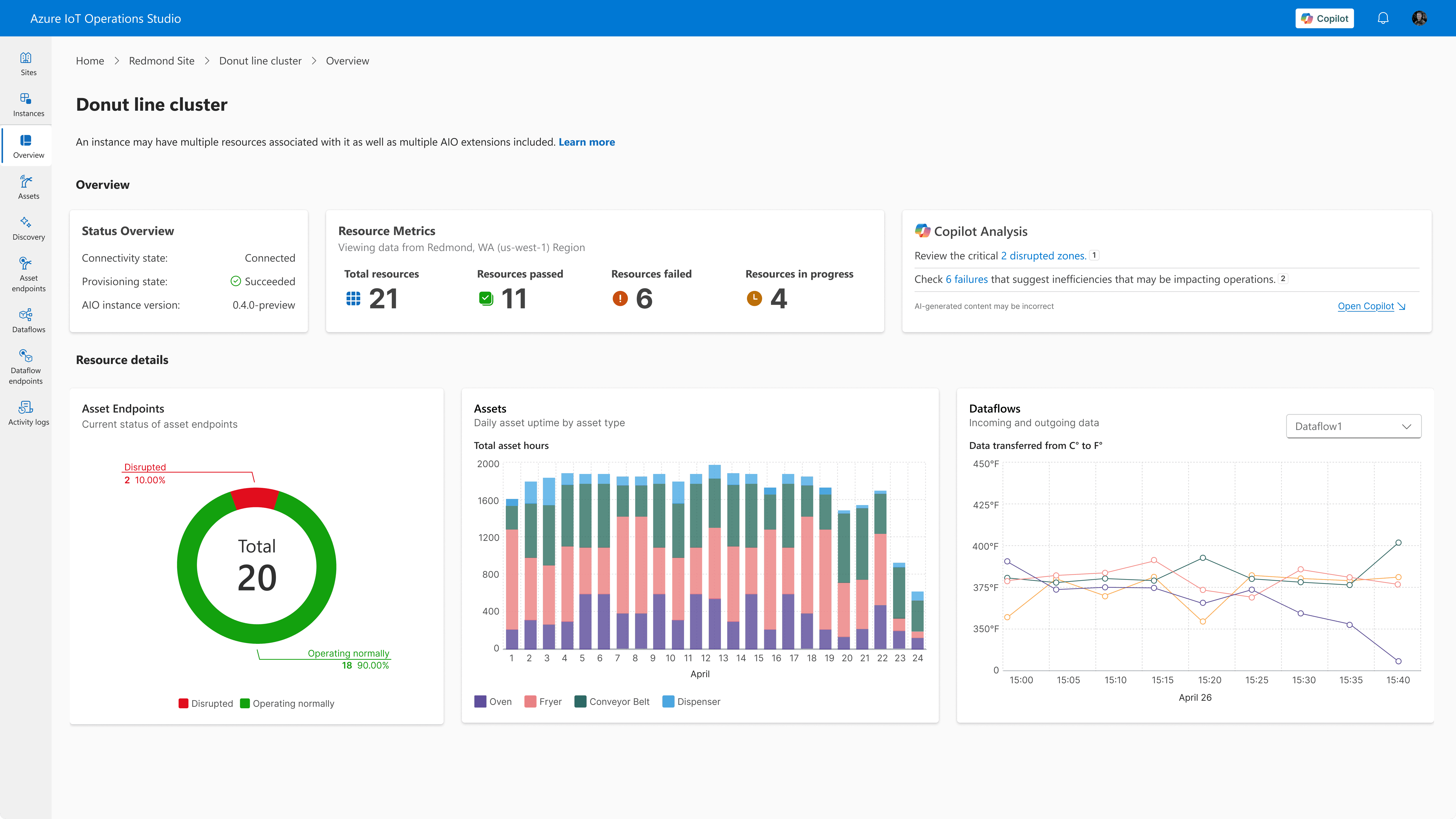
Dashboard
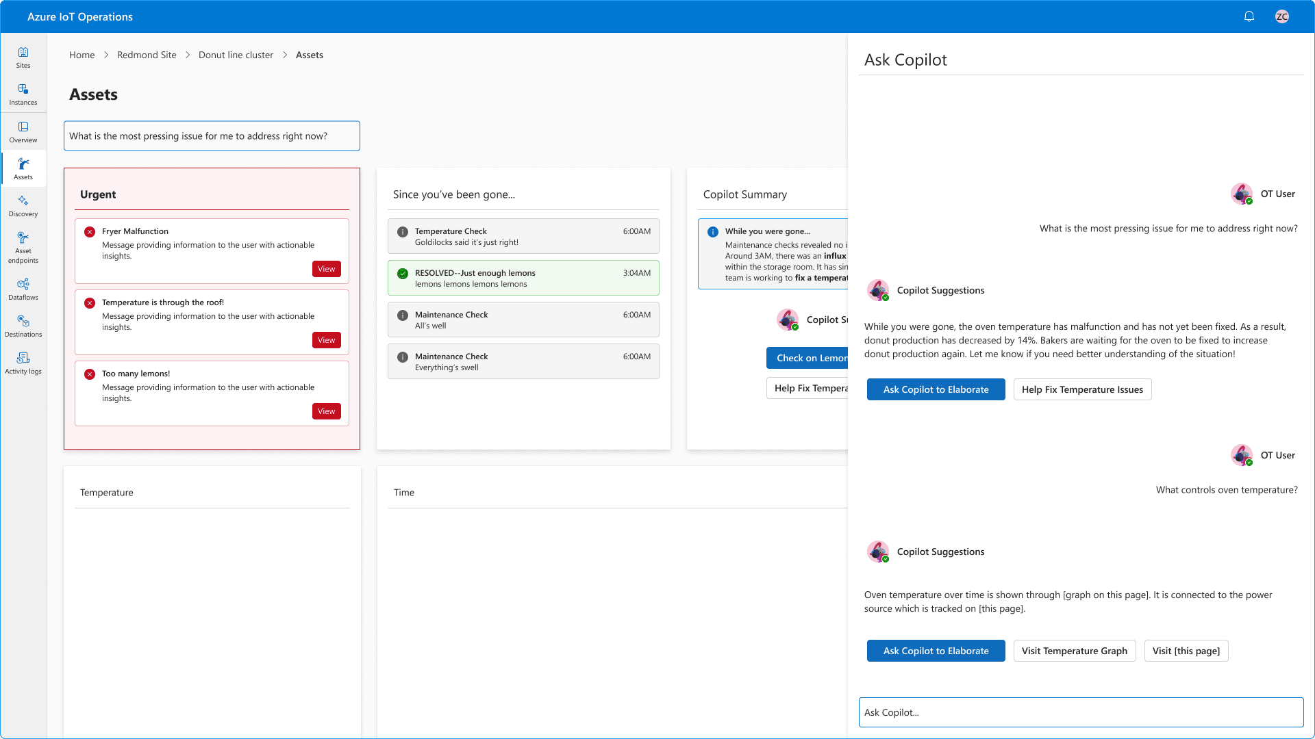
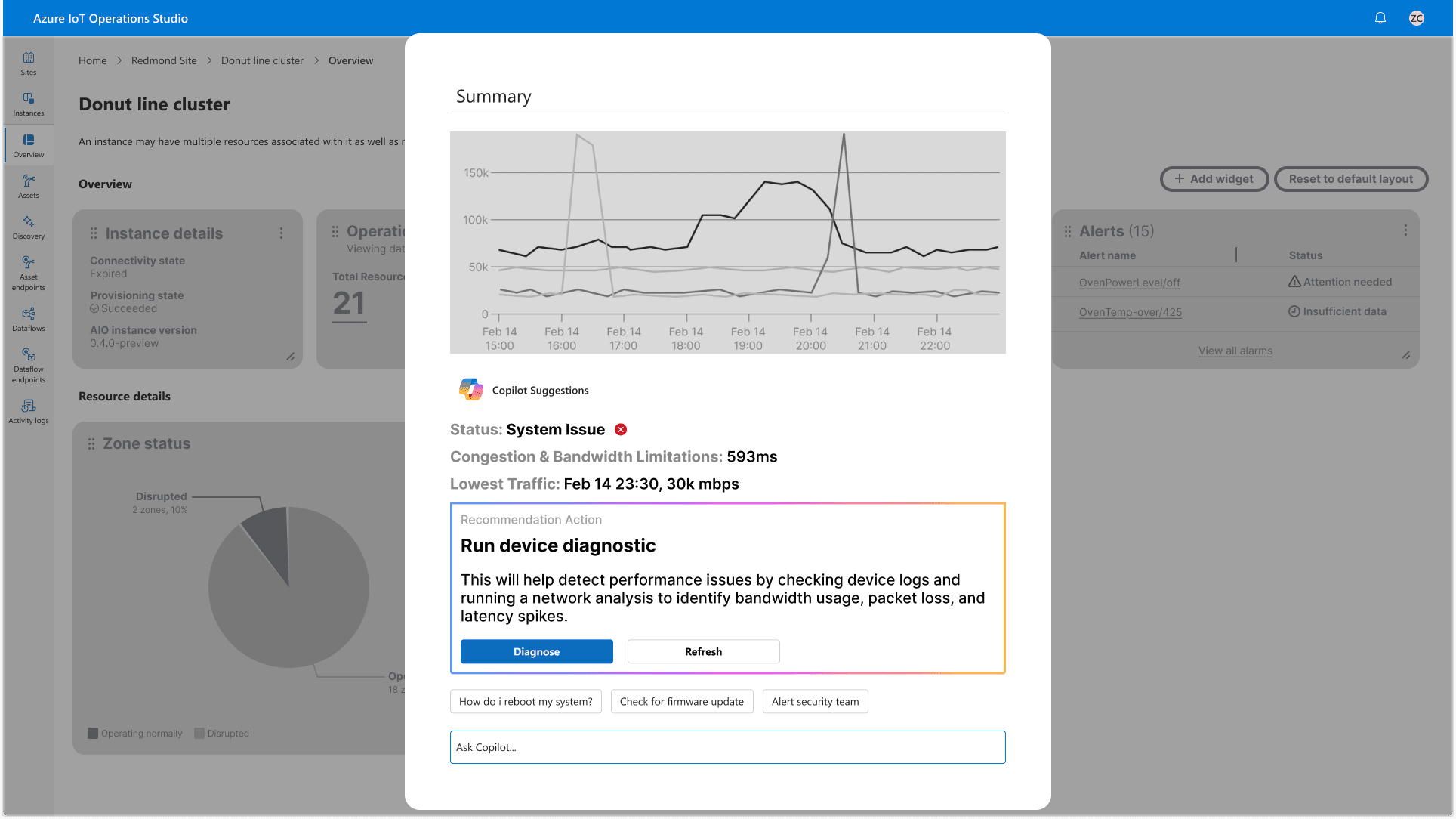
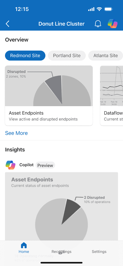
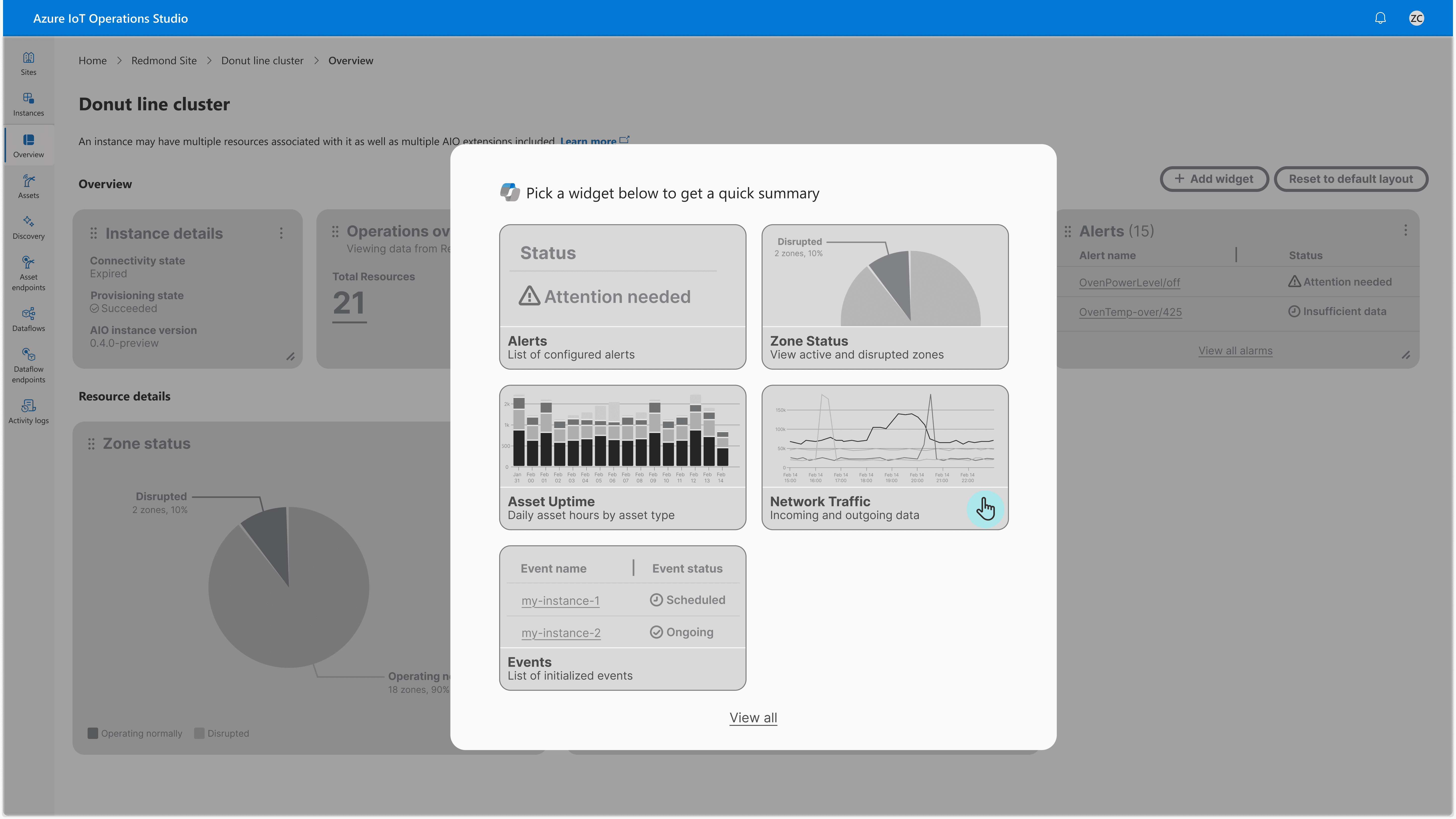
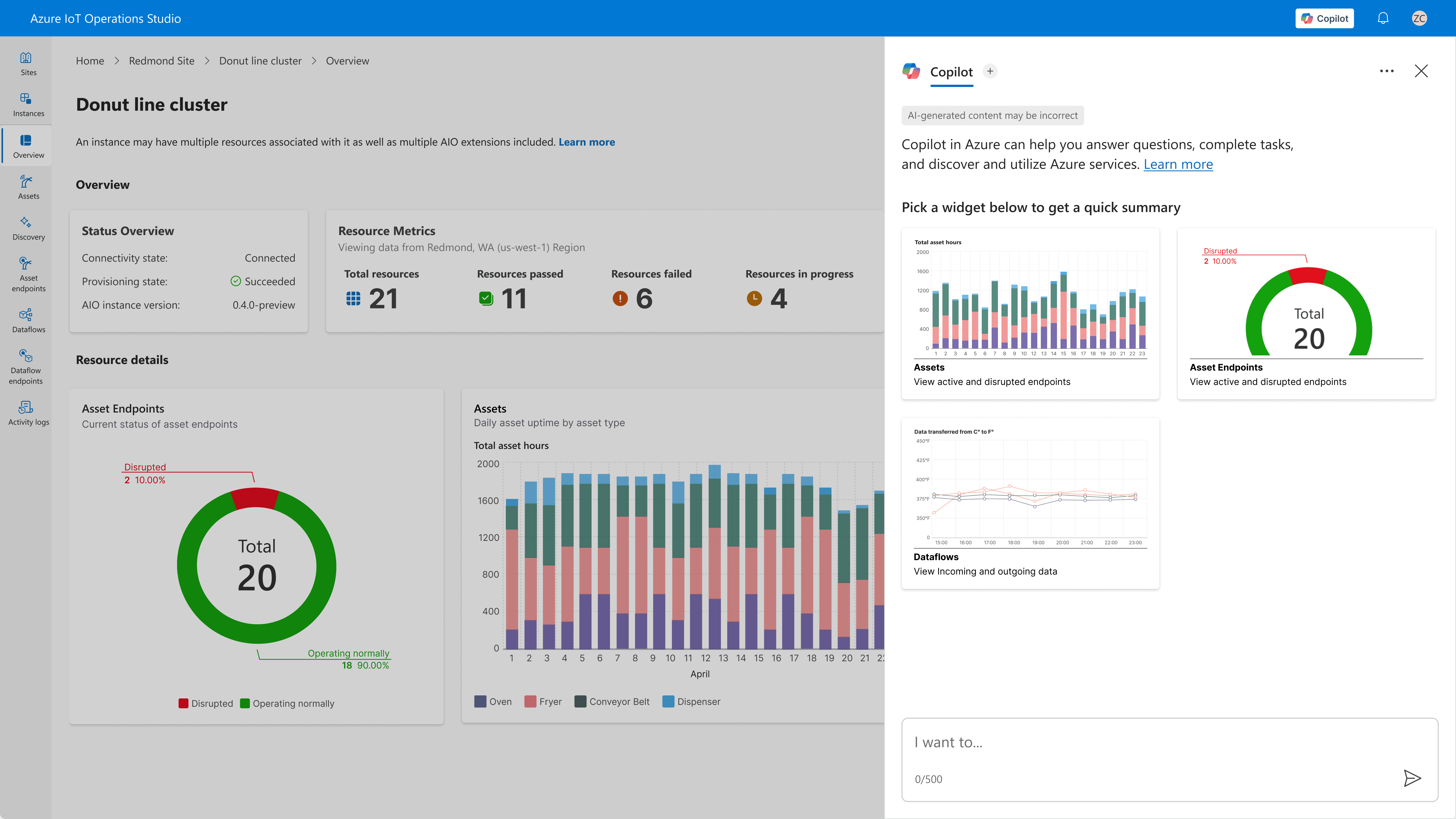
01 WIDGETS
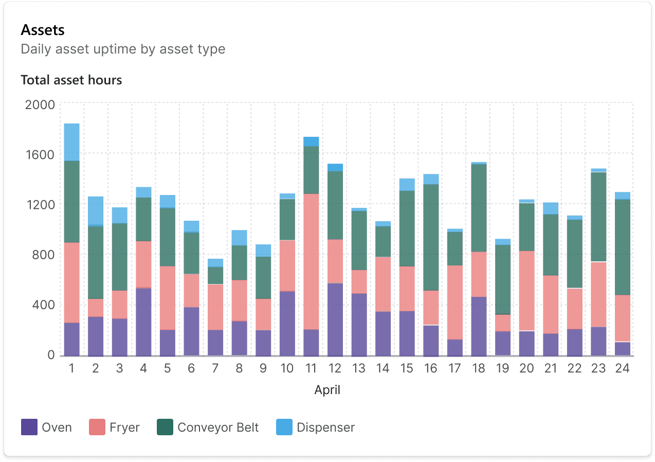
Quick-glance insights
To understand trends and see visual summaries of data, our team designed visualizations that would live on the dashboard — the first thing you see when you log on. This way, OTs can quickly assess the health of their systems at a glance without digging through raw data or navigating multiple screens.
02 COPILOT AI
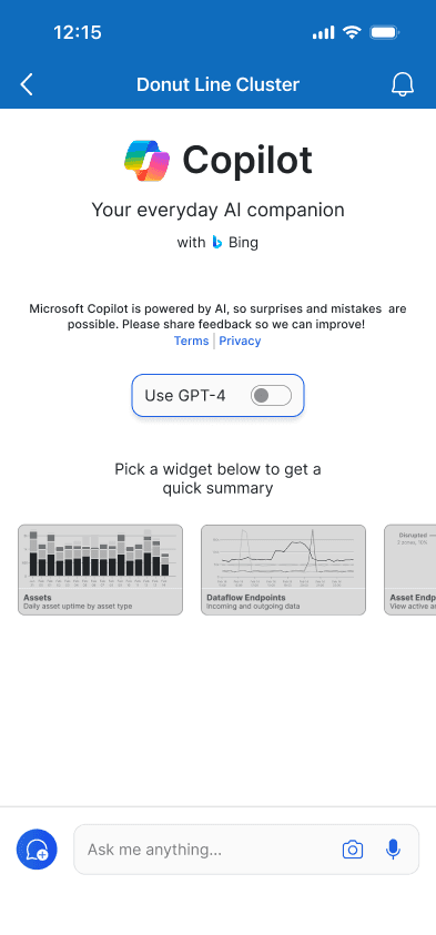
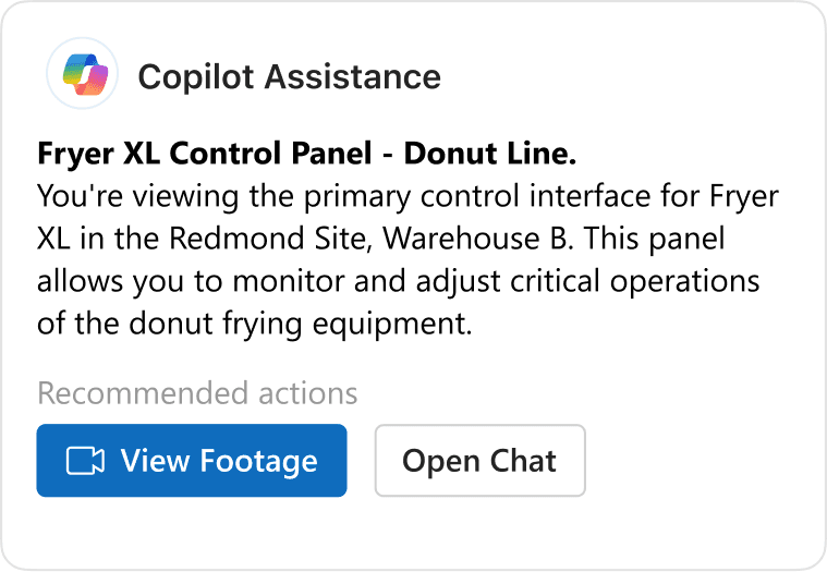
Use Copilot AI to investigate and get answers instantly.
To access insights efficiently, OTs can ask Copilot questions in natural language. Instead of reading documentation or analyzing data manually, they get immediate answers with recommended actions.
03 TABS
Keep your workflow seamless with persistent tabs.
Data often overlaps and is connected. To keep your workspace as flexible as the data you work with, Copilot tabs stay accessible across all pages so you can start a conversation on one screen, navigate elsewhere, and pick up right where you left off.
03 MESSAGE
Share diagnoses instantly with your team.
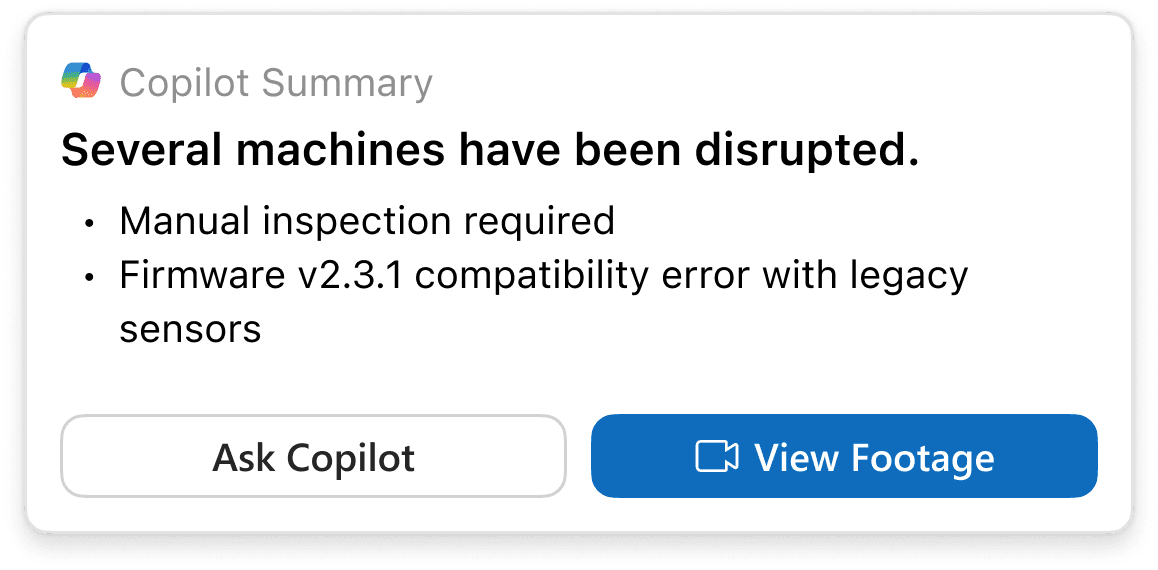
Copilot identifies the problem source and generates a message with full context — what happened, when, and why. Send it to Teams chat with one click, keeping everyone aligned without manual report writing.
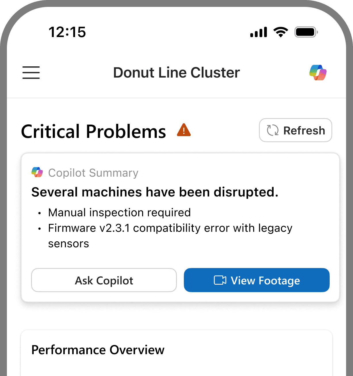
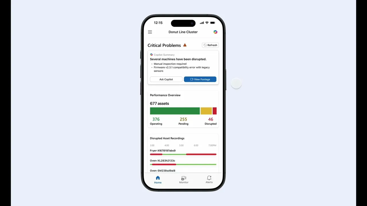
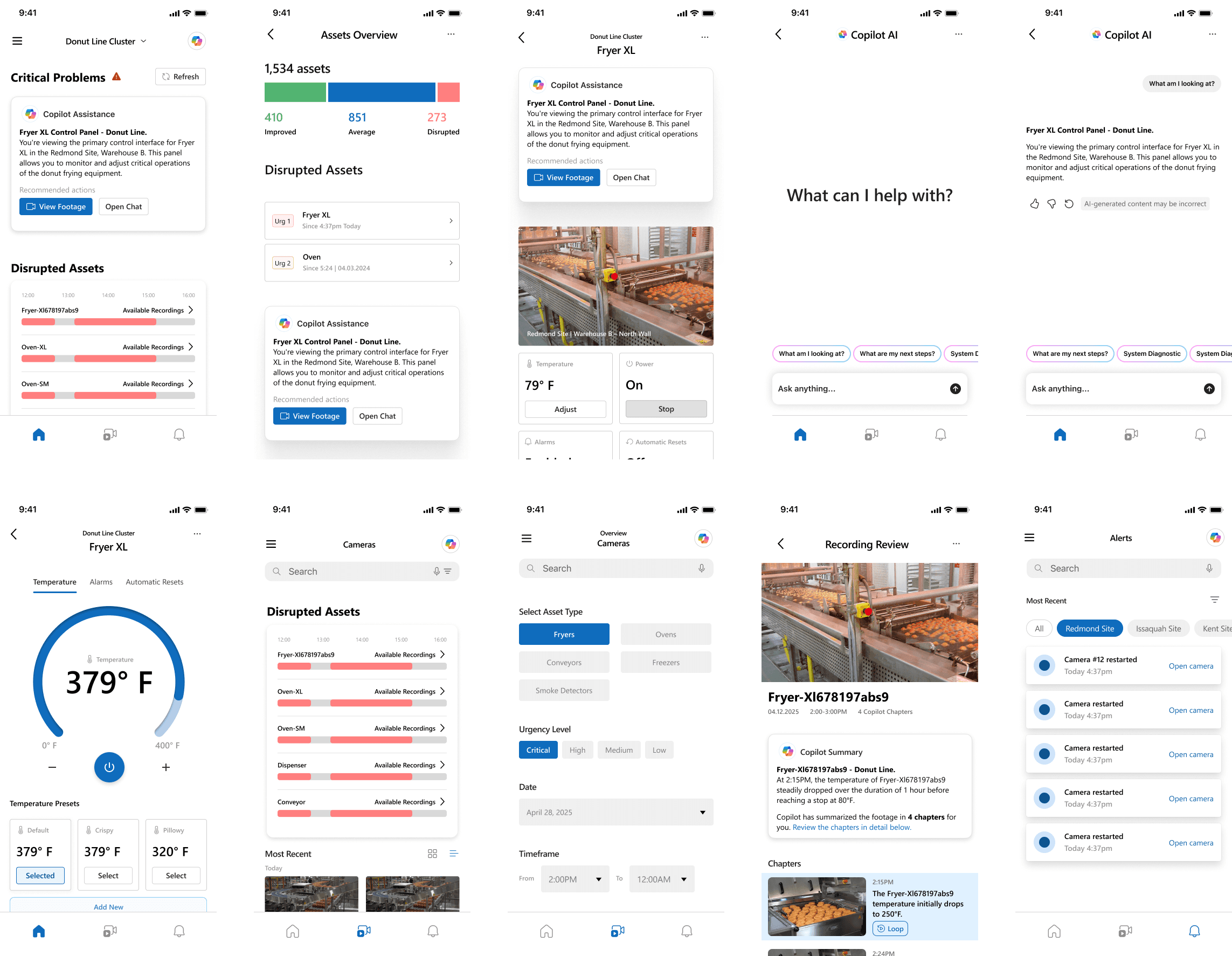
Mobile App
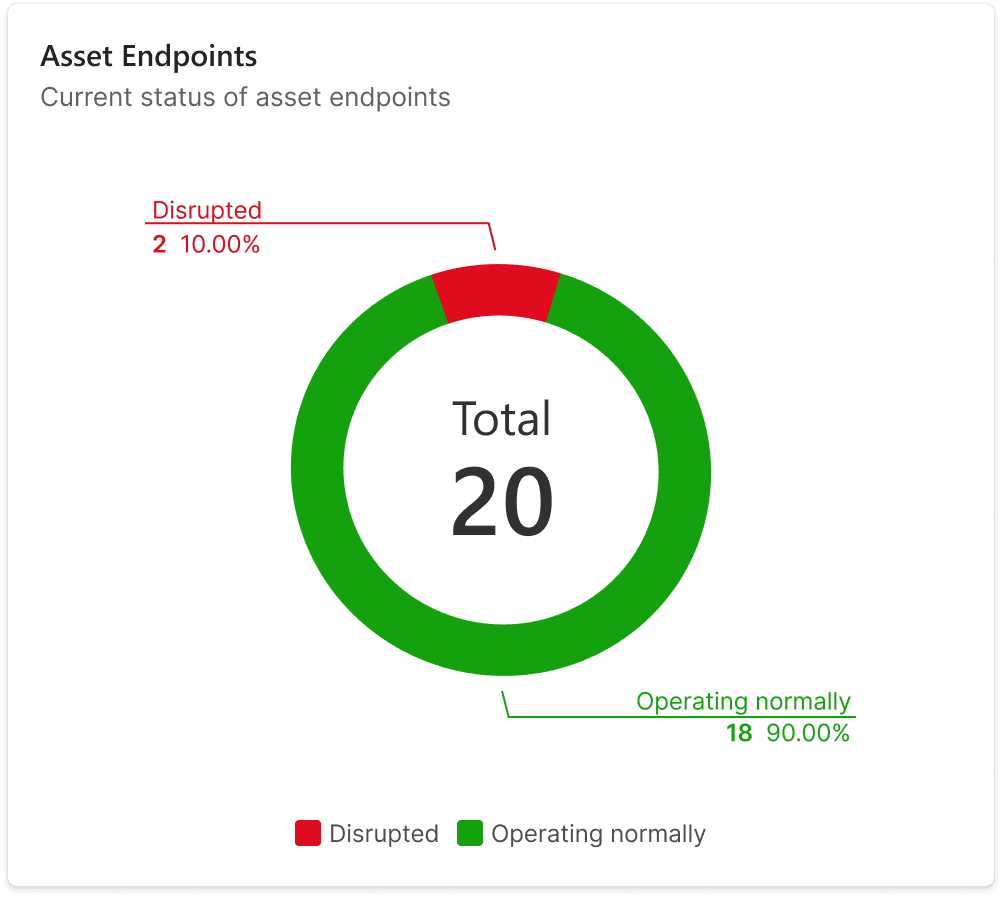
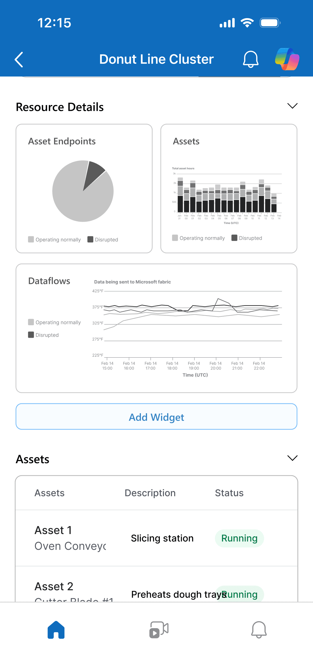
Glanceable summary widgets to understand on-the-go.
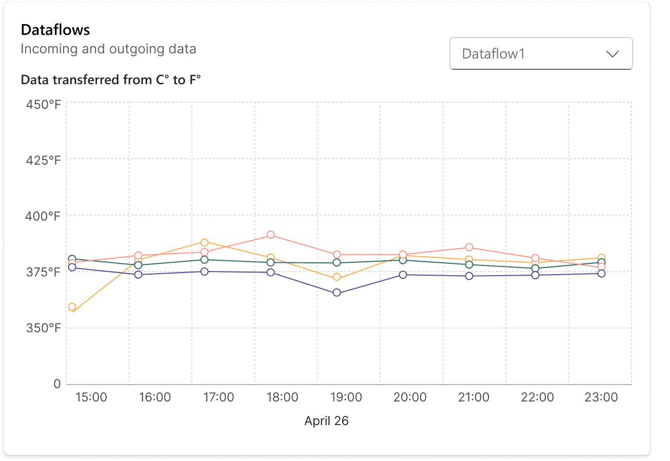
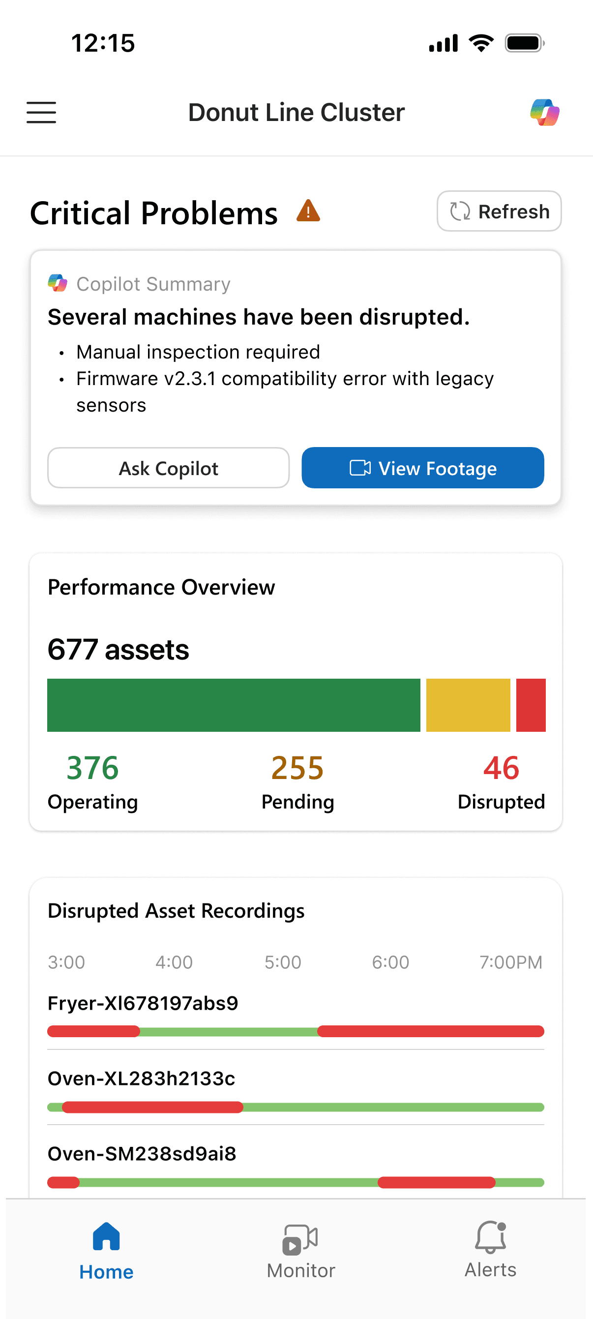
Mobile widgets show how each production line and asset is performing without overwhelming you with details. Copilot summaries at the top lets you understand system health in seconds, even while moving between locations.
01 SUMMARY WIDGETS
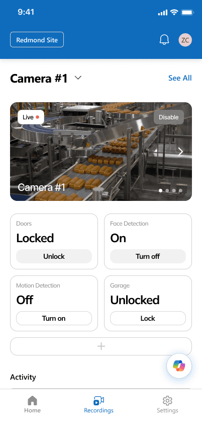
02 REMOTE CONTROLS
Take action from anywhere.
OTs can manage equipment remotely through quick, templated controls. Restart a machine, change operating modes, or adjust settings directly from your phone.
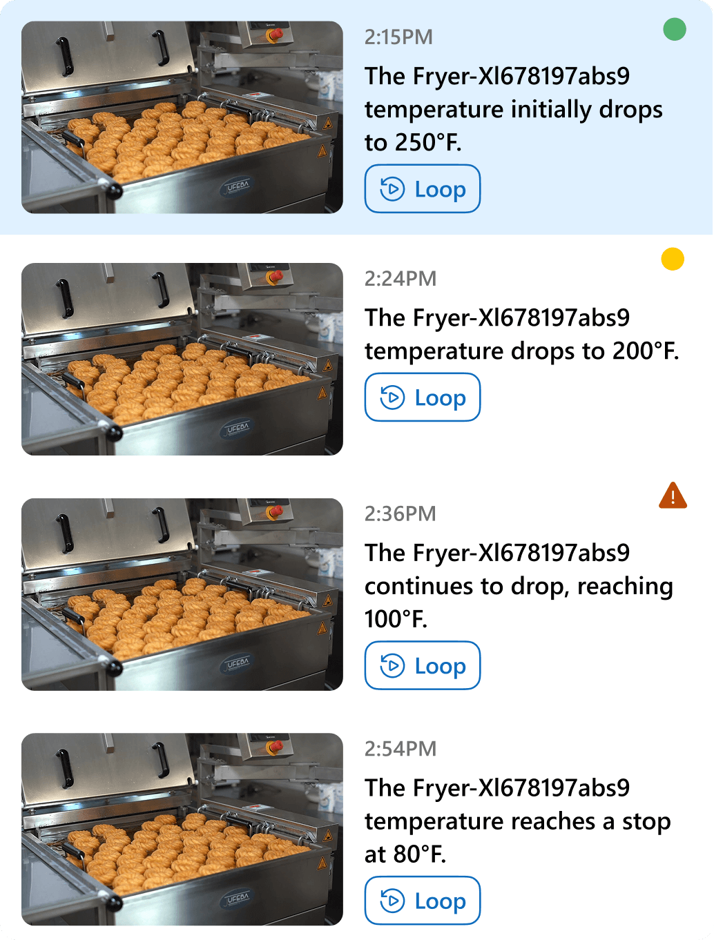
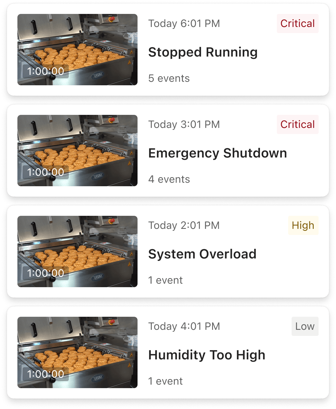
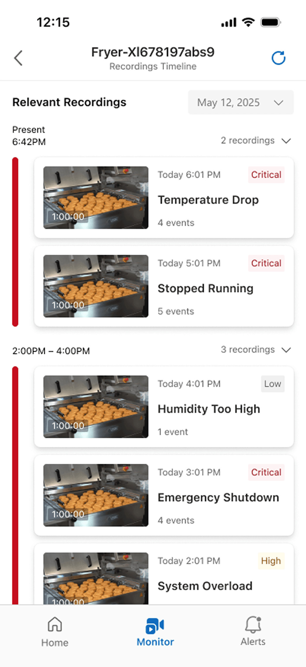
03 PRIORITIZED ALERTS
Prioritized alerts that show what matters most.
No more guessing what needs attention first. The mobile app clearly communicates urgency and potential production impact, so OTs know exactly what needs attention first. Color, text, and priority tags work together to guide decisions.
04 COPILOT CHAT
Get quick answers without leaving the floor.
When you're on the production floor and need information fast, ask Copilot questions from your phone. Get context-aware answers and recommended next steps instantly — no documentation hunting or returning to your desk required.
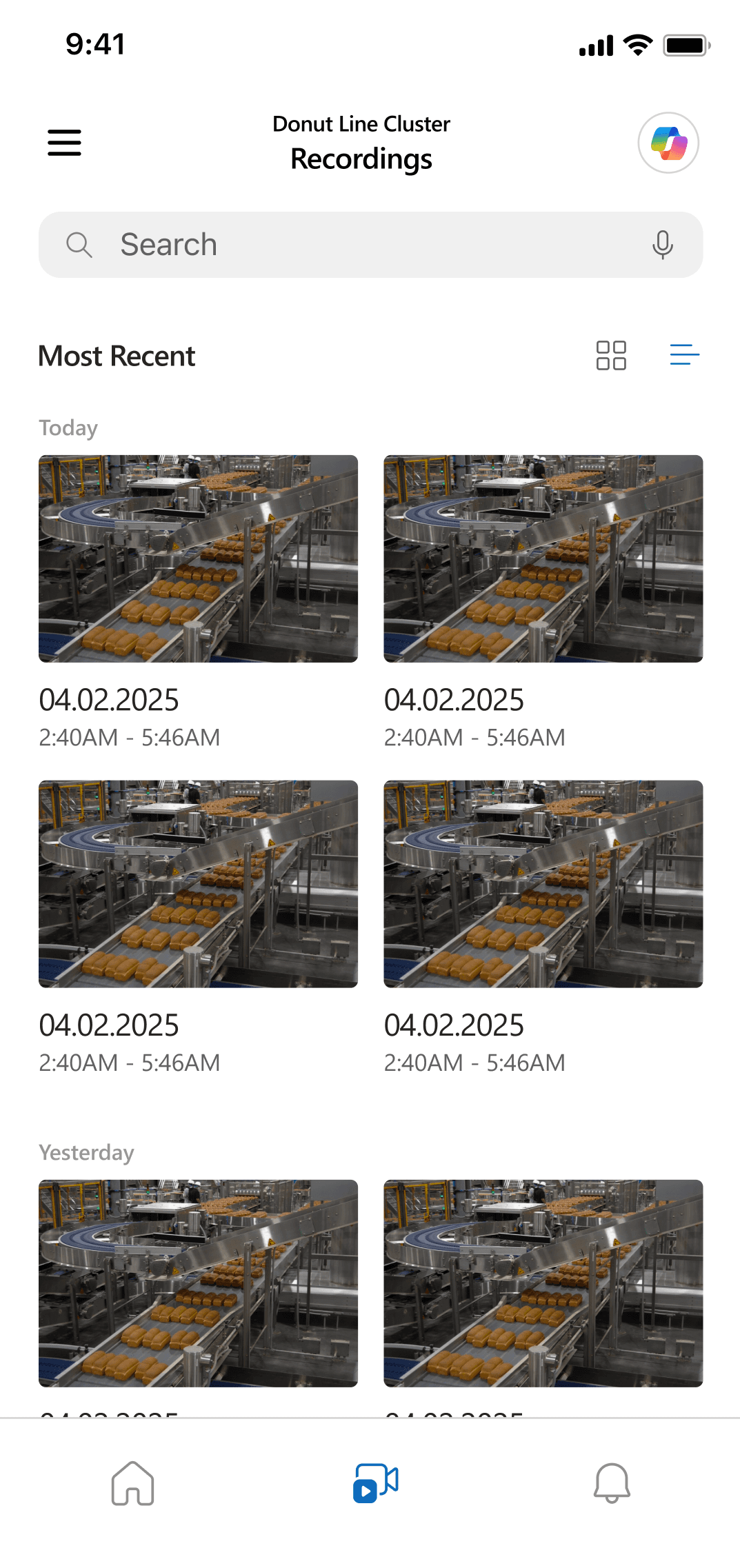
05 RECORDINGS
Review footage before visiting the site.
Access camera feeds with AI summaries highlighting disruptions. OTs can review footage, understand the issue's scope, and decide whether an in-person visit is necessary — saving unnecessary trips while staying informed.
User Research
Who are Operation Technicians?
Designing for both new and experienced OTs.
Using internal user role cards and meeting with Azure IoT stakeholders, we synthesized and developed two user personas — one for new and another for experienced users. Their needs differed significantly despite sharing the same role: new users needed guidance, experienced users needed efficiency.
DAY 0 USER
Lucia
New to Azure IoT Platform that her company freshly adopted, Lucia struggles to integrate it into her routine. She wishes there was an easier and faster way to access urgent information.
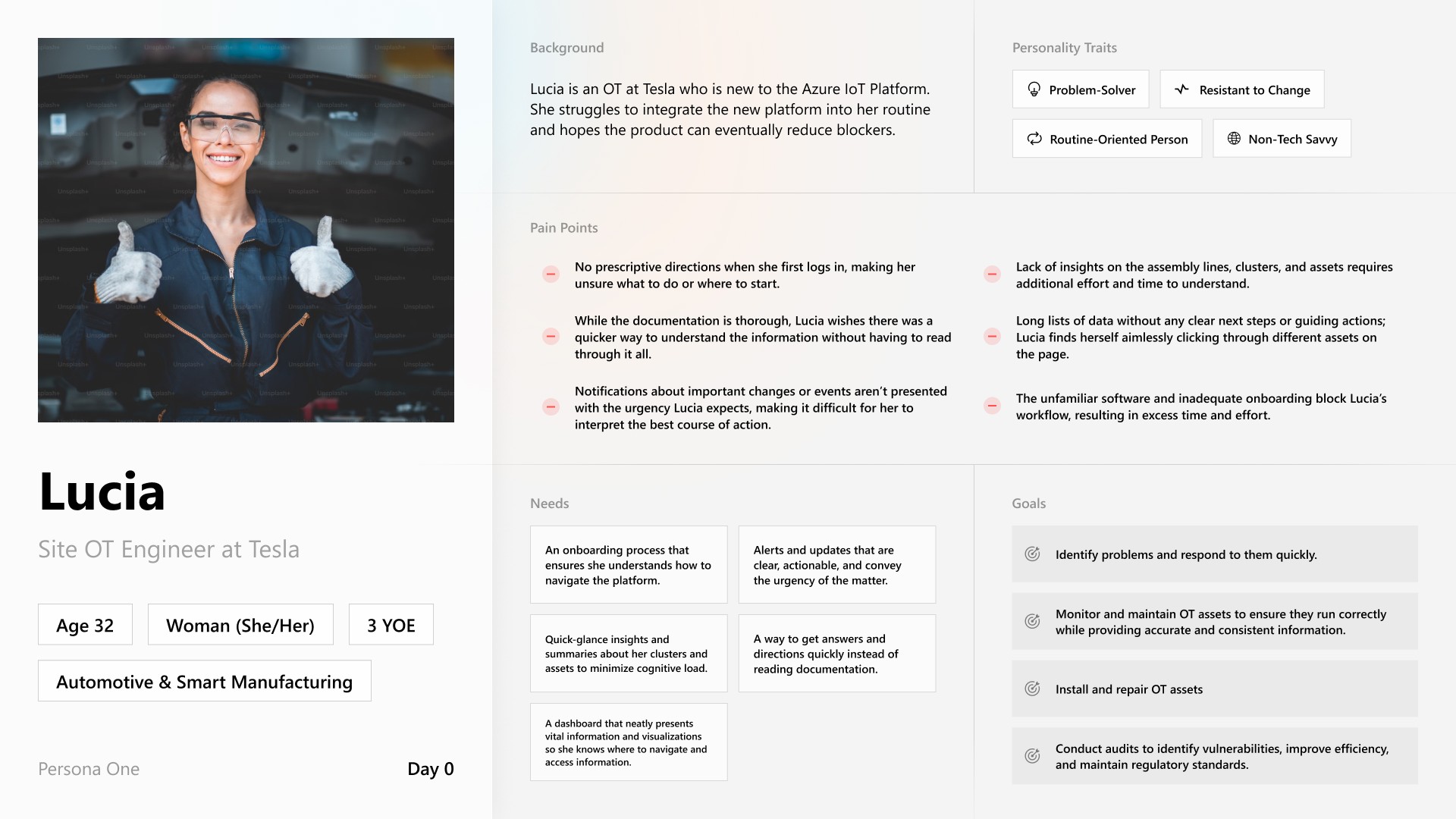
PAIN POINTS
No prescriptive directions when logging in; unsure what to do or where to start
Lack of insights on assets requires extra effort to understand
Wishes for quicker understanding without reading all documentation
Notifications don't convey urgency; difficult to interpret best action
NEEDS
Onboarding that ensures she understands navigation
Clear, actionable alerts that convey urgency
Quick-glance insights to minimize cognitive load
Quick answers instead of reading documentation
DAY 30 USER
Mateo
Mateo is an experienced user that understands the system, but it doesn't help him make quick decisions. There's too much raw data, and he constantly has to switch between views.
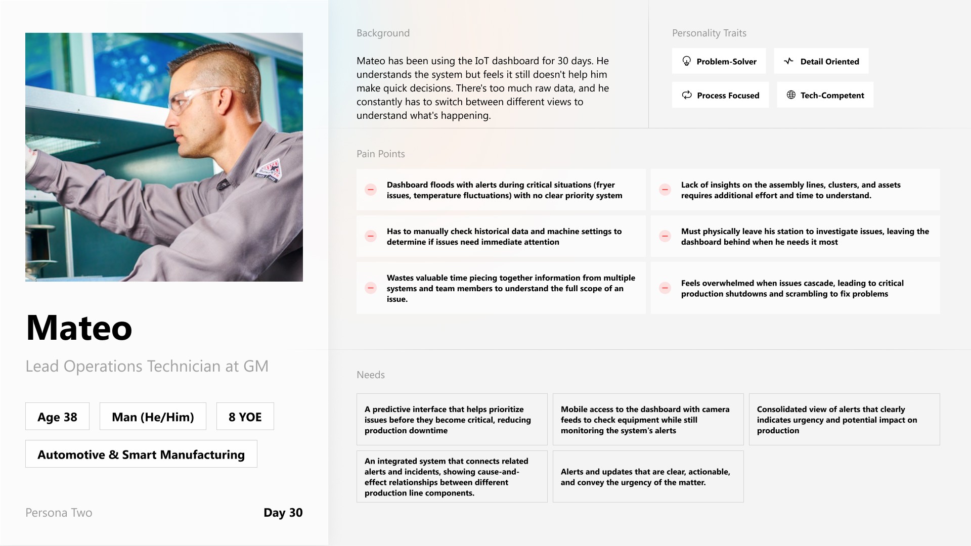
PAIN POINTS
Dashboard floods with alerts with no priority system
Must manually check historical data for immediate attention
Wastes time piecing together information from multiple systems
Overwhelmed when issues cascade, leading to shutdowns
NEEDS
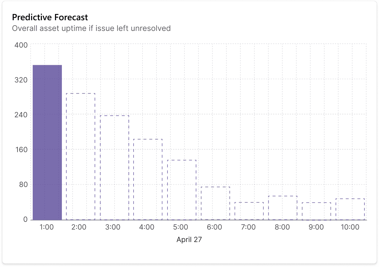
Predictive interface that prioritizes issues before critical
Mobile access with camera feeds to check equipment remotely
Consolidated alerts indicating urgency and production impact
Integrated system showing cause-and-effect between component
Competitive Analysis
Auditing the landscape of IoT tools.
How do other platforms utilize AI agents?
We audited apps like Amazon IoT, ClickUp, Notion, and IBM IoT to see how they support complex systems, and found the best tools minimize cognitive load, adapt to users, and offer predictive guidance.
We also spotted opportunities to simplify workflows, improve clarity, and make AI assistance more intuitive.


Desktop competitors
For mobile apps…
Studying mobile-first monitoring tools.
We analyzed Google's Arlo and Nest — home security and monitoring apps — to understand how they consolidate data for smaller screens. We studied their UI and features to see what level of remote control users have and how information is prioritized on mobile devices.
Mobile app competitors
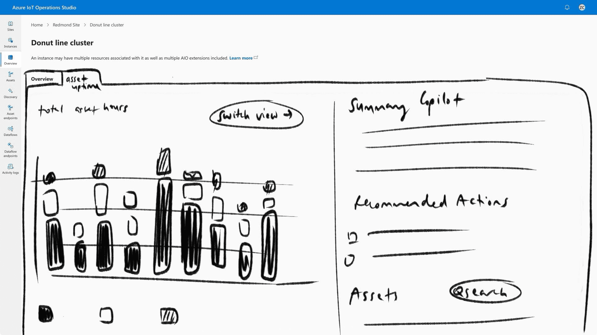
Ideation — Desktop
How might we redesign the dashboard to make critical information effortless to scan?
We focused on improving better search and streamlined workflows
OTs needed to retrieve data quickly, not dig for it. This meant prioritizing information at the surface — right on the dashboard's main view. We whiteboarded and landed on four core ideas, and created low-fidelity mockups for each one:
KEY CONCEPTS
Customizable dashboard
To fit every user and their unique needs.
Copilot Integration
For fast and easy retrieval of data and insights.
Actionable insights and alerts
To make urgent actions clear and minimize cognitive load.
Tab windows
For more flexible and optimized workflows.
01 CUSTOMIZABLE DASHBOARD
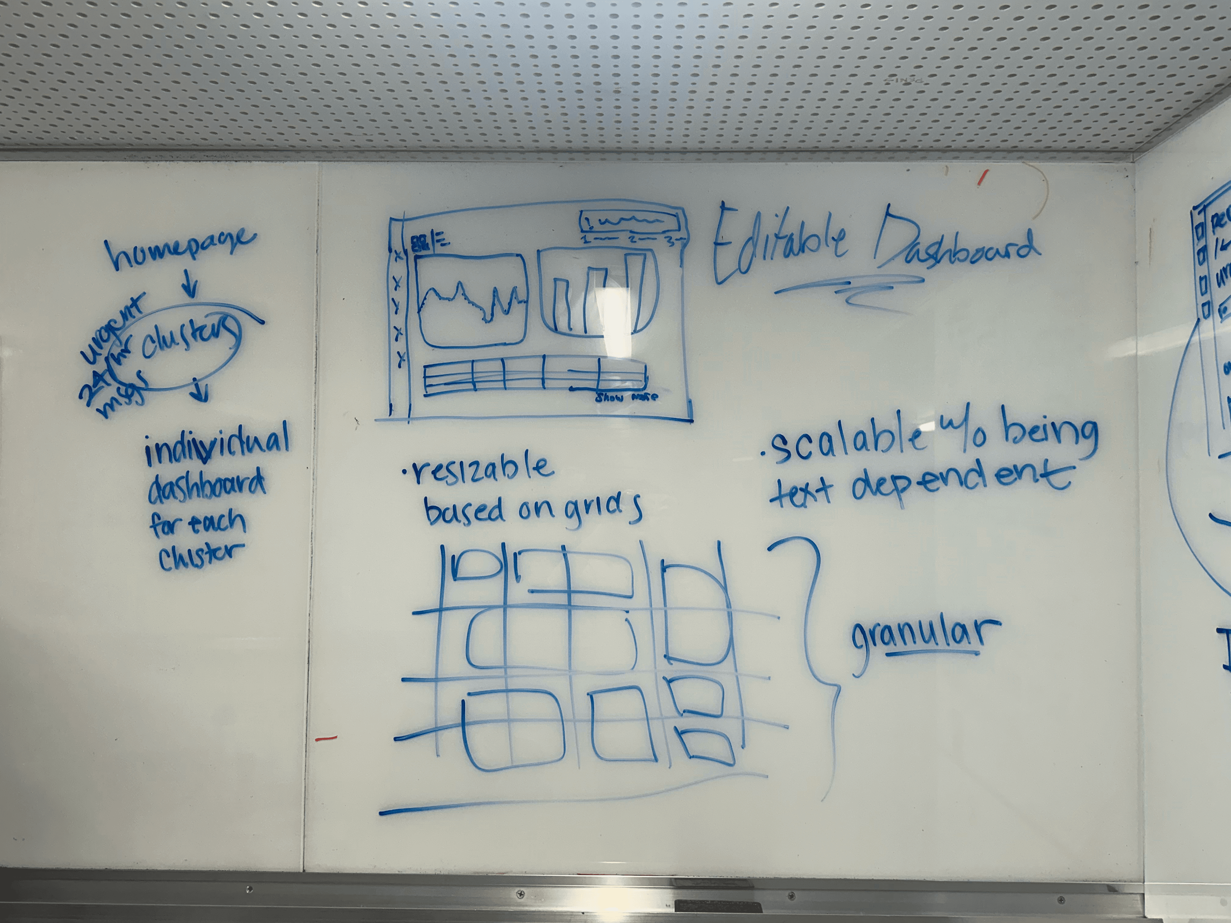

02 ALERTS & COPILOT CHAT

03 WIDGET MODAL
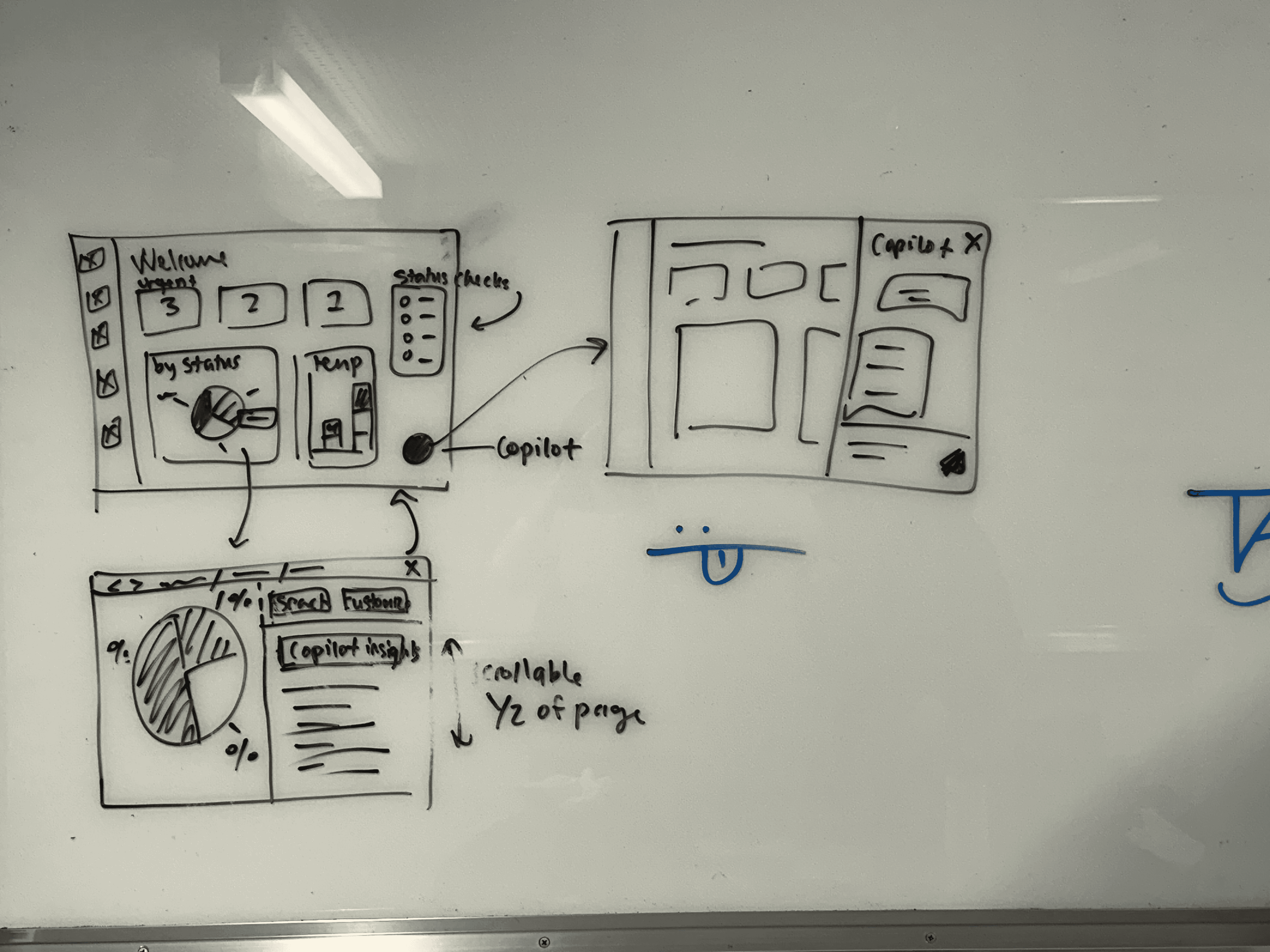
04 TAB VIEW
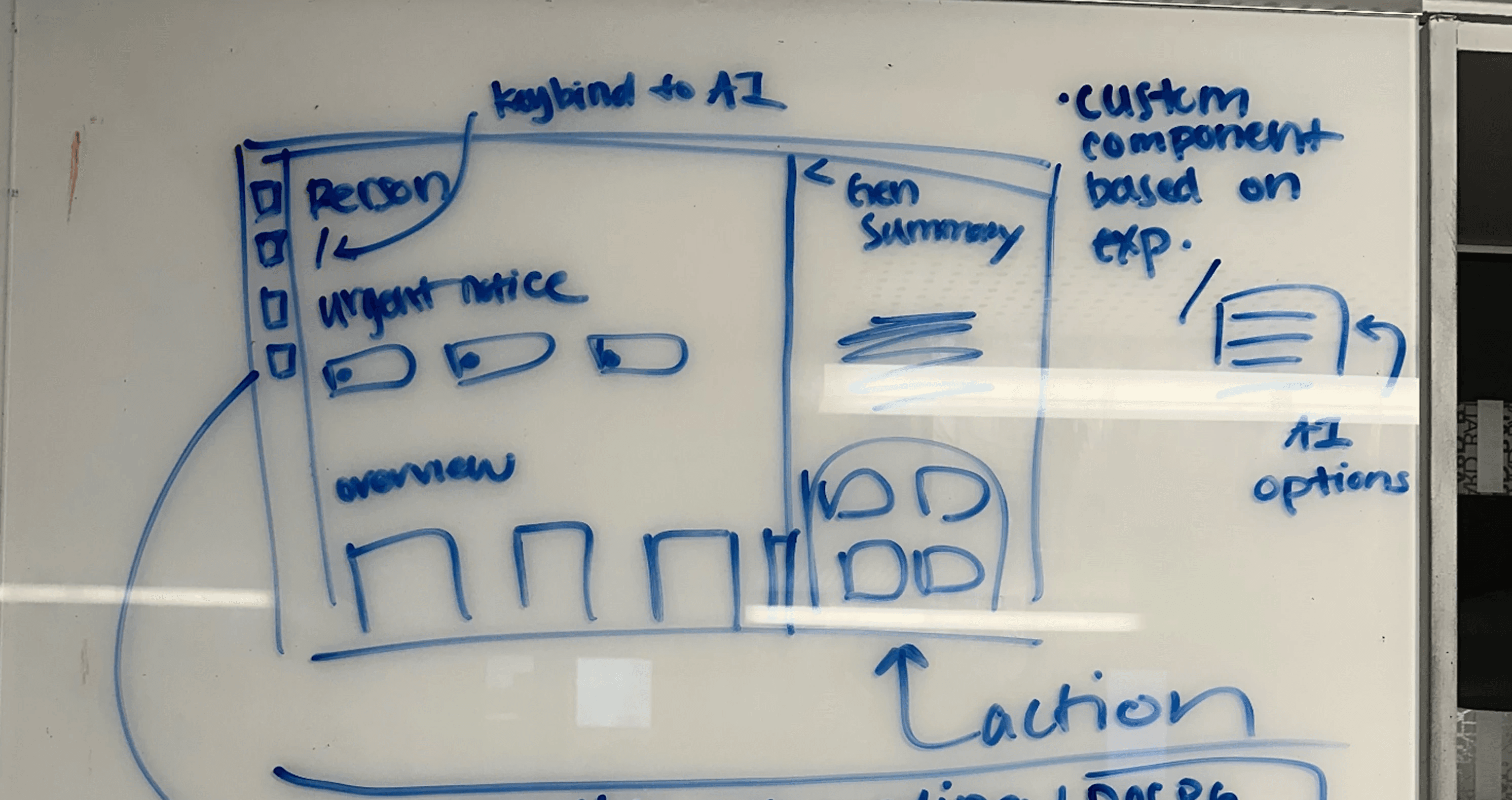
Ideation — Mobile
How might we give OTs critical monitoring capabilities without a full desktop?
Envisioning a totally new mobile app experience.
When OTs leave their desks to investigate issues, they lose access to the dashboard. We sketched ways to bring critical data to mobile, designing interfaces that keep important information at their fingertips. We decided on four key concepts and translated these sketches into mockups as we did previously:
KEY CONCEPTS
Home Dashboard
Let OTs understand at a high-level quickly.
Copilot Integration
For fast and easy retrieval of data and insights.
Actionable insights and alerts
To make urgent actions clear and minimize cognitive load.
Recordings & Timeline
To remotely monitor and see activity in correspondence with activity.
MOBILE EXPERIENCE
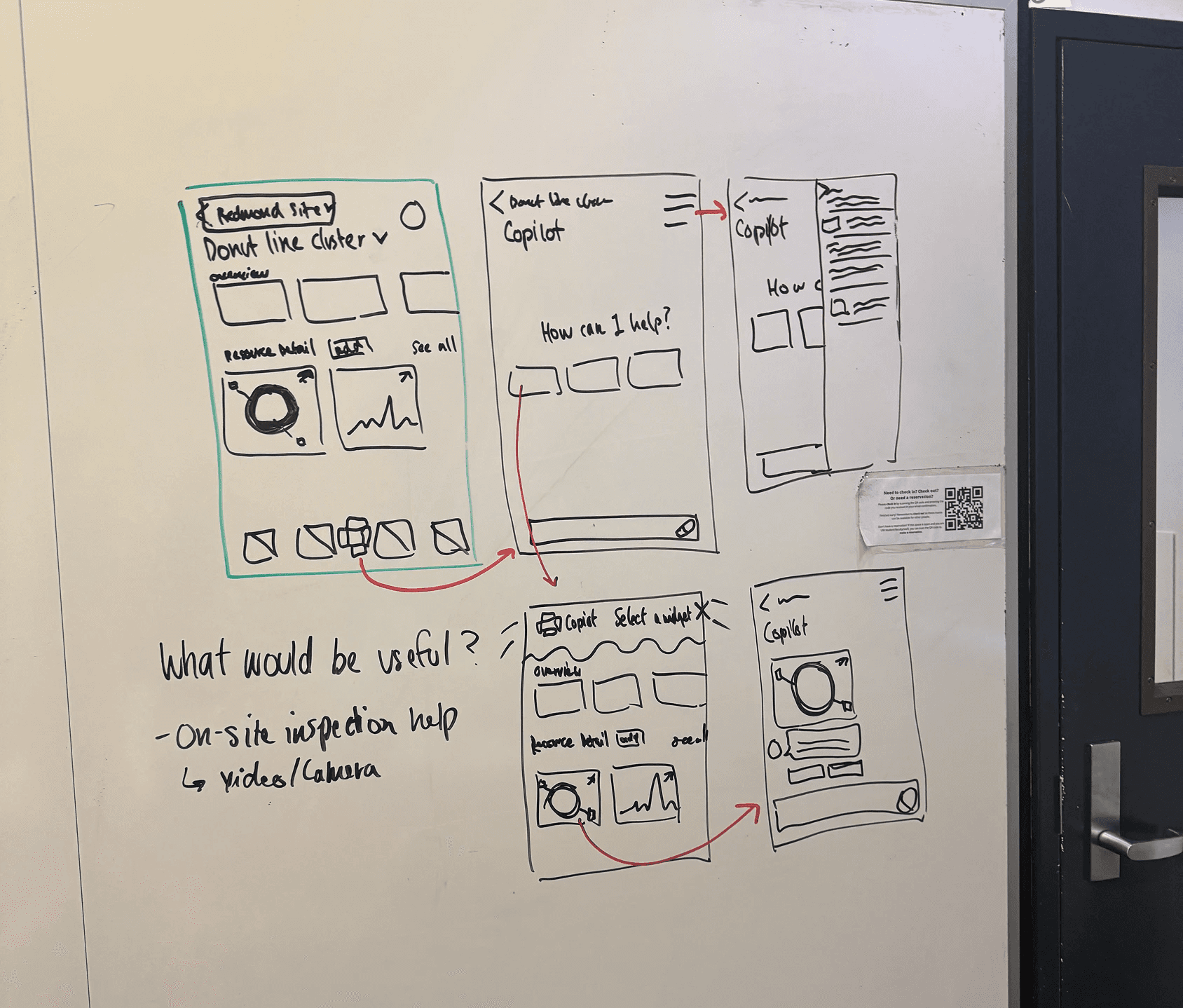
Ideation before whiteboarding to identify must-have features
Concept Validation — Desktop
We shared our ideas with internal stakeholders.
Ensuring we meet design system and accessibility guidelines.
We validated our ideas with cross-functional stakeholders on the Azure IoT team — UX designers, a UX researcher, a PM, a software engineer, and an accessibility specialist. Their feedback helped us refine prototypes around Fluent Design system compliance, accessibility improvements, and concept clarity.
Desktop Feedback

DESKTOP PROTOTYPE
WHAT WORKED
Widgets provide quick-glance insights and summaries
Copilot tabs keep insights organized globally
Actionable insights with priority tags make critical issues visible
WHAT DIDN'T
Modals didn't follow Copilot patterns
Scalable widgets could confuse users when elements shifted
Content design language was unclear and inconsistent
Mobile Feedback
MOBILE PROTOTYPE
WHAT WORKED
Glanceable widgets and copilot summaries surface key insights at a glance.
Recordings surfaced key disruptions, making it easy to spot and review issues.
Alerts and priority tags make critical issues immediately visible.
WHAT DIDN'T
Communicating only in color for alerts and status of assets.
Treating recordings as a centralized database, instead of urgent situations.
Using unclear and inconsistent language.
Iterations
How our designs evolved.
Incorporating feedback from weekly reviews, concept validation, and usability testing.
We iterated continuously based on stakeholder feedback and testing insights. Below are the most impactful changes:
01 ITERATION
Customizable Dashboard
In early explorations, we designed a dashboard where OTs could customize and resize widgets to personalize their workspace.
The Problem
Modular/resizable widgets aren't accessible because they can shift and confuse users.
Solution
Users can add or remove widgets, but sizes and positions remain fixed for predictable, accessible layouts.
BEFORE
AFTER
02 ITERATION
Side drawers over modals for Copilot.
When users wanted to analyze dashboard data with Copilot, we initially designed a modal where they could select which widget to discuss.
The Problem
Modals don't follow Copilot design patterns and block the entire screen, interrupting workflow.
Solution
Move interaction into a side drawer triggered by a global Copilot button.
BEFORE
AFTER
03 ITERATION
Prioritizing Crucial Information
When we first began designing the mobile app, we took the wrong approach of translating desktop functionalities straight to mobile — instead of prioritizing crucial information.
The Problem
Dense data would overwhelm users instead of surfacing essential information quickly.
Solution
We designed glanceable widgets that would show a high-level summary on the home page.
BEFORE
AFTER
04 ITERATION
Making alerts accessible and scannable.
In early mobile designs, we communicated urgency through color alone and used inconsistent language across alerts.
The Problem
Color-only cues excluded users with visual impairments. Long, unclear alert text made it hard to scan and understand urgency quickly.
Solution
Combined color with icons and priority tags. Standardized alert language to be concise and consistent—making urgency clear through multiple visual cues.
BEFORE
AFTER
05 ITERATION
Surfacing urgent recordings, not databases.
Initial designs showed the full recordings library, treating it like a reference archive rather than a monitoring tool.
The Problem
Showing all recordings overwhelmed users instead of highlighting what needed immediate attention.
Solution
Prioritized urgent, relevant recordings first. AI surfaces critical footage immediately so OTs can quickly assess and understand disruptions.
BEFORE
AFTER
Outcome
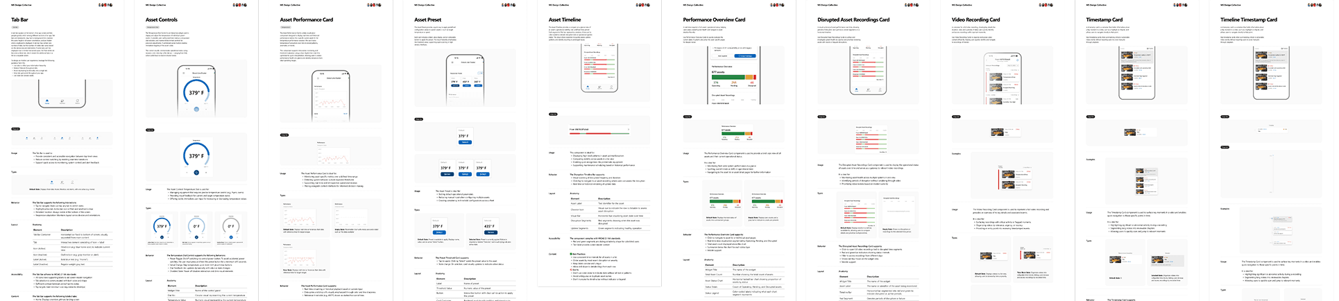
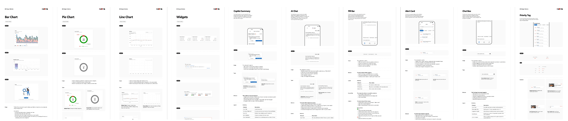
40+ new Fluent UI component variants designed and documented.
Building the foundation for future mobile development.
We created and documented 40 new mobile and desktop components and states following Microsoft's Fluent 2 design system, kickstarting Azure IoT's first mobile exploration. While not yet shipped, our designs will guide future mobile development. In our handoff to the Azure Cloud Experience team, leadership praised the polish and scope achieved in 6 months.
Next Steps
What we'd do next
User research with actual OTs
Next, we want to get this in front of real Operation Technicians. Watching how they move through the app during an actual production day will help us see what truly supports their workflow — and what still gets in the way.
Outlining empty and error states for development
A lot of the real experience happens outside the perfect case, so we’ll design clear empty, loading, and error states. These give technicians direction when data is missing or sensors fail, and help engineers build something more reliable from the start.
Iterate based on real-world usage
As the AI becomes more capable, OTs will need tighter control over what gets analyzed and stored. We’ll keep refining the experience based on real usage patterns so the system stays transparent, helpful, and easy to trust on the production floor.
Looking Back
Looking back on the most ambitious project I’ve worked on so far.


I learned how to navigate complex spaces and use cross-team feedback to continually refine and elevate my work.
Special thanks to my amazing peers and the ACX team at Microsoft for their invaluable support!
WHAT I LEARNED
The value of a good design system.
Working with Fluent 2 showed me that design systems become even more critical at scale. They keep teams aligned, reduce inconsistencies, and make collaboration across disciplines smoother. I learned how to build within a system while still leaving room for flexibility and thoughtful craft.
Finding my footing in new domains
I stepped into IoT and OT workflows with zero experience in it, and while intimidated at first, I soon caught myself up to speed after doing research and asking lots of questions (thank you, Thomas 🙏). Although I don't know every terminology in the book, I was able to understand missing pieces and areas for improvement in the experience, reminding me how fun it is to be curious and willing to dig into new spaces.
Prototype fast. Learn faster.
Quick prototypes helped us test assumptions early, uncover edge cases faster, and get richer feedback from engineers, PMs, and accessibility specialists. Iteration became the engine that moved the whole project forward, and communicating design decisions for critique was extremely valuable.